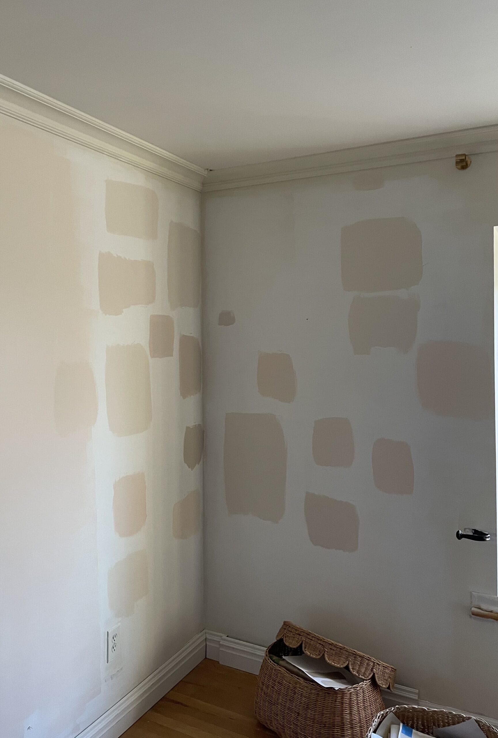
What, like you don’t swatch 21 samples and paint half a room before committing?
I’ve done it. I’ve tucked away my Farrow & Ball fan deck and called it a day after finding the perfect pink-beige (really, taupe) for our living room.
My whole life I’ve had this thing where if I’m trying to make a decision – whether it be an ice cream flavor or the color of a room – I always spin on my options and eventually end up going with my first choice, 98% of the time.
Even though I know in my gut that my first choice is probably the best, I put myself through the wringer trying to make sure that I’m definitely making the right decision by considering all the other options.
With that said, it should come as no surprise that the paint color I chose and absolutely ADORE in our living room is…
If you’ve been following this saga via IG, you’re probably aware that Joa’s White was my original top choice before I decided I wanted something “lighter” and “pinker” and went and spent an embarrassing amount of time and money on sampling.
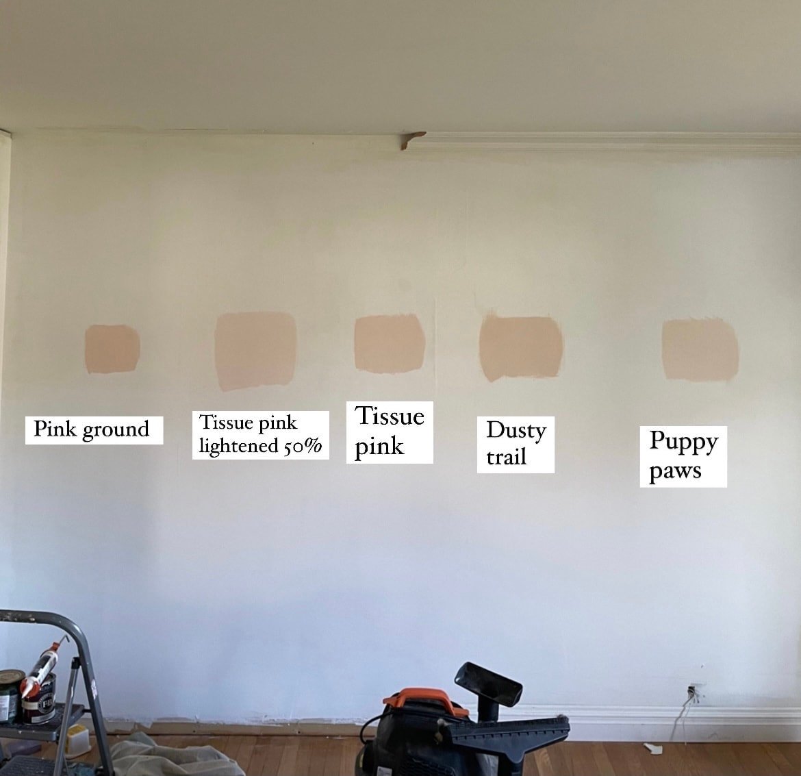
I even bought two gallons of paint just to find out that both gallons were too pink (BM Puppy Paws and Farrow & Ball Dimity).
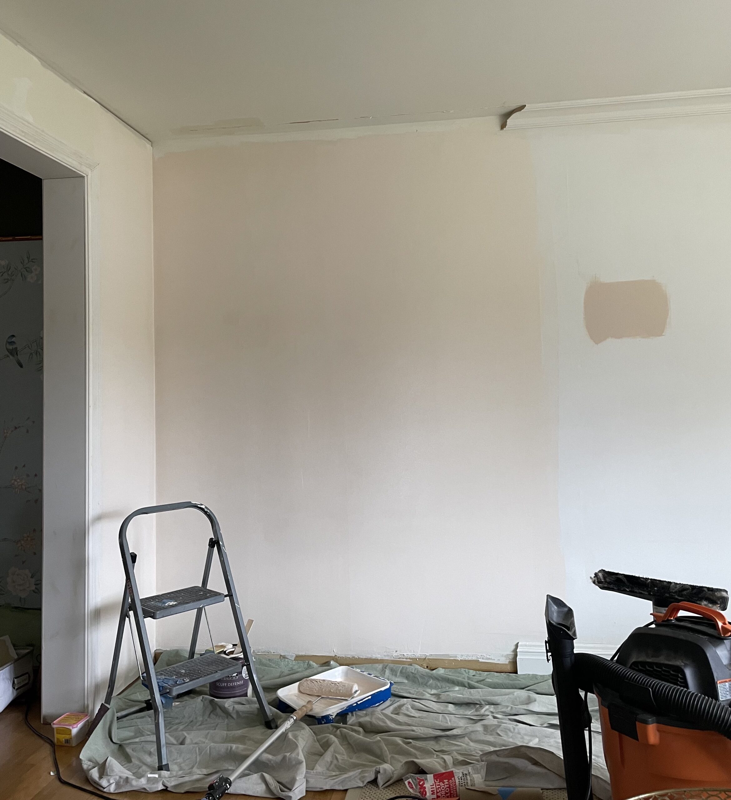
First gallon I bought was Puppy Paws – way too light/pink. Immediately no.
Never – EVER did I think that Joa’s White would look as good as it does on our northern-facing walls based on the photos I saw online and based on my Joa’s White paint swatches.
It’s a red-based, mid-tone neutral, but after seeing it compared to Tissue Pink, it looked so muddy and yellow, and I felt like I had to try Tissue Pink because it looked more like what I wanted.
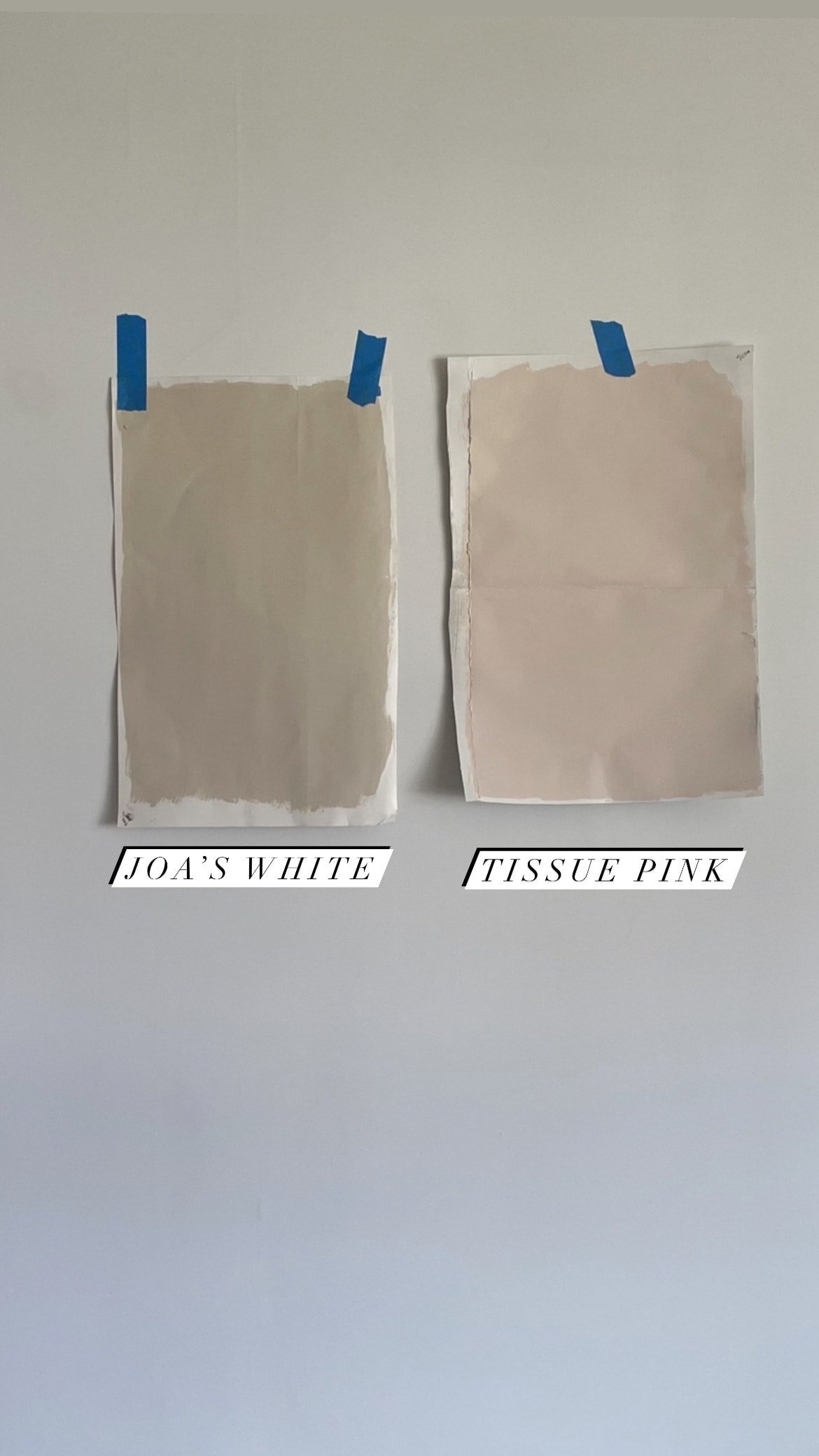
When I started painting samples on the wall, Joa’s White looked like split pea soup compared to everything else, so the thought of committing to it didn’t even cross my mind.
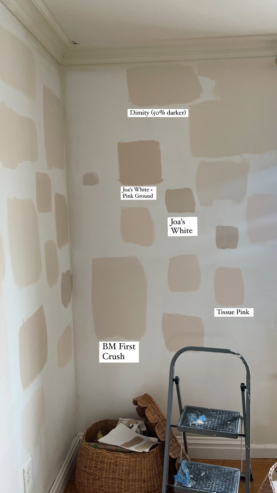
(It doesn’t quite look like split pea soup in this photo but it did in person)
I bought a gallon of Dimity (which is supposedly one shade lighter than Joa’s White) and gave up 3 minutes in when I realized I *once again* chose a color that was way too light and way too pink:
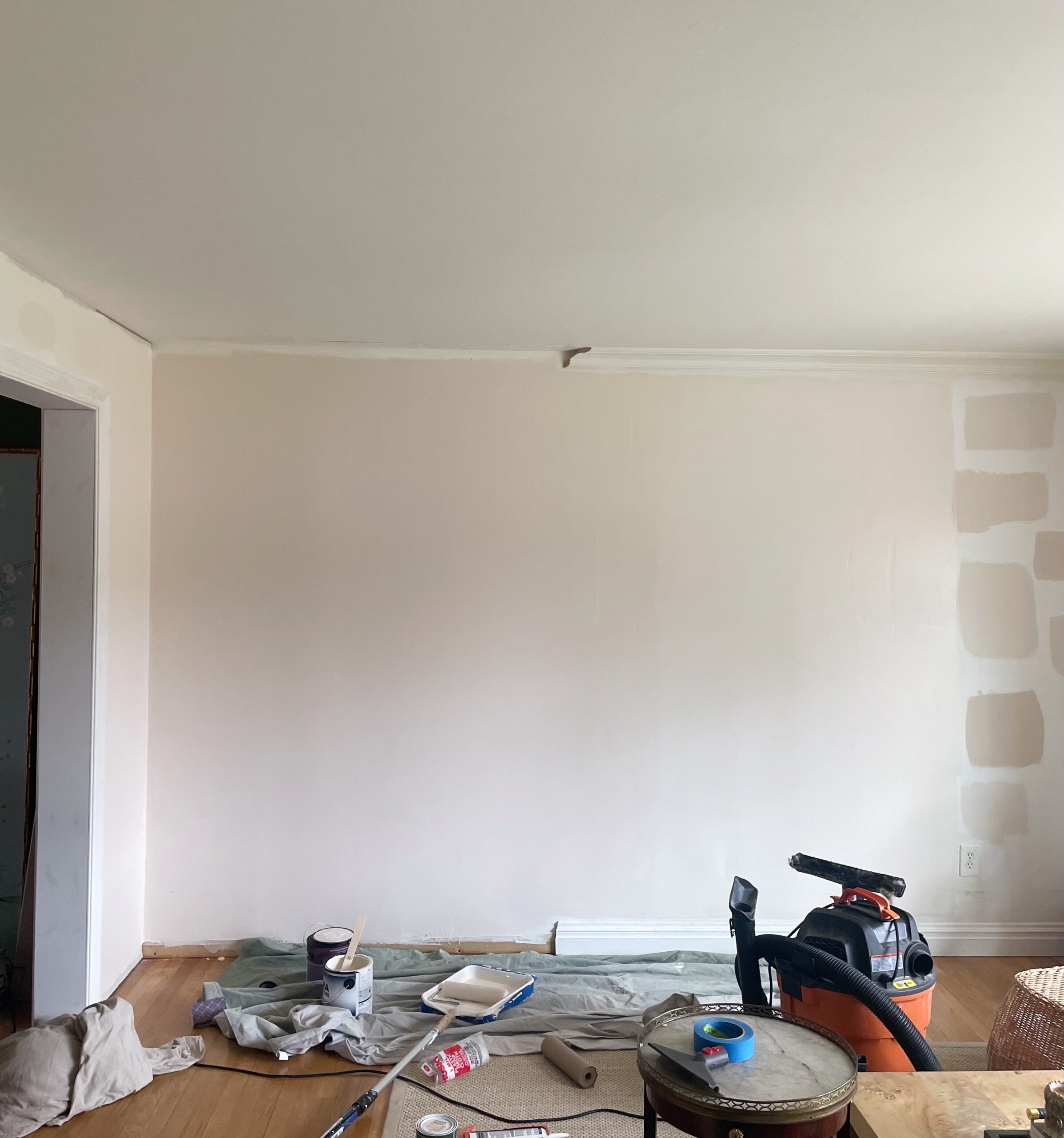
At this point, I was really frustrated, but I realized that if I wanted a true pink-beige (taupe), I needed to go with a darker, muddier, yellow-er color than the ones I’ve been sampling, because they clearly weren’t working.
Before I succumbed myself to this journey down the pink-beige road, I wish I knew what an absolute bitch it is to pull off in general, but particularly in a northern-facing room.
So after Dimity, I went to buy a gallon of Joa’s White. As soon as I started painting and knew almost immediately that it was the perfect pink-beige that I was looking for.
My reaction:

I’ll be doing a separate blog post on the colors I swatched and which ones I loved/recommend (even though they didn’t work for me).
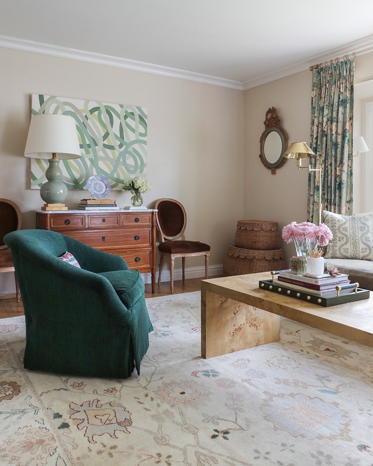
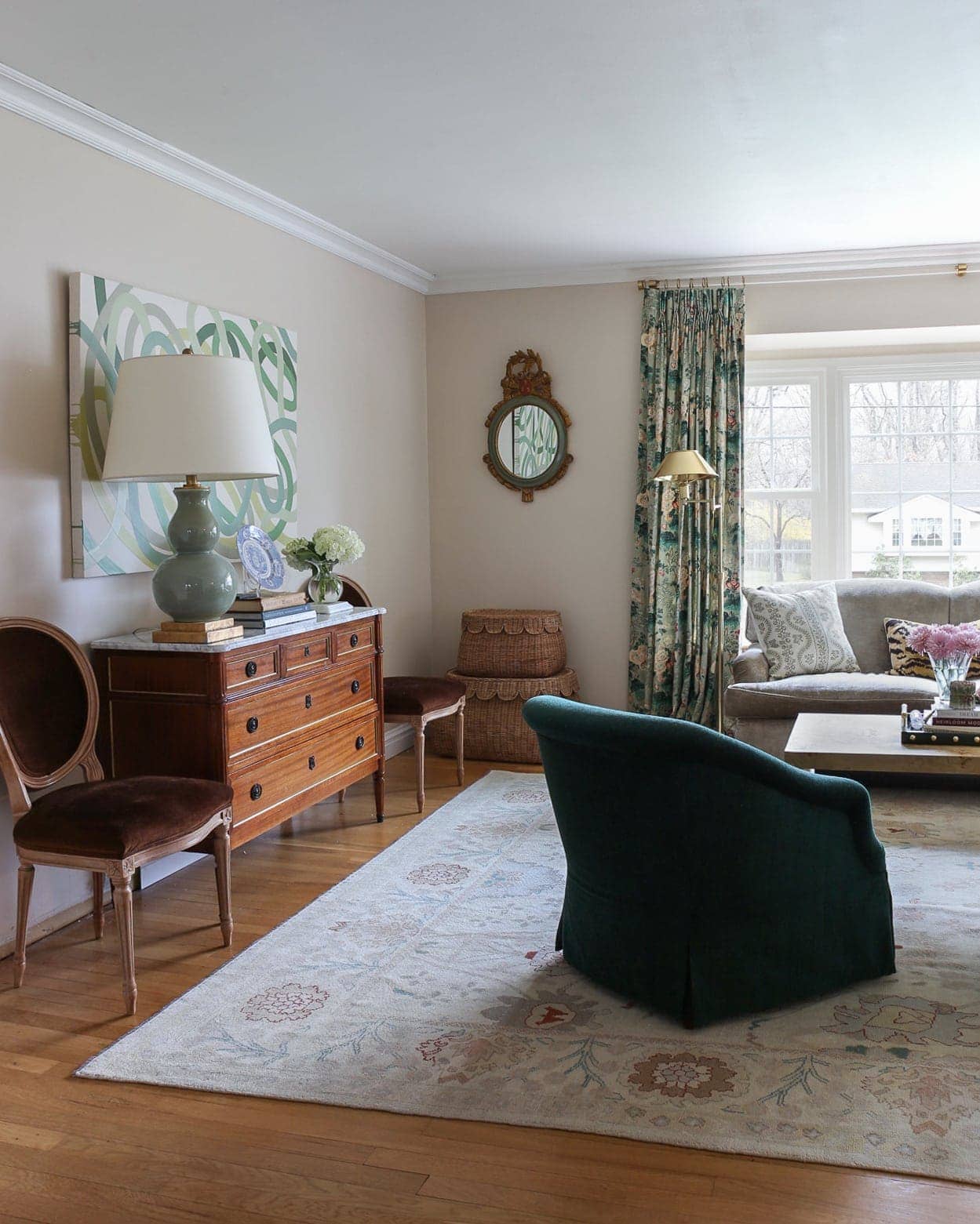
The room is still a work in progress, but here are some photos…
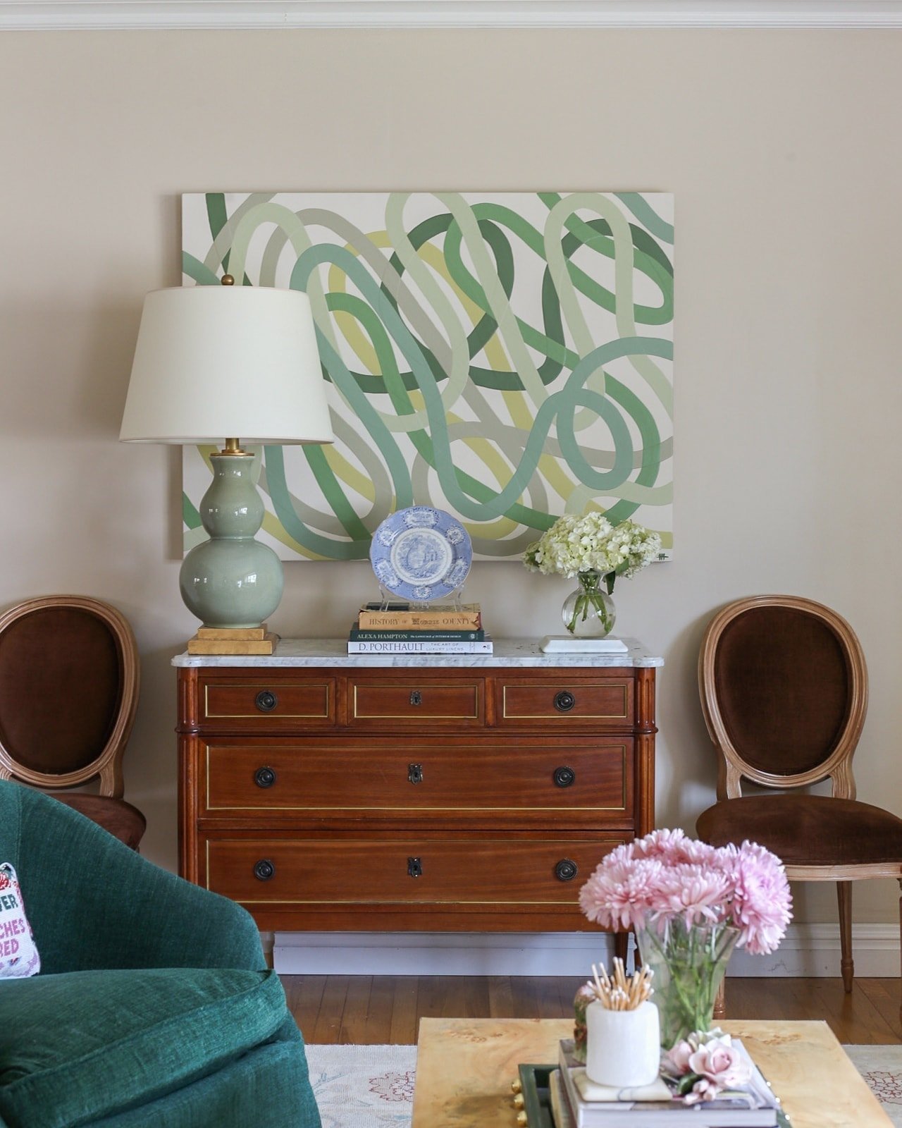
How AMAZING is my new commission from Hilary Howorth? It has 5 shades of Farrow & Ball Green (and one Sherwin Williams). I love her work so much! I plan to frame it eventually and also include more art on either side of this piece.
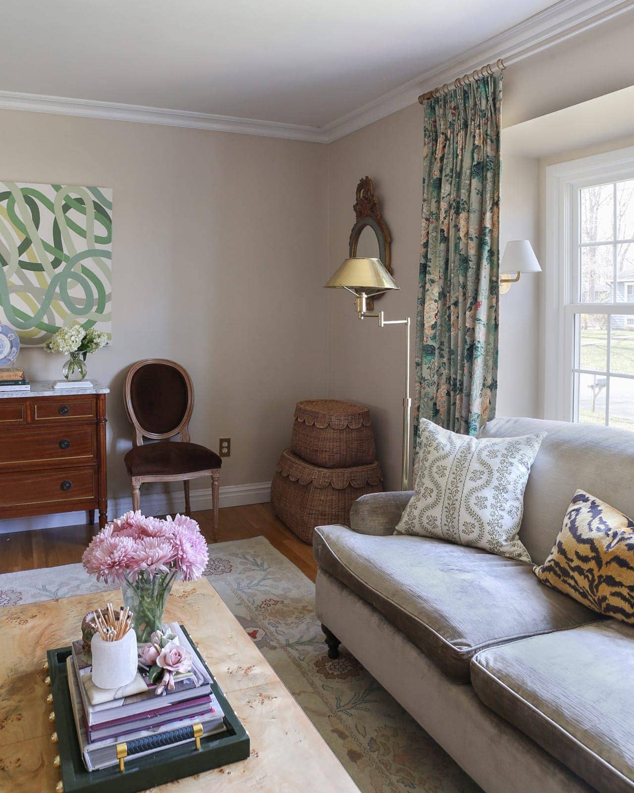
The brown chairs were borrowed from the dining room. I’d love to find a new set of chairs (secondhand) that fit the scheme better.
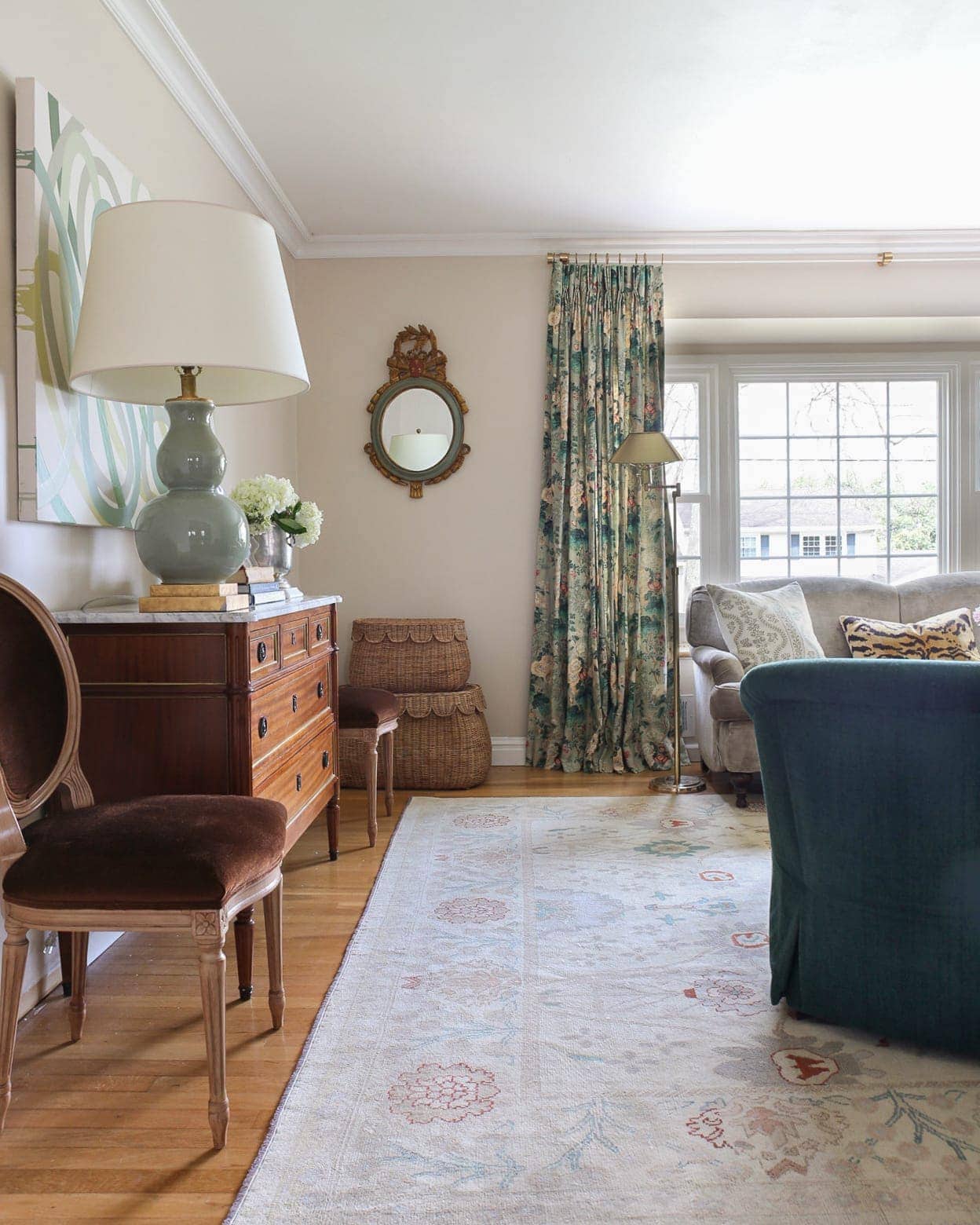
I absolutely love this new look, but I definitely feel like this room needs more masculine elements. I’m thinking some black accents/art?!
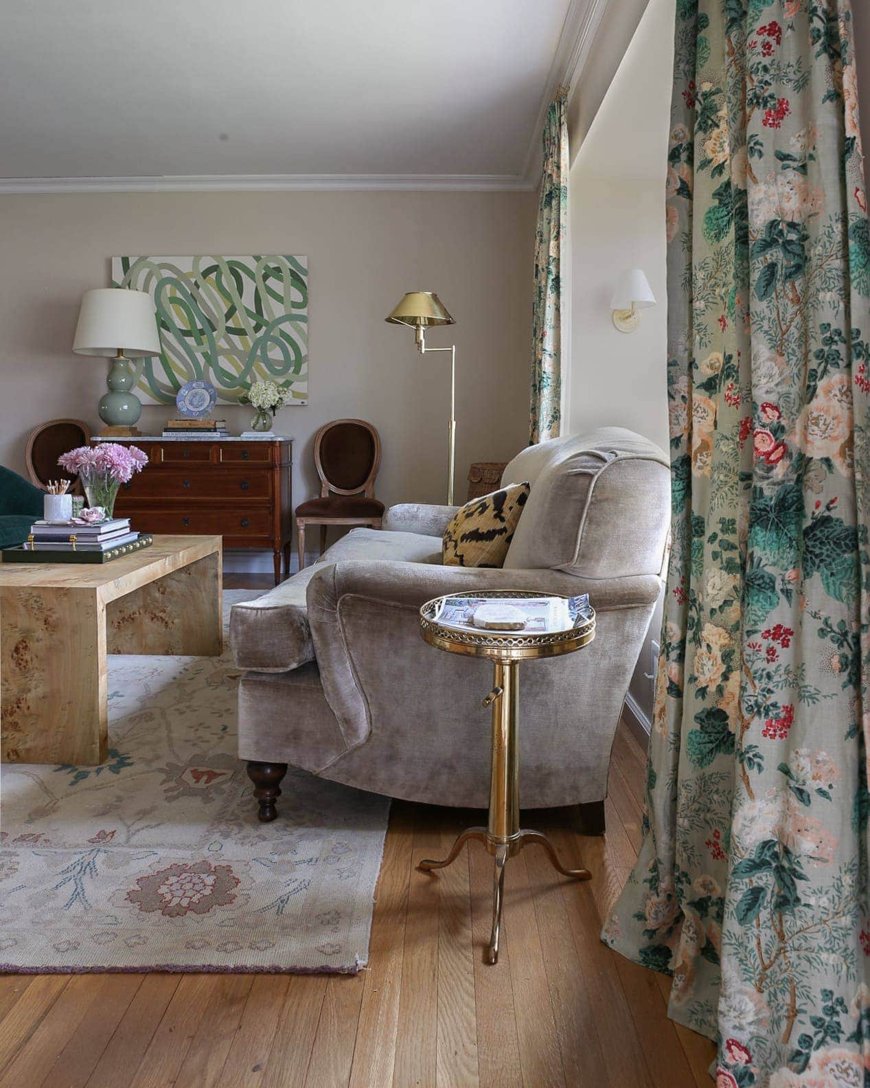
The chest is not staying on that back wall. I have plans to include a longer credenza/buffet there as it’s more fitting. I’m aware the size of the art and chest is off, but it’ll do for now.
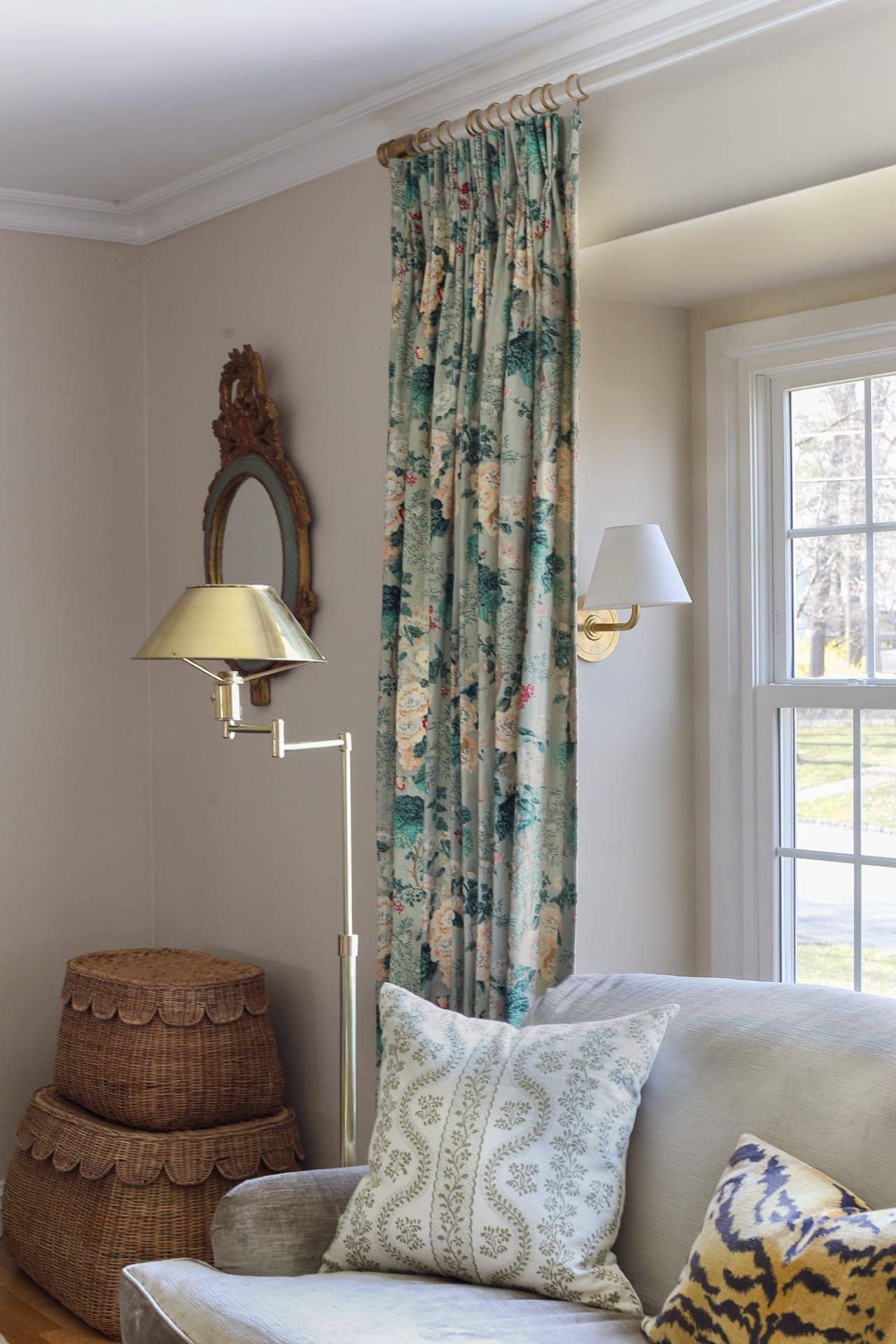
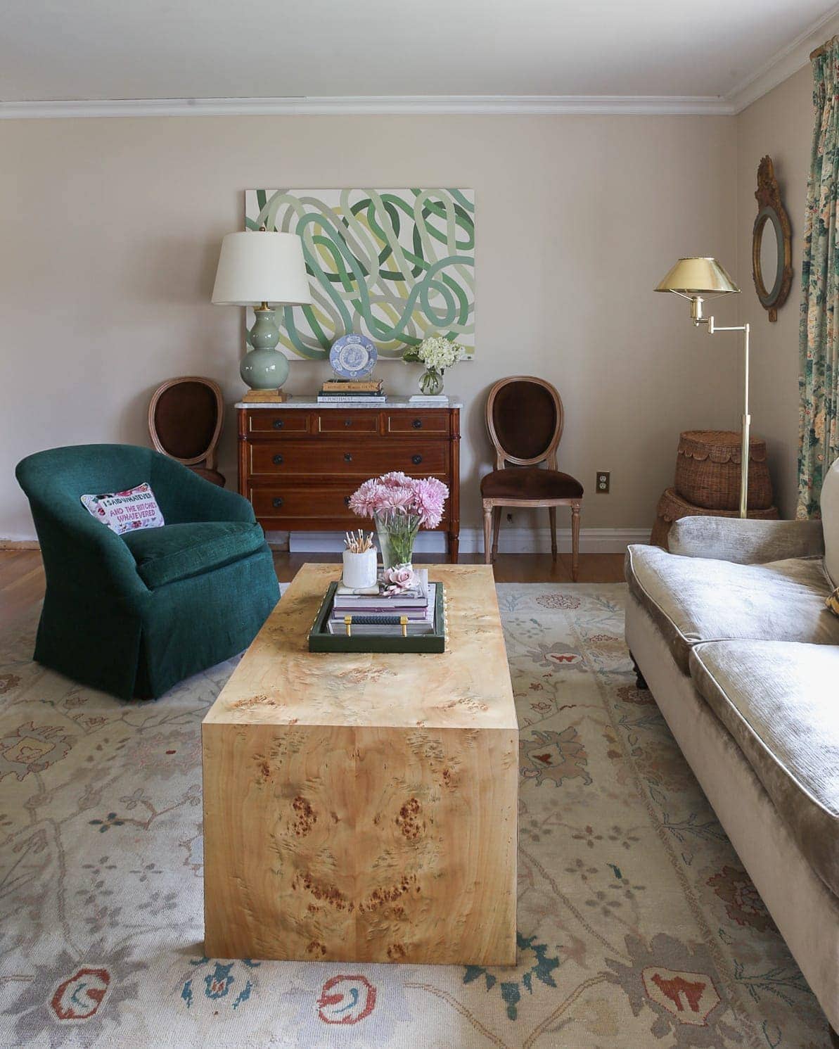
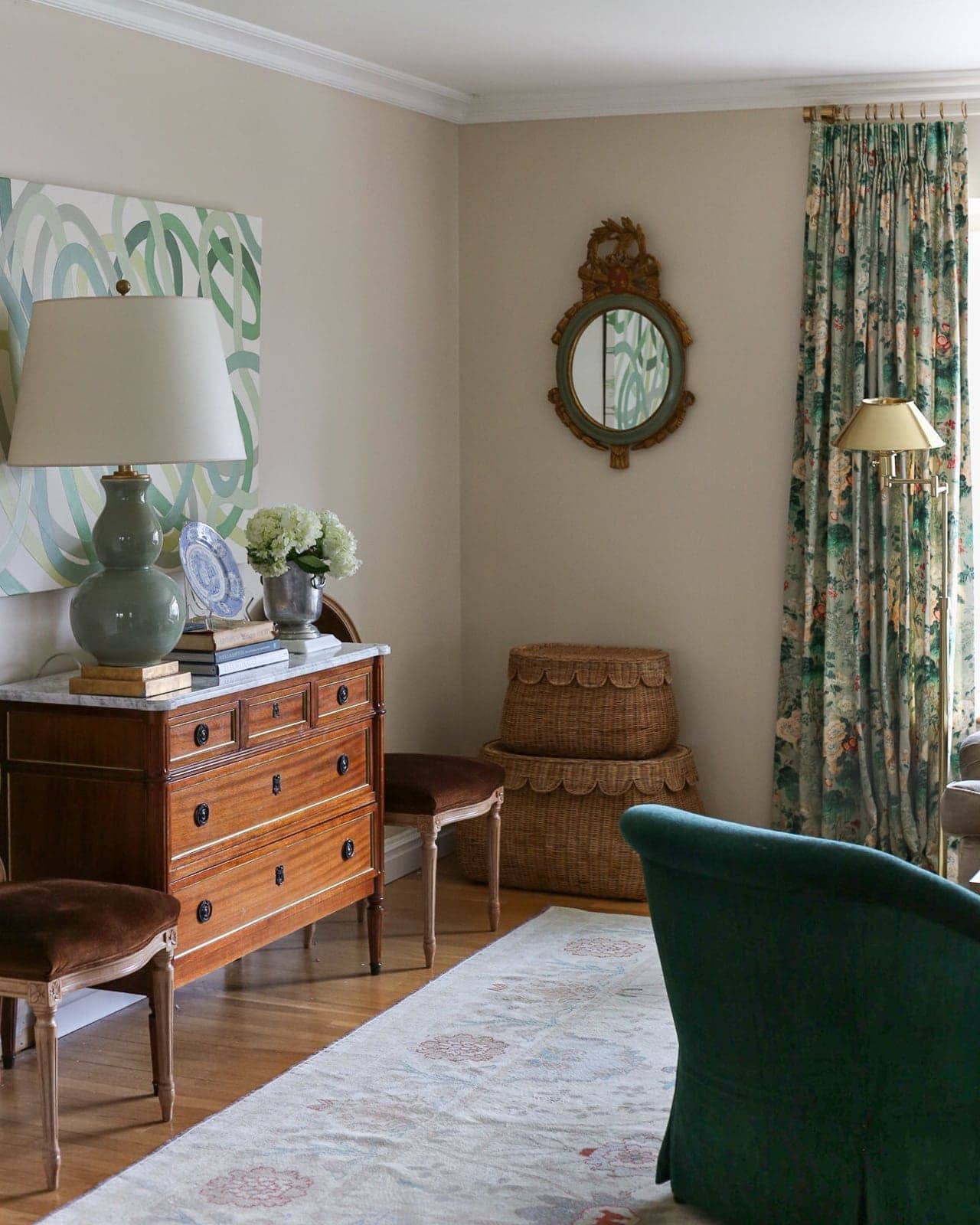
I always loved the elements in our living room individually, but never felt like they really shined with white walls. Now, I feel like they’ve come to life with this paint color.
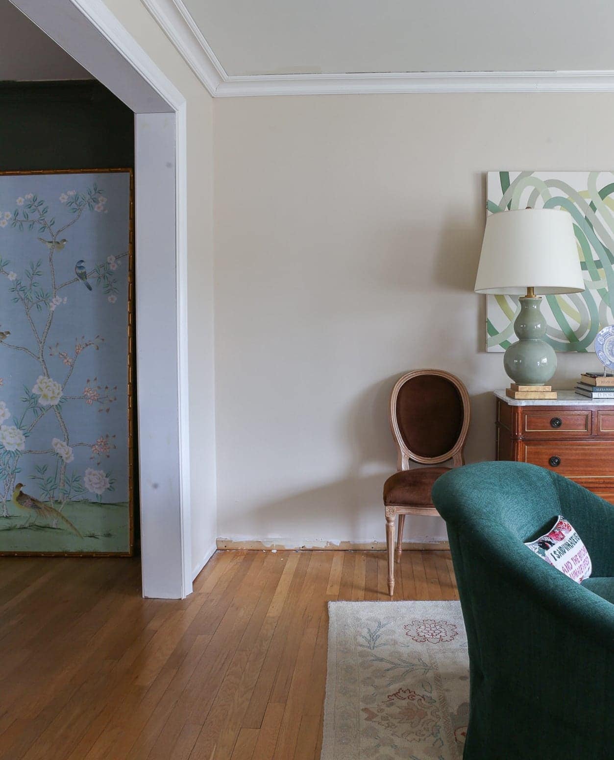
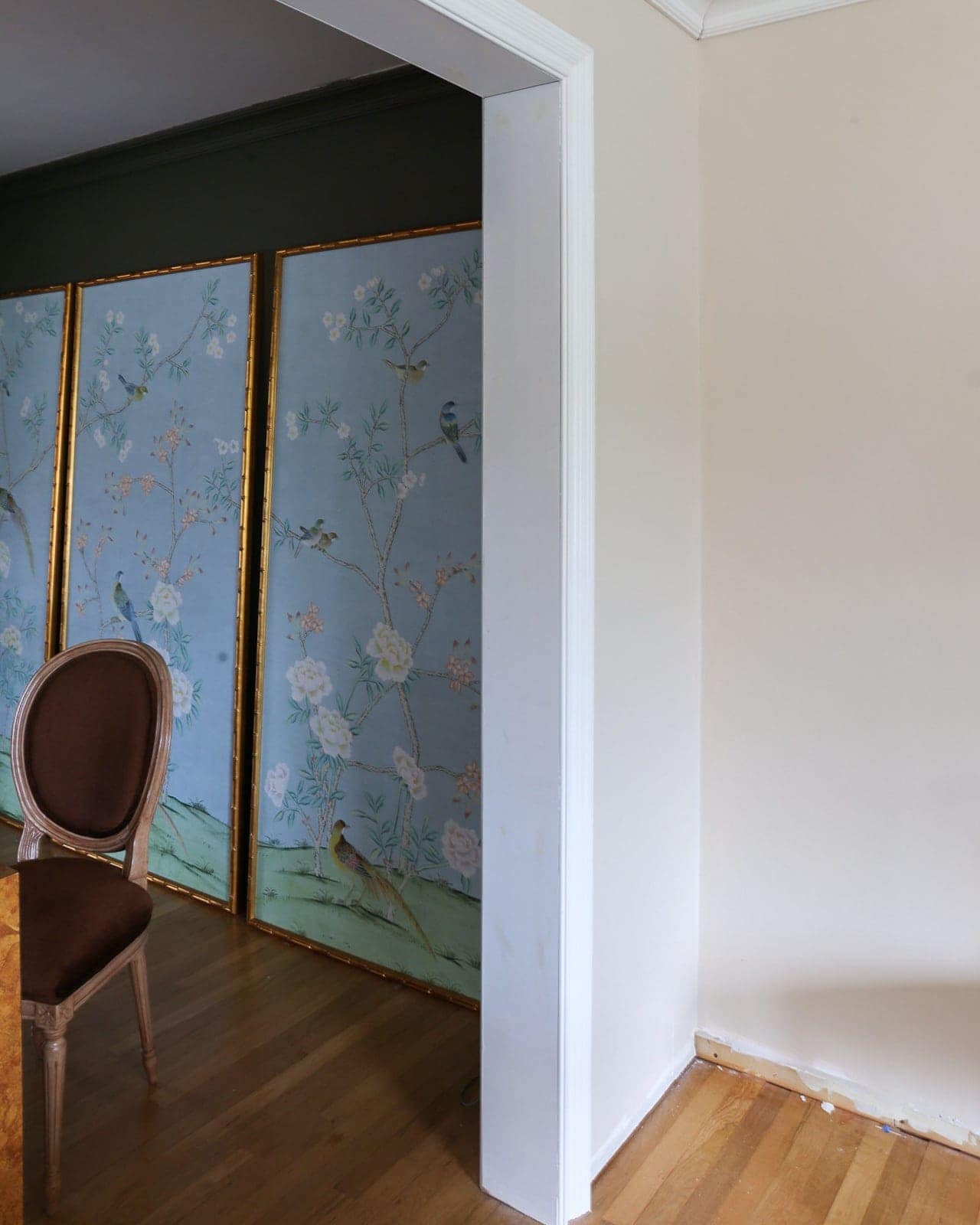
The color looks wonderful against the dark olive walls in the dining room.
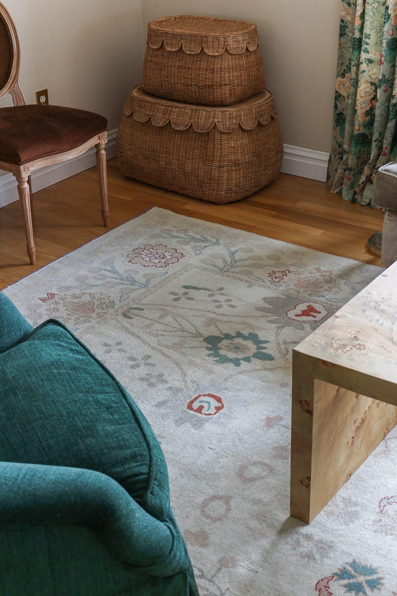
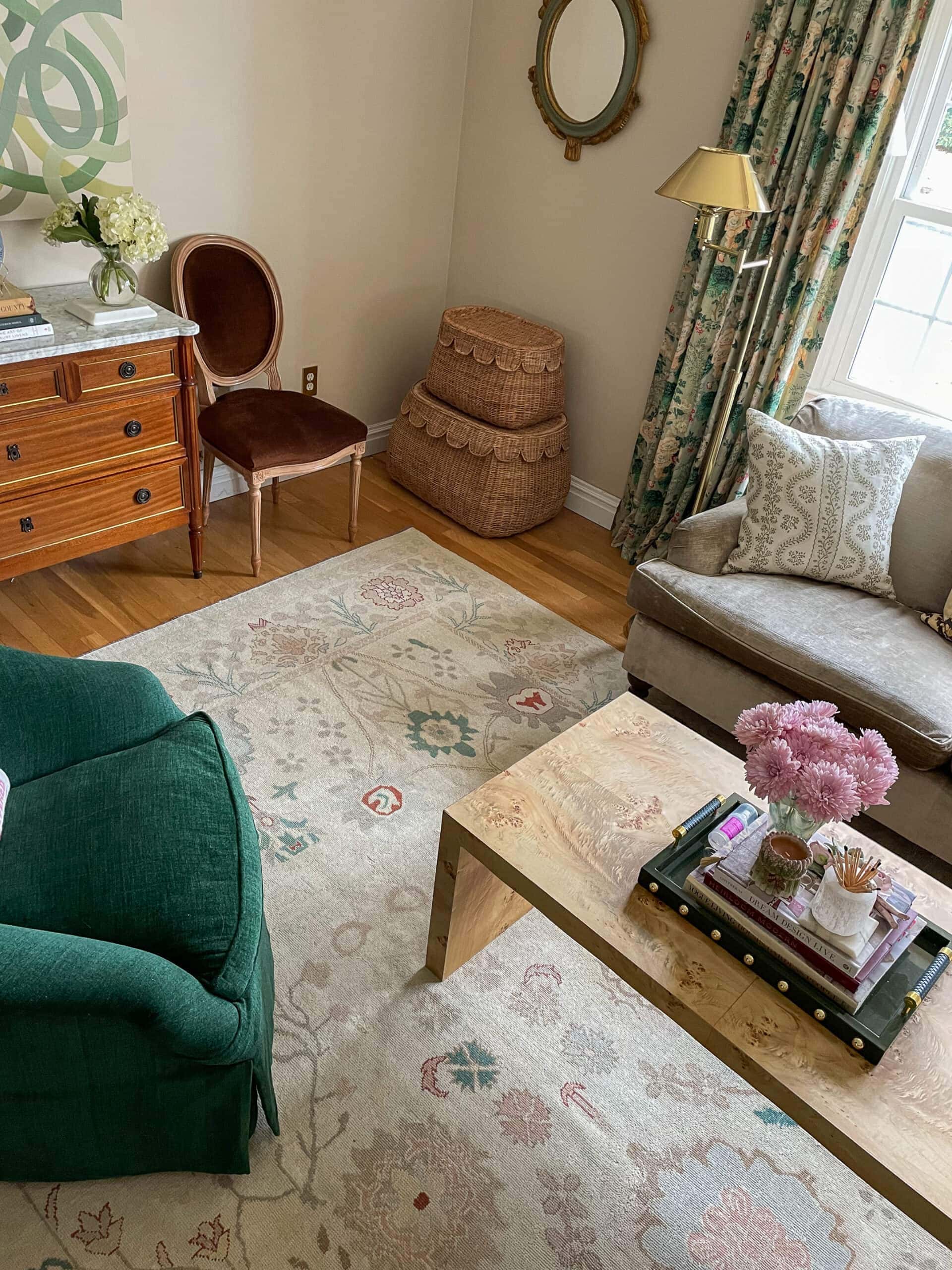
The life lesson I learned (besides just sticking with my first choice in order to save myself a headache) is to give the ugly swatch a chance.
Also…I gave myself more validation that I should go ahead and just paint an entire room before deciding on whether or not I like a paint color.
SOURCES:
- Floral oushak rug: One of a kind from Rug Source (use code SpringRug10 for 10% off)
- Window Sconces: Hudson Valley Lighting
- Brass Floor lamp: Serena & Lily
- Louis XVI Chest: See this post
- Visual Comfort Lamp
- Scallop Baskets
- Louis XVI Chairs: Facebook Marketplace
- Art: Hilary Howorth
- Mirror: Carver’s Guild (Facebook Marketplace)
- Coffee Table: DIY tutorial here
- Sofa: George Smith (Facebook Marketplace)
- Green Chairs were recovered in Fabric performance chenile
- Lee Jofa Althea Curtains: More in this post
- Tiger pillow
- Sister Parish Pillows
- Needlepoint Pillow
- To come: this beautiful wicker urn for that will go against the cased opening wall!
- Art on back wall from Diana Garrett
And this area is now in progress. I plan to include a console here. Obviously, the door needs casing as well.
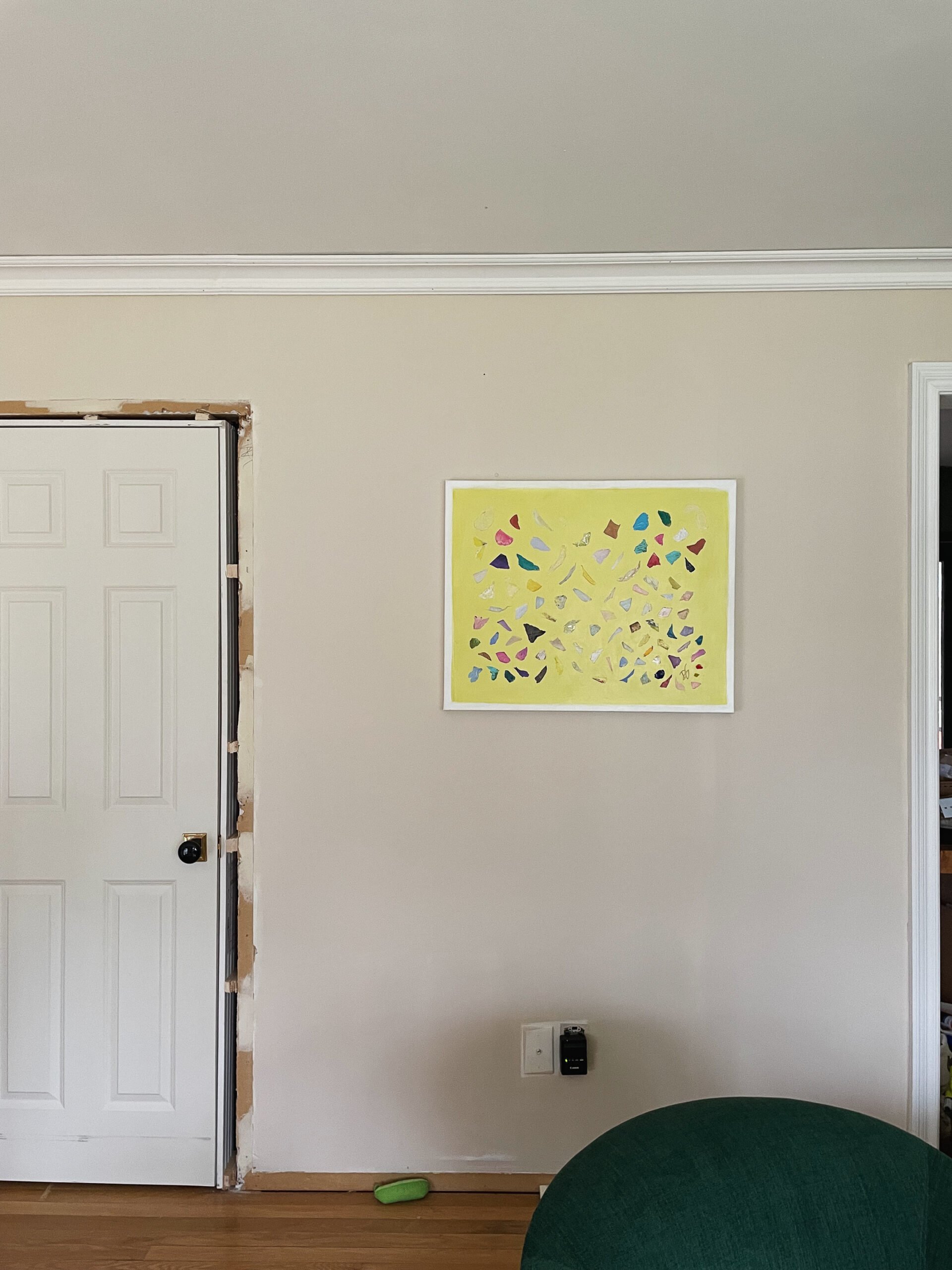
I just love this art from Diana Garrett!
BEFORE
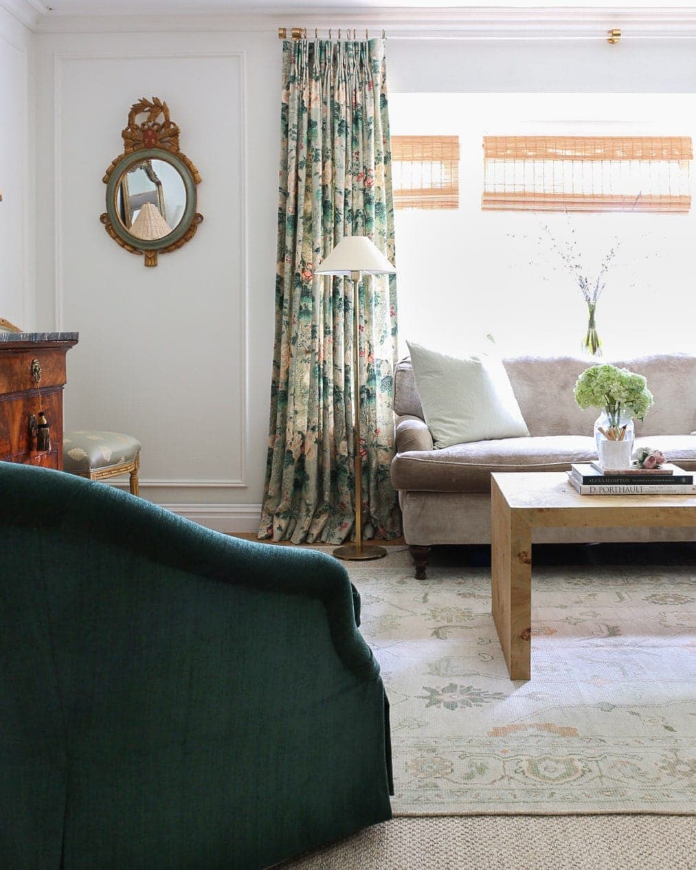
AFTER

Omg I love it! It turned out even better than I would have imagined.
Thank you so much Jessica!!!
What color trim did you use?
I love your sense of style, Alisa! That wall color is perfect, you’re right. It really does make the room come to life. Simply beautiful!! The ribbons commissioned painting is stunning. I want one!
Enjoy the fruits of your labor.
Thank you so much Tara!!!????
It looks so good Alisa! I was hesitant when you said you wanted to go pink, but this color is perfect. It doesn’t scream “nursery” to me
Thank you!
LOVE the color! You’re right, it is not a showstopper by itself but it absolutely makes everything else in the room sing and really amps up the cozy factor. I don’t consider myself a grandmillenial but I love your content and always look forward to your reveals 🙂
Thank you!!!
Love the paint color you ended up with! Everything looks so beautiful – I am especially loving the new rug!
Thanks Elizabeth!!
I love it! It really does make everything in the room pop. I too have decided I have to paint half the room to really get a feel for the color. I’m glad I’m not the only one that obsesses over paint colors and has multiple swatches painted on! It’s the only way to really get a feel for what the room needs! I love following your process and I always love your results! ❤️
Thank you!! Haha, yes we are not alone ????
May I ask why you removed the decorative moulding trim that was in the living room? Thank you for this fun (for us!) journey to your final wall paint color.
Thanks!! I removed it because we built a cased opening to separate the living and dining room, and the molding placement no longer worked.
Beautiful color for your space and I, too, am surprised at how cozy it feels even with it being a lighter color. All of your furniture and decor bring it to life. Thanks for sharing your process!
Beautiful! I agree, all of your furnishings really come alive with the colour, it’s perfect!! By the way, I noticed the mouldings are gone. What was your thinking behind that? Would they not have looked as good with the new wall colour?
Seeing the before and after with the new paint colour, you can really see what a difference it makes. Everything just looks more cohesive now. I had been thinking of painting my walls white for a while, currently BM Natural Linen, and this just illustrates to me that my traditional furnishings probably won’t work with that. I’ll probably just go with a tough different shade with less yellow. Thank you for the post!!
I was really rooting for Puppy Paws (because aww ????????????) but Joa’s White is perfect for your space!
Thank you so much!!! ????????????
Perfection!! And the rug is fantastic!
I’m not sure I see this room as overly feminine or missing masculine elements, but… If you’re thinking of black touches, I think black lampshades are always chic. When you replace the side chairs, maybe go less ’round’ and more contemporary. Parson’s chairs might be one option. Replace sweet patterned sofa cushions with something else and/or pick up a complementary color from the rug/curtains – like the red/rust or brownish tones.
You’ll figure it out and love it whatever you choose. 🙂
Yes!! We are totally on the same page, thank you for that!! ????????????
So gorgeous! Can’t wait to see the cool wicker pieces. And a big “yes” to adding something black.
Thank you!!!
Wow! It is incredible how different the swatch looks compared to the final result. I totally agree that the new color brings everything together and makes it feel so much warmer and alive. And as much as I love picture frame molding, I think it looks great without!
Thank you so much Lauren !
Whoa, it looks SO GOOD! Love it with your curtains. Great choice!
It looks beautiful! It is so warm and inviting and brings everything together.
This is a lesson that it took forever for me to learn (with probably 100 paint samples over the years – at least 50 in my primary bathroom!) – always go muddier and darker than you think. I always thought that lighter would be a more relaxing subdued color but it is usually just brighter. And it’s so deceiving when I put a muddy color next to the color that I *think* that I want and will give that relaxing feel. I do the same thing – I would rather sample than spend the effort of painting a room twice (ask me how I know!).
Ugh you’re so right!! I learned my lesson for sure ????
Lovely. I’ll share what someone told me about sampling colors- don’t put them next to each other because you’ll just see the differences between them rather than them in the space.
I made this mistake in my hallway and looked at BM Intense Gray next to Paper white. Intense Gray looked positively brown in comparison but when the Paper White went up by itself it was practically light blue. Luckily could switch to Intense White which by itself is a lovely light gray.
Oops! I meant Intense White (which is a light gray…)
Love this tip!!
Would you consider the Joa’s white a pinky peach color? I like how it looks, i just cant tell if its more pinky or greige
Your final choice looks a lot like Benjamin Moore Sheraton Beige, which I know doesn’t look like much on their website, but I’ve used it in multiple rooms and it’s a lovely creamy taupe with just a touch of blush in certain light… ????
Sheraton Beige is actually Point Beach with a fancier name, and basically a light orange cream. It’s a lovely shade and looks really good in rooms with no window light. Where there is a lot of light it can look a bit washed out, but in windowless rooms, it is beautiful.
What size is your curtain rod and where did you find it? Looking for around a 9’ one. Thanks!
This was so helpful. Found this when I was looking for a beige-pink paint for my daughter’s East-facing room and your samples are exactly the same that I have looked into. Will definitely try Joa’s white and check out your site a little more. Thanks again!
I love Joa’s white, never used it yet but you’ve just convinced me to go for it! It looks nothing on the paint chart but looks so quietly warm & lush in older houses – my friend had it in his bathroom- every single time I visited I commented…looks great in your room.
Hi!!! I am sooooo glad I found your site!!!!
Thank you for introducing me to Farrow and Ball!
I had the exact same problem you had.
I could not find the perfect shade of beige with pink overtones.
Everything I looked at was too dark, too rose/mauve, too pink or too grey.
Found your post, and I immediately got samples (yay!!) of F&B Pink Ground and Setting Plaster.
Pink Ground was super pretty but too pink and too light. Setting Plaster looked GREAT in my skylighted den, and appeared perfect colorwise, but in my LR/DR, which is a darker room with no skylights, it was too dark and too yellow. I have nothing but yellow wood everywhere (TY, Andersen windows and doors) so I had to think about this one. I am trying to tone it down with this pink beige and a dark floor. (Yes, the floor matches the windows and doors. EEEkkk!) So I combined 50% Pink Ground with 50% Setting Plaster and it is perfect!!!! Their paint is really dreamy, I spent $100 on samples of every Benjamin Moore pink beige I could find and none of them were as good as the F&B. Thank you so much!!!! I’m not a room designer like you are, but even in my modestly furnished LR/DR, I needed a touch of elegance. 🙏
Hi there! Just came across your blog post and my goodness… Im going through this now! I’ve purchased so many samples and all are “too pink”— my guest bedroom is also north facing. Joa’s white looks perfect in your space! Which other pinky warm tones would you recommend?
You absolutely nailed the colour I’m looking for! Thank you for all your efforts.