I can’t believe I’m admitting this but, less than a year ago when we were buying our house, I had decided that I needed a completely neutral home. It had to be filled only with an abundance of grays, ivories, and silvers to achieve that rustic glam look and the only pop of color I would allow were apples sitting in a basket on the kitchen counter.
This is (one of) the gorgeous yet color-lacking photos that inspired that rustic-neutral-glam vision:
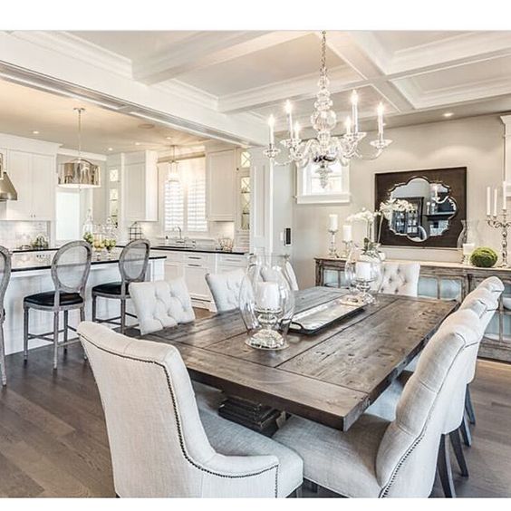
I binged on sleeves of soft baked chocolate chip cookies and bags of Swedish Fish in the 4-week-long process of driving myself towards insanity while trying to choose the perfect NEUTRAL gray paint (not too warm, not too cool), which would be the *ultimate* backdrop for all those NEUTRAL accents. Looking back on it, I can’t believe I couldn’t see that all that “neutral” shit was so not…me. I blame it on the overly-stressful process of purchasing a home in the midst of wedding planning. Yes, that must’ve been it.
3 lbs and 4 weeks later, every single room in the house was painted one of two grays:
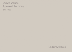

(Before and after pics here).
In hindsight, I think I was actually afraid of color. I was too busy worrying about our first mortgage payment and wedding centerpieces to think about a color scheme, so I stuck with what was easy and quite frankly, boring.
That was almost a year ago and sweet Jesus has my taste evolved. Gray still makes up most of our house and we do love it, but I eventually let my “color guard” down and began painting and styling with the idea of being “bolder” and “unforgettable” in mind. I’ll unashamedly admit that I still won’t allow certain colors in the house (i.e. blue, orange, purple), and will only buy things if they match the home “theme.”
Ain’t nothing wrong with wanting a cohesive look.
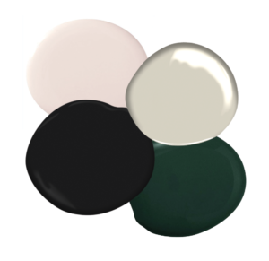
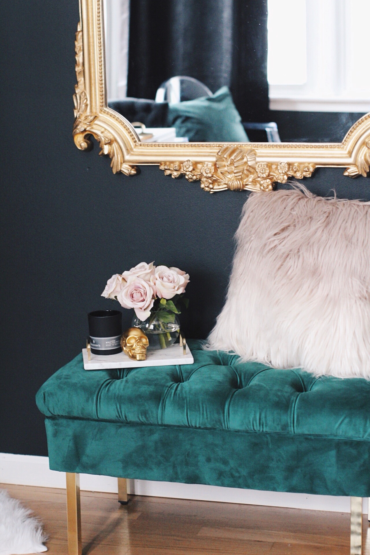
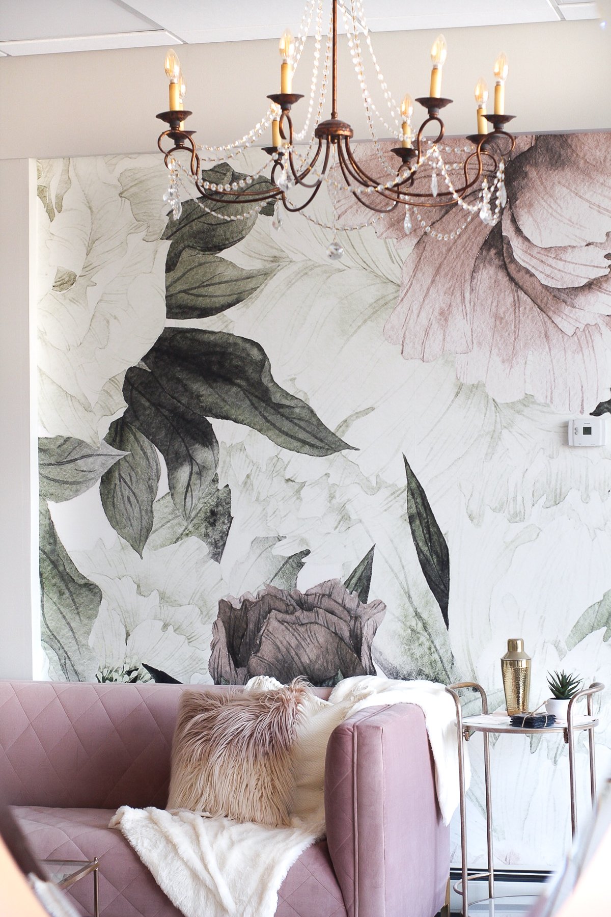
Every room in the house is slightly different from the next in terms of color schemes, but I generally maintain a consistent color palette made up of grays, blacks, blush pinks and forest greens, which have become quite abundant throughout our home:
A good example of all my color scheme in one photo (minus gray):
Akay..this is all fine n’ good, but how can you create a color scheme for your home? Luckily, I’m here to tell you that establishing a color palette that you truly love is possible and can be done by asking yourself a few simple questions.
(for the purpose of this post, I’m including a color wheel to use as a reference):
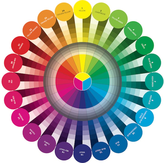
Choose 3-5 of your favorite colors
*eye roll* I know I know, are you EFFIN KIDDING ME? But I had to ask myself this obvious question when I finally decided to begin adding color to my home. I recommend taking a look at your Pinterest board and your wardrobe to nail down your color style. Is it filled with neutrals (i.e. black, white, gray, ivory) or is it filled with vibrant, saturated colors? My wardrobe is filled with (surprise surprise) dark greens, blushes, blacks, and grays. What colors are you drawn to when you’re shopping? What colors are you? When working with new clients, I always ask about colors they dislike. I personally dislike orange, so I don’t bring it into our home. Check that bitch at the front door.
To create my home color palette, I narrowed down 4 of my favorite colors by choosing the following:
1-2 neutrals – use these neutrals to paint your walls and to keep in mind for larger purchases like a sofa or bed. Unless, of course, you’re feeing daring.
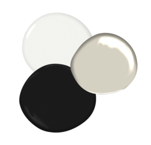
2-3 bold colors – use these bold colors to keep in mind for smaller purchases like throw pillows, decor, accent chairs, or even painting an accent wall.
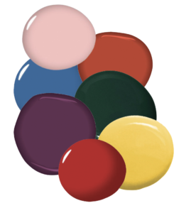
OK great, you’ve chosen your colors, but how do you know they’ll look good together in your home? Here are some tips that have helped me:
x Choose colors within the same color temperature; either cool or warm. Warm colors are the reds, yellows, tans, and browns while cool colors are the blues, greens, violet and some grays. From experience, it’s hard to mix warm and cool tones well, although it can be done.
x I can’t stress this enough: the light bulbs you choose greatly impacts how colors look in your home. I talk more about that in this post, but just like colors, lighting also has various color temperatures ranging from bright blue to deep yellow and can make or break your home.
x Pay attention to the shade of colors you’re drawn to. Are you drawn to darker or lighter colors? I’m drawn to dark, bold walls with neutral furnishings. You may be drawn to white walls with bold furniture.
x If you’re hesitant about including bolder colors like I initially was, start by adding only 1 or 2 colors at first until you get a feel for what you like. You can incorporate these colors in throw pillows or small decorative objects. The way I feel about these bold colors is that if you get sick of them, you can easily switch them out.
Ask yourself the question: How do you want your space to feel?
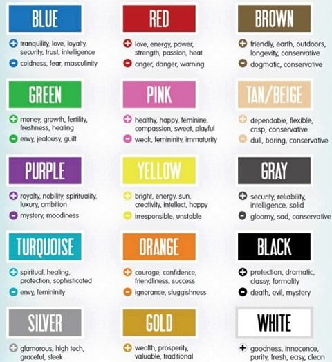
My background in marketing is urging me to ask this question: when thinking of your favorite colors, you should be aware of how each of those colors impacts your emotions/behaviors. Don’t know how each color effects you? Let me help you with this image I pulled from the Google machine…
Chances are, you’re favorite colors already make you feel good n’ happy because they’re like, your favorite colors. I’m not recommending to change your favorites based on this chart – I’m encouraging you to embrace the qualities of your favorite colors. You like beige, which can be seen as dependable but also as dull and boring? Good. Make this shit a challenge. PROVE TO BEIGE YOU ARE SASSY AND POWERFUL.
Lastly, Establish Your Color Scheme
There are 4 kinds of potential color schemes you can use to establish your home color style:
1. Monochromatic: Uses tones of the same color while including a neutral (i.e. black or white) to lighten or darken the color. I see this a lot with gray and this was the original look I was going for in our home:
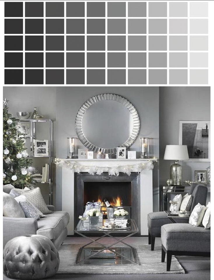
2. Analogous: For a soothing effect, use colors that are next to each other on the color wheel, like yellow paired with green or orange, or blue paired with green or purple.
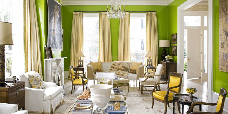
3. Contrast: To create a bold statement, use contrasting colors like yellow/orange, green/blue and red/purple
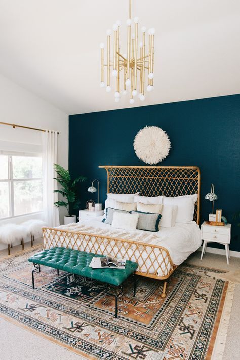
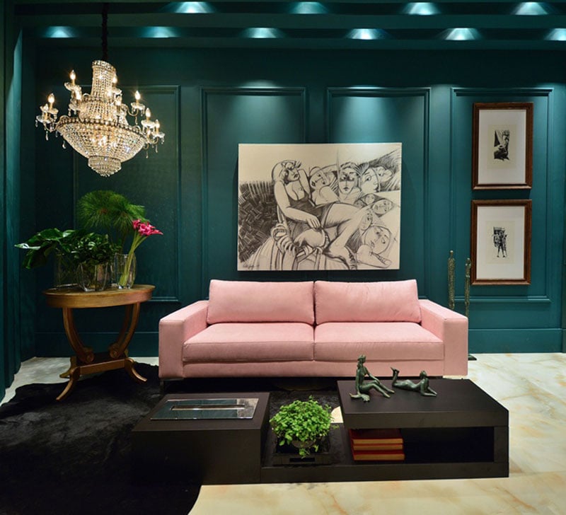
4. Complementary: If you want a high-energy color scheme, use two opposing colors, such as pink and green (my personal favorite)
TL;DR (too long, didn’t read)
x Determine your color style – whether it’s looking at your Pinterest boards or wardrobe, nail down 3-5 of your favorite colors
x Understand how you want your space to feel and recognize that the colors you choose will impact emotions and behaviors, but then disregard and do whatever you want anyway.
x Choose a color scheme (you can create this on a vision board)
x Buy all the things
OK guys, this was a long one and I am sleeeeeepy. I hope you were able to learn something from this post and I expect to see photos of how you incorporate colors throughout your home!
Have a FABULOUS weekend! <3
Alisa
Good day! Behold is a good offer for you. http://bit.ly/2rAmifo
This is really serious, You’re an exceptionally seasoned writer. I have signed up with your feed plus count on enjoying your personal tremendous write-ups. On top of that, I’ve got shared your web blog in our social networking sites.
I signed up. Great article. I am having a lot of difficulty picking a color for my kitchen/dining room that opens up into the living room. I love the earth tone colors such as raw sienna, burgundy and a gray blue. My living room walls are pained Macedonia with Chapel White trim and I love it. My issue is I have a large island that is blue to slightly gray blue. Counter tops are grayish with beige and a hint of gray blue. Cabinets are a natural maple which turned honey/orangish. Any hope for suggestions for kitchen wall color?
Without seeing pictures, it’s a bit difficult, if not impossible or unwise, to recommend a color for your Kitchen.
It seems like you have a lot of colors going on already. I’m curious as to what color is “Macedonia?”
Do you want your kitchen to be dark and moody or bright?
Off the top of my head, it seems beige or light grey to coordinate with existing elements might be a good backdrop. Or go with a forest green to add contrast.
Incredibly easily, the article is in reality the sweetest on this laudable topic. I agree with your conclusions and definitely will eagerly look forward to your approaching updates. Simply just saying thanks definitely will not simply be sufficient, for the enormous lucidity in your writing. I can promptly grab your rss feed to stay privy of any kind of updates. Nice work and also much success in your business efforts!