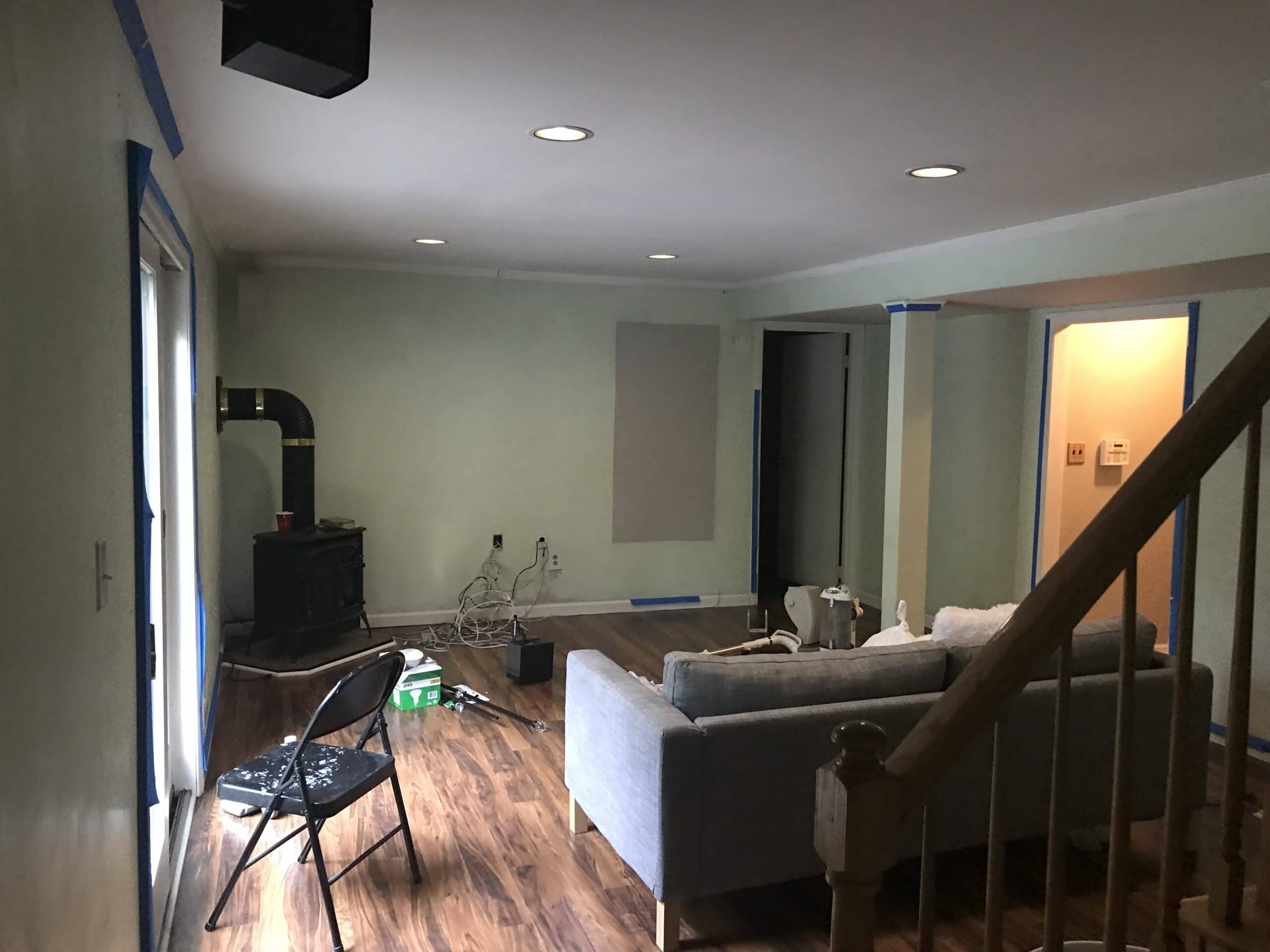
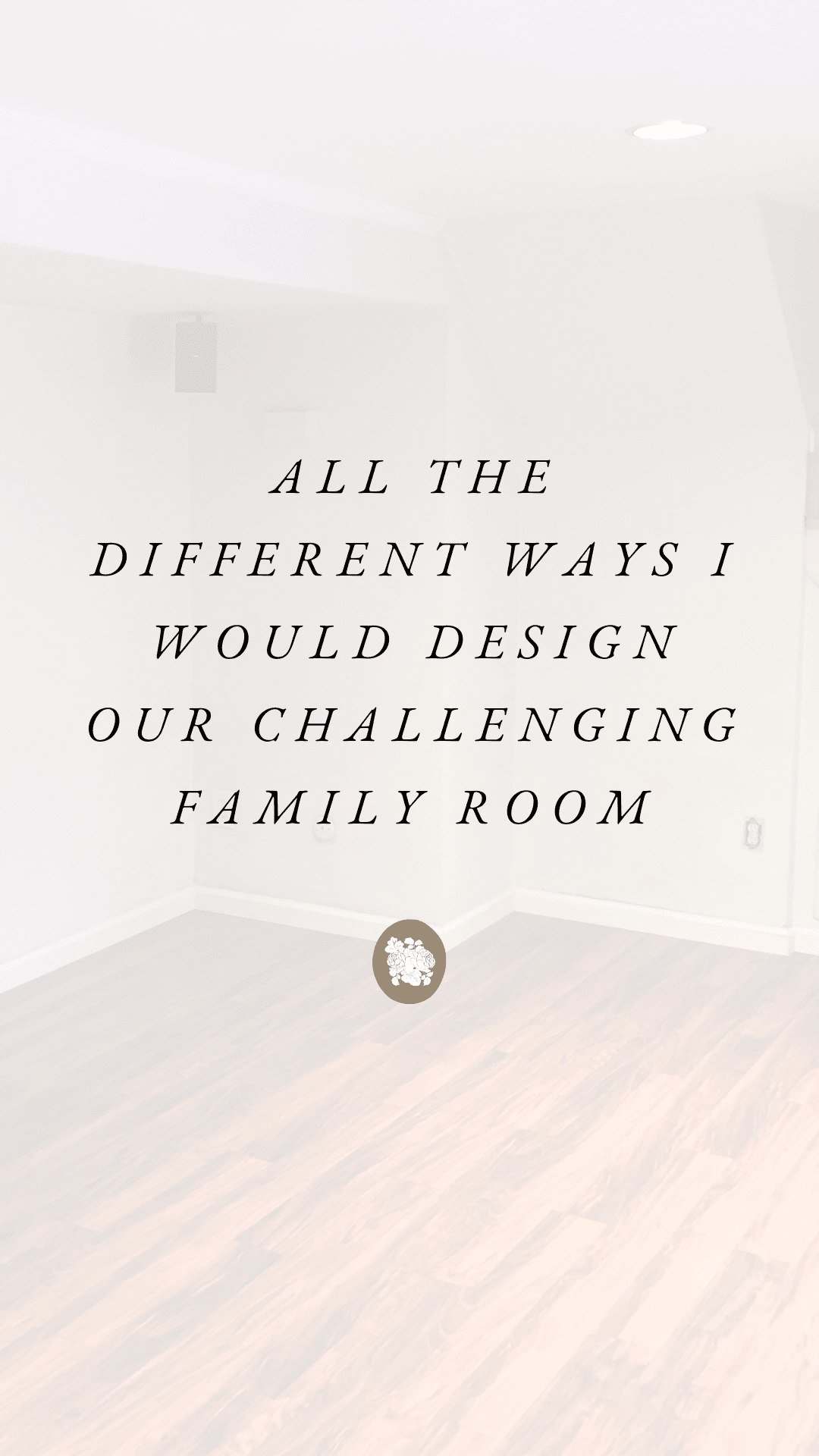
Photo taken a few weeks after closing on our house in 2017
Behold, our (challenging) family room. I’ve never done anything to this space because honestly, I just never saw the potential, so I’ve never felt inspired by it. Between all the angles, the ceiling drop, the beam, the fireplace, and the floor, I just felt like no matter what I did, it wouldn’t look great.
It’s currently a mess because, bebe, so below are some photos of this space from when we closed on our house:
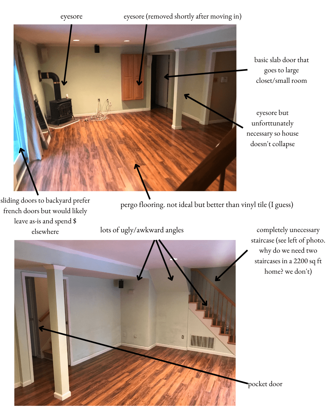
Since we’re a little family now, I’ve been thinking about how I want this space to feel, because it’s where we spend a lot of time. Right now it feels cold, awkward, and not so welcoming. I want this space to feel comfy, cozy, and chic. And today, I thought I’d share some ideas for how I can accomplish that.
These mockups are just to show you the placement of things, so take them with a grain of salt.
OPTION 1:
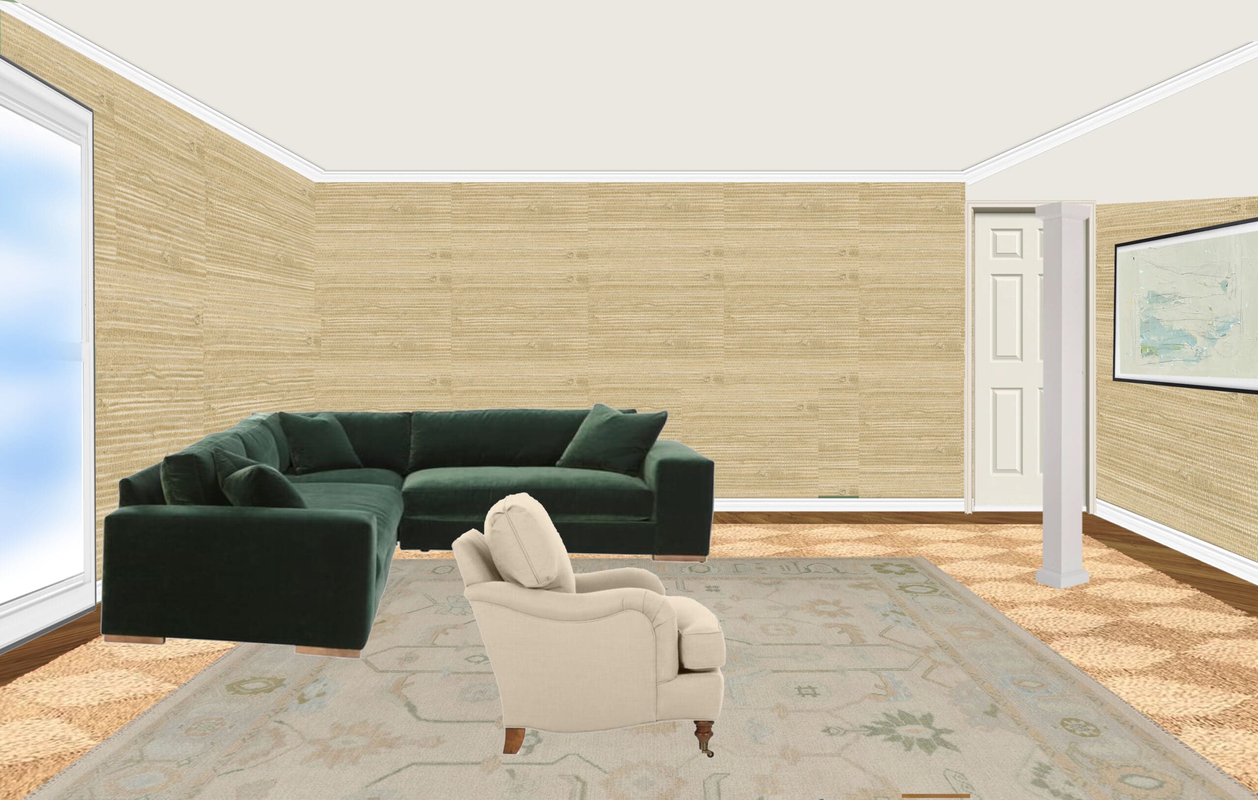
Angelo and I aren’t fans of this option but wanted to share it anyway. That beam looks like it would be obstructing the view of the TV, but it wouldn’t. While I’m not a huge fan of a sofa against the wall, this option would allow for a giant, comfy sectional and lots of art to hang above. This could work with the back of the sectional facing the beam and the TV on the left wall, too.
OPTION 2:
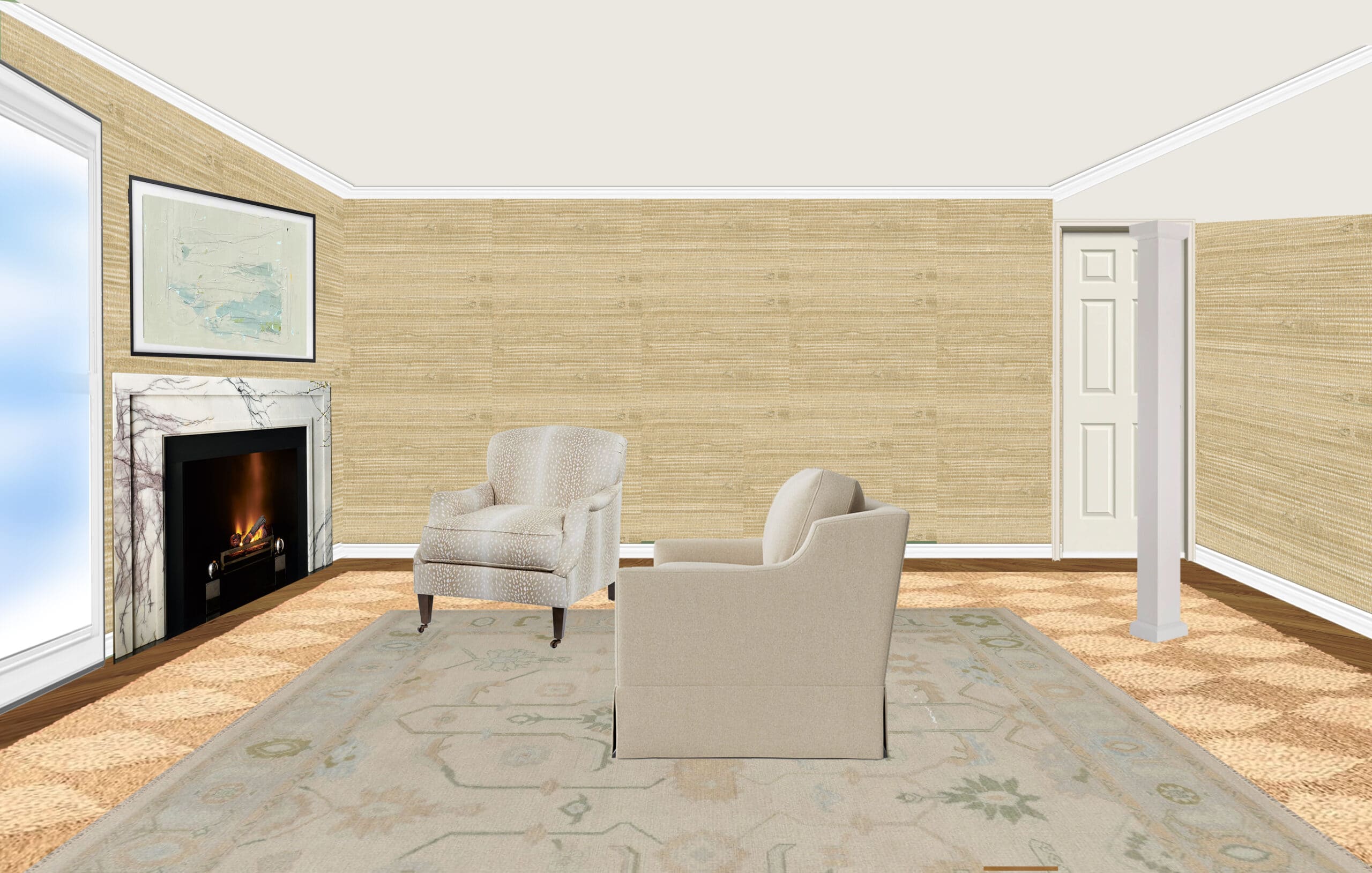
I should mention that we use that corner fireplace a lot during the colder months. We just hate the look of it. With this option, we would remove the existing fireplace and replace it with a new one. Since a fireplace vents through an outside wall, it would have to be placed on the left wall rather than the center wall, where I would prefer it to be. Unless we could do a ventless fireplace…
OPTION 3
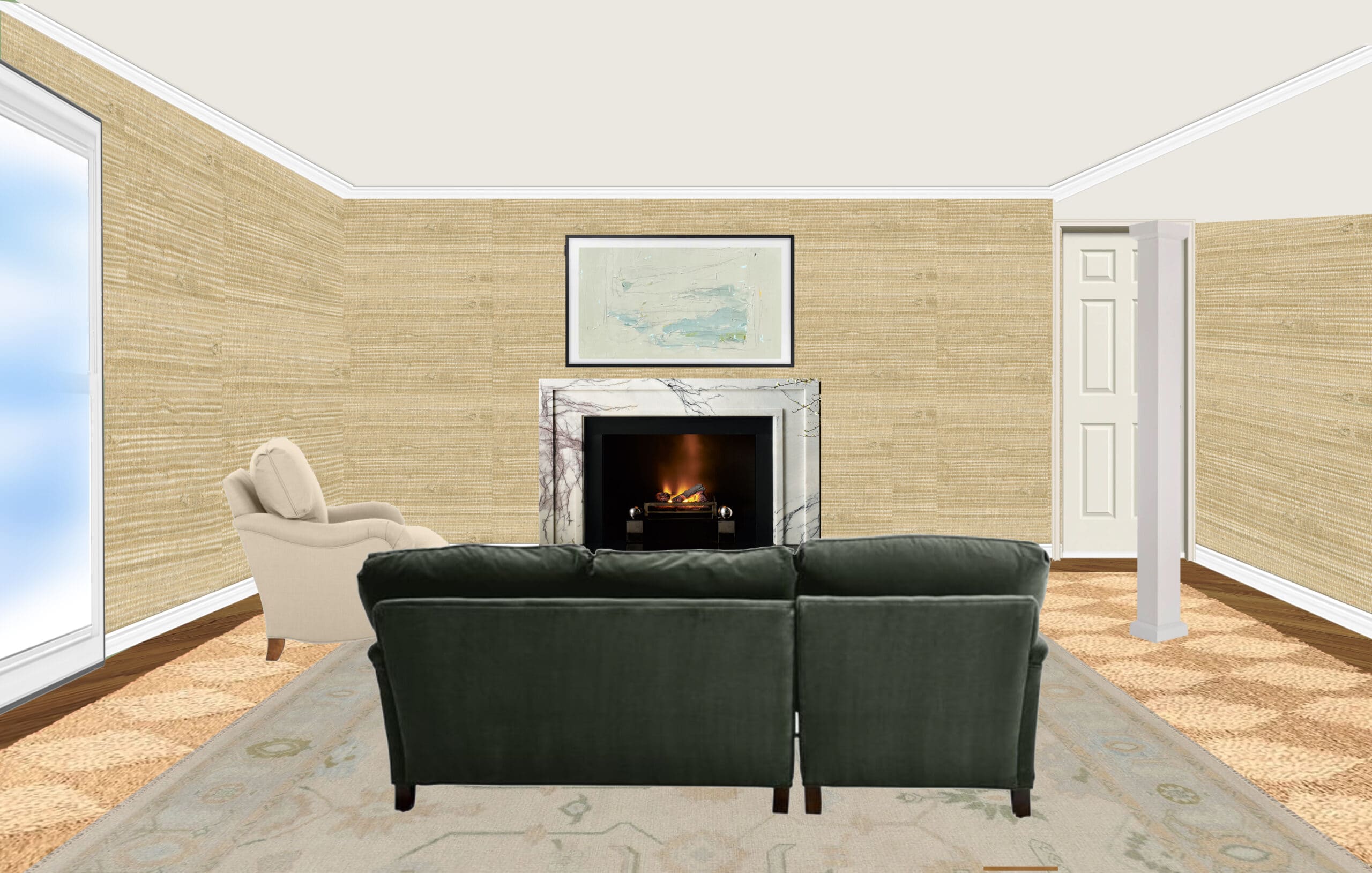
I like this option the most, but would need to figure out what’s possible and how pricey it would be.
OPTION 4:
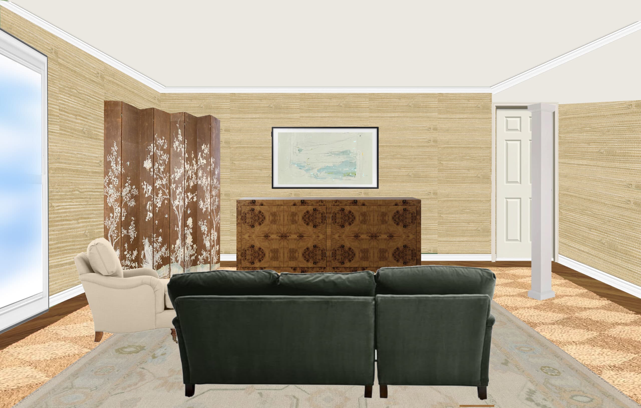
We’re not crazy about this option, but it’s the most cost-effective. Instead of removing the gas fireplace, I had an idea to put a folding screen in front of it. And if we want to turn it on we can just fold the screen up and place it to the side.
OPTION 5:
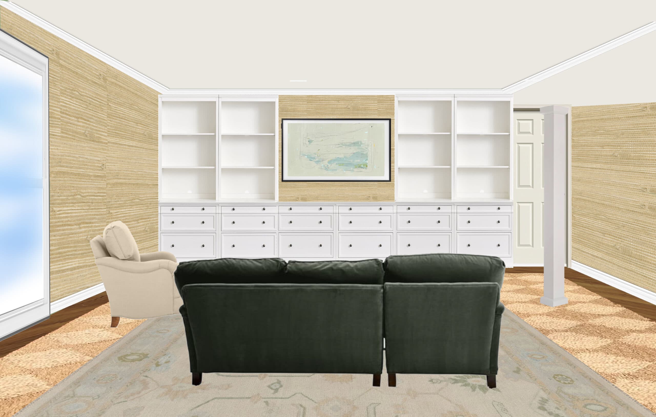
Angelo and I have thought about built-ins here many times, but with the drop ceiling and that door to the right, we don’t think it could work in a way that looks seamless. We could do a fireplace in the built-ins, but overall I just don’t think built-ins could work?
This photo was from after we painted (during my gray phase lolol). It still looks like this, except now we have a larger off-white Macy’s sectional in the center, and those sheer drapes are gone. That back door leads to our laundry room.
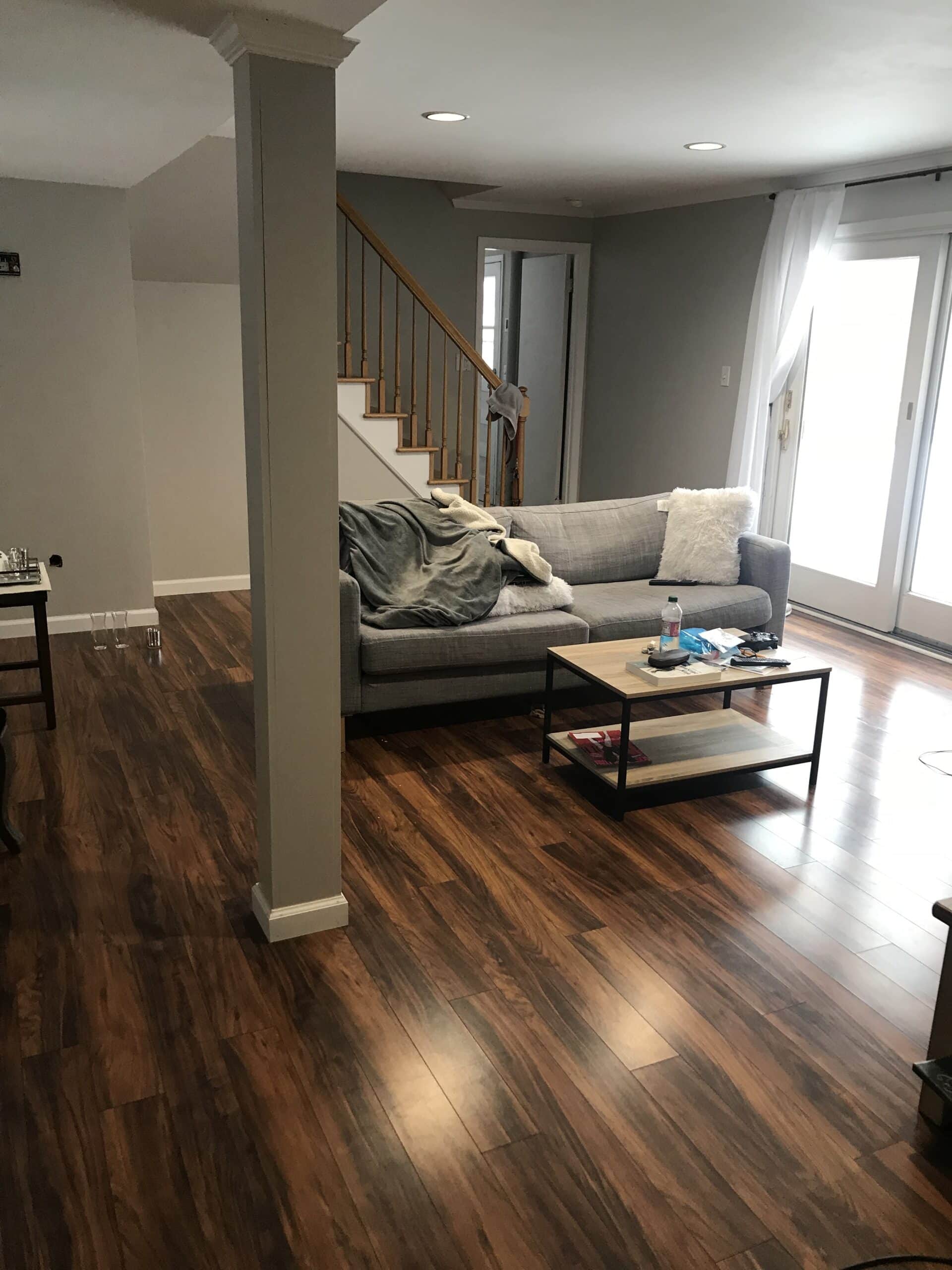
Overall thoughts:
- I would cover the whole floor with a durable, giant area rug, likely an indoor/outdoor sisal. This room gets a lot of foot traction during spring/summer/fall when we’re going in and out from the backyard. The floors are Pergo, so covering the floor with a large area rug would make me feel better about not having hardwood 🙂
- As I mentioned above, we use the fireplace a lot during the winter months but hate the look of it. So somehow incorporating a new, more visually appealing fireplace would be ideal
- I’d do drapes around sliding doors
- I’d paint the stair risers and banister white
- In the back corner, where all the awkward angles are, I was thinking of doing a game table with some extra seating
- I need to get some estimates for moving/adding a fireplace to that back wall. Since it’s not an exterior wall, I’m not sure what’s feasible. I’ve previously done some research on fireplaces and shared options in this post
- Maybe this could be the room where I can do grasscloth without it being an overwhelming project that would take 3458 weeks to complete lol
This would ideally be a 2023 project, but also I really want to prioritize saving funds and planning for our kitchen. I can only juggle so many projects with a blog, a full-time job, and a baby, hah! This will probably be another slow-to-makeover room because I’d like to furnish it with mostly secondhand finds.
By the way, if you’re interested in learning how to create mockups similar to what I shared above, I offer a Photoshop class that teaches you how.
Which option do you like best? Would love to hear your thoughts!
this room for sure has potential. I personally like option 2 and 3. you should try to keep a fireplace if you use it a lot. good luck!
I love option 3 with a ventless fireplace if feasible. The game table in the back would be great and maybe one day, if time and money allows, you could remove the extra staircase to give you even more space. This looks like a great place for the grass wallpaper too!
Thank you so much Malarie! I totally agree with you!
It’s tough when you have a room that just doesn’t inspire you. But shortly something will click and you’ll be on your way!
Looking at the mock-ups (and please know I know I’ve never been in the space and that I have a terrible time with proportion), my thought was to take the sample sectional and rotate it so that it starts at the closet door, the back runs along toward the column, and then turns toward the sliding doors. You then have created a little hallway along the back, integrated in the column so it isn’t standing off by itself, and you are facing both the fireplace (new one built into the wall) and the long wall where you could hang the tv with a narrow console or cupboard to hide all the stuff that kids seem to come with. So this orientation also solves the hated tv hung way too high above a fireplace look and gives two focal points, both of which can be looked at comfortably from a sectional. And then with the space by the stairs you can do a games table.
Just an idea. And remember, most of us are here for your thought process and love the discussion about “I tried this, it didn’t work, so I thought about something else – let’s see how that is.” Instant perfection isn’t relatable!
Love that idea, Cris! Thanks!
Ditto. I was thinking of how to make that walkway to the laundry room a “hallway”… solves the fireplace issue. Good luck!
“Instant perfection isn’t relatable.” Amen! That’s why I love Alisa’s blog.
I love your thought process, Alisa. That grass cloth wallpaper looks great.
I would like to see a scaled floor plan with these schemes to really know what would work best.
All the best,
Tara
My preference is #3. The room is more balanced. Love the grass cloth!
#1 has you facing away from the windows into a dark room.
#2 the fireplace is placement is odd.
#4 is acceptable but do you really want to be moving the screen all the time? You probably use the stove every time you’re down there during the colder months.
#5 I like the looks of the built ins but where is your heat source?
Me too Joanna! I have some thinking to do, haha.
I think option 3 is the best choice visually. Have you considered adding molding/trim to that beam? You could even add another beam to balance the space (bear with me). I tried to link a few websites in this comment as a reference. If you added molding to the beams and perhaps some wainscoting to the room, the ceiling would look higher. Painting the space white (I’ve been using Alabaster by Sherwin Williams on my molding/wainscoting) will make the space look larger too. For that weird wall near the staircase, can you source a vintage/antique pew or bench to create a unique little sitting space? Reference below.
I’ve got no advice for the fireplace other than to make it a focal point by adding… another fireplace? Idk. Example below. I think it’s kind of fun though (we don’t have those fireplaces in Texas) and I wouldn’t be in a rush to do an expensive removal.
Hopefully these links work!
https://i.pinimg.com/564x/b4/f9/33/b4f933c76b19c15666a4f94e693113e0.jpg
https://www.homebunch.com/wp-content/uploads/2016/07/Breakfast-Nook-Drapery-Fabric.jpg
https://www.beneathmyheart.net/wp-content/uploads/2016/10/f6d4f8757529699597c18decdb2fa78a.jpg
Your links work, thanks so much Erika. I love your ideas! I didn’t think to add another beam to balance but I think it’s a good idea.
Great ideas! My first thought was to put the seating back-facing the beam. Having a view of the fireplace and outdoors feels like a light and open choice. And the drop ceiling would help to define the room that way, instead of looking out of place. You could always employ a screen until you can move into option #2, or #3. A tall plant would help to cover those pesky angles.
Agreed! I love the idea of being able to look outside.
I like 3 best :). I also like 5 for a room like this. I see movie nights and games happening here with your family and all the storage would be ????. What about combining them? The fireplace in the middle as in option 3, and some builtins on either side? And yes to the grasscloth everywhere!! It will look so luxe!
We did a wall of builtins floor to ceiling in our playroom. The ceiling was already about 9’ but it really pushed the ceiling up visually. You might really like them in here. It breaks up that low horizontal line, and directs all the attention away from the other areas you don’t like as much.
I also did it by myself by trimming out simple wood bookcases since my husband wanted no part of it lol. You can even order doors online for European/frameless cabinets.
I suggest talking to Fireplace specialist, there are so many options! We just did a cool wall system in a client’s house. It gave us a lot of options :).
Tha’ts so helpful! I considered a fireplace in the built ins but didn’t think built ins would look good in general so I didn’t bother mocking up. Maybe it wouldn’t be that bad and I’m over thinking it. I appreciate your insight, Melody!
https://i.pinimg.com/564x/c8/58/6f/c8586fcf49d7a537048ee85a0ab7159e.jpg
link for column moldings. Adding molding to that 12 inches of wall/ceiling the columns are anchored to will help blend the space immensely.
Love that thank you so much
I definitely like option #3 the best. With the fireplace centered on the wall. And putting a game table in the corner with all the angles is a great idea.
Thanks so much Jill!
For sure Option 3! I too have a family/great room with lots of angles (ugh) and the best way to make them recede is to paint everything the same color or use the grasscloth (preferred but more $$$). If you spend a lot of time in the room it will be worth the cost and effort. I love your idea to put a seagrass or sisal very large area rug in the space bc then you literally wont notice the Pergo. If it’s indoor outdoor you could do wall to wall which is even better imo.
SO frustrating! thanks for sharing, Sharon!
I like option #3, and while sectionals are not my favorite, I do think one would be great for your family, but I would have it turned so that it backs to the beam and faced both the fireplace and the door. I too inherited a Pergo floor on my lower level and hit it with a large indoor outdoor sisal. It works! I would incorporate plenty of storage down there for toys. As your little guy gets bigger, I think you will find that you use this space a lot and you want it to be stylish but also comfortable and warm. I also vote yes on the grass cloth. I think it would be perfect. Can’t wait to see you get started.
Thanks for the feedback, Teresa!
I think there is no choice for the fireplace other than to place it as you did in Option 3. I would put my first $$$ toward accomplishing that. However, I don’t think the built-ins in Option 5 look bad at all. You could build them around the fireplace, TV over the fireplace, perhaps even at a later date. Hey, that’s what I want to do in my family room which is located adjacent to the kitchen. Ugh, Pergo. Cover it up until you can replace it. I’m not sure where your family room is located; if it’s a different level from your main floor, think about luxury vinyl tile. I put that in our basement walkout exercise/TV/project room, it looks beautiful and it’s indestructible.
I agree re: the fireplace needing to be on the center wall. need to get some estimates to see if that could happen! thanks for the insight Virginia!
OK, unpopular opinion here … I love the idea of the screen in front of the existing fireplace for so many reasons! It’s definitely more budget-friendly, and since you already know you don’t want this to be your forever home, why spend the money on a different fireplace? I just love the idea of working with what you have. It’s also the perfect opportunity to add some chinoiserie with an amazing screen. You could even DIY one in a similar way to your dining room panels if you don’t find something on FBM that you like. It also adds a unique visual interest, something that would make your room stand out as yours. Sometimes I think the current state of social media encourages so many structural changes, when we can put our stamps on something (and make it function better for our lifestyles) without architectural details involved. Plus — so cozy!
you’re right! I do love that idea. Just need to find the perfect screen 🙂
I agree!
I was on the fence until this reader reminded me this isn’t your forever home. I LOVED the screen idea but now it just seals the deal for me. Def a good console for you storage. Also, plan for a play kitchen somewhere in the room (you can probably DIY a really cute one that blends with your decor). I also agree with the readers on good lighting and using thr column as a back to the sofa or a chair. It really does sort of make it disappear. And it’s nice to have the outdoor views from the seating rather than looking into the room. Can’t wait to see what you decide to do! I know it will be great!!
I am suggesting the Option 4 in deference to your budget. Using the screen is a economical choice but what about having another chair just like the one pictured placed by the post? It’s hard to tell with proper perspective if that is possible but it would be a balanced look and offer more seating. Maybe place tiny tables near beside each chair for drinks/remotes and then the post sort of disappears….
I like the built ins because soon your baby will need toys! They explode everywhere! It’s nice to have lots of storage for that stage so that your room feels good for you and is workable for your kid(s). I think furniture can always be rearranged as needed. I always like sofas against the wall in kids play spaces because that increases the play area… love your process thanks for sharing
thank you!!
Lots of good ideas! I just want to mention that with a young baby soon to be a toddler (really, it happens so quickly!), you may want to reconsider your rug choice. You’re going to want a softer landing spot for his little knees, feet, and bum, plus something smoother for all his playing (rolling toys, setting up blocks and eventually building tracks and legos, etc.). So I’d think something with less texture would work better.
So many great suggestions!
I’ve seen some fantastic basement room designs over the years, and the one thing that made a huuuuge difference in all of them was a really well designed lighting system. It totally changed the feeling of the spaces, visually making the ceilings less oppressive, and the rooms feel warmer. It might be worth a consult with a lighting designer sometime along the way. 🙂
In England lots of people have slower ceilings I their cottages so I use lighting and lamps..game changer
thank you for sharing! I agree, lighting truly makes allll the difference
As a parent of two young children, we put a built-in in our basement, (similar situation, where it wasn’t a wall-to-wall seamless look and feel), but I love the storage space to hide all the toys. A lower cost solution may be a large, enclosed console like in option 4.
Agreed, built-ins would work wonders for storage. I need to reconsider! thanks for the insight
The comments have been a delight to go through. I agree with most saying Option. 3 feels right. I also love the idea of combining that set up but including the built ins. Good luck and can’t wait to see it come together over time.
yes!! thanks so much Brenda!
Would it be possible to incorporate the post into an actual wall, creating a small hallway to the garage door? That would also give you a finished corner on the family room side allowing you to center a fireplace, built ins, sofa, tv- whatever ends up working best? I think the narrow post is the thing that reads “basement” more than anything else- the rest of the room is fine. (Maybe eventually the second stairs could go but they’re not bad!
Sorry- I guess that slab door goes to a closet not the garage
ugh I love your idea though!
Have you thought about putting the built ins in the awkward portion of the room? You could do a faux cabinet over the soffit and awkward areas to make the room feel less awkward. Also it’s great for storing all of the toys.
I have, but threw the idea away after I couldn’t figure out how that would work around the angles, LOL! I will reconsider, thanks Melissa!
I need a wall to be made from the storage door to the support beam. Keep the fireplace, either as is or to an exterior wall. I think the ceiling is too low for a wall of storage. It will really take over the space visually. I know you do a beautiful job no matter what; but please add that beam into a wall ????????????
I like seeing your process. It’s very helpful! I have an awkward family room too and I just don’t know what to do with it.
Some thoughts:
If you wanted to put the money into it, you could take out the support column and do an I beam through the ceiling.
I wouldn’t worry too much about the flooring in regards to your baby learning to walk. It’s a relatively short phase and they get through it even with a hard surface. And Pergo isn’t as hard as tile!
As others have said, having a place to store toys is nice. It doesn’t have to be a crazy amount of space, because kids actually do better with fewer toys. (Which is a relief to me as a clutter-hating person)
Can’t wait to see what you decide to do!
Great! FF Beta Test APK is a special version of Free Fire designed for testing new features before release. It allows players to experience upcoming updates and gameplay improvements early. The app runs smoothly on most Android devices and offers a simple interface. Players can try new controls, weapons, and settings in a safe environment.