Today is the day – the master bedroom transformation is complete!
Similar to the Fall One Room Challenge, the last few weeks felt like a rollercoaster filled with uncertainty, stress and excitement. The bulk of time spent on this master bedroom transformation consisted of painting the room (3 times), cutting and installing a few hundred feet of Metrie molding, and then painting the entire space (doors, trim, ceiling and walls) another 1-2 coats of paint for good measure.
I’m just thankful a sloped shower bed and mortar wasn’t involved for this makeover.
This remodel was filled with decisions that forced me to step outside of my comfort zone, and in taking those design risks, I ended up creating the luxe traditional modern bedroom I had always longed for, but never knew I wanted. My ultimate goal was to create a good balance of masculine and feminine, and I truly feel like I accomplished that. But I’ll get to those details later.
OK, I know you’re not here to read my word vom. You’re here for the photos.
So let’s cut to the chase.
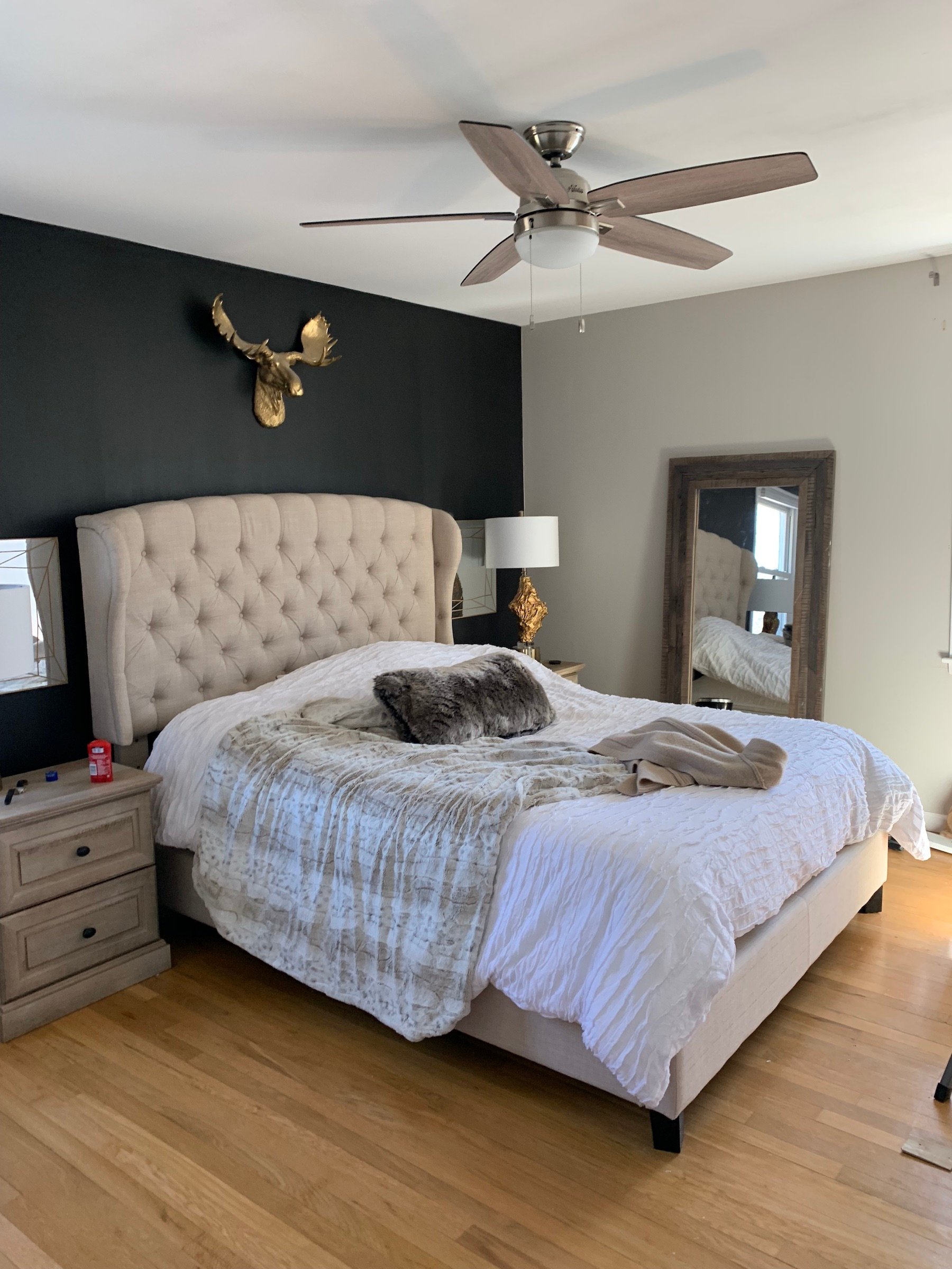
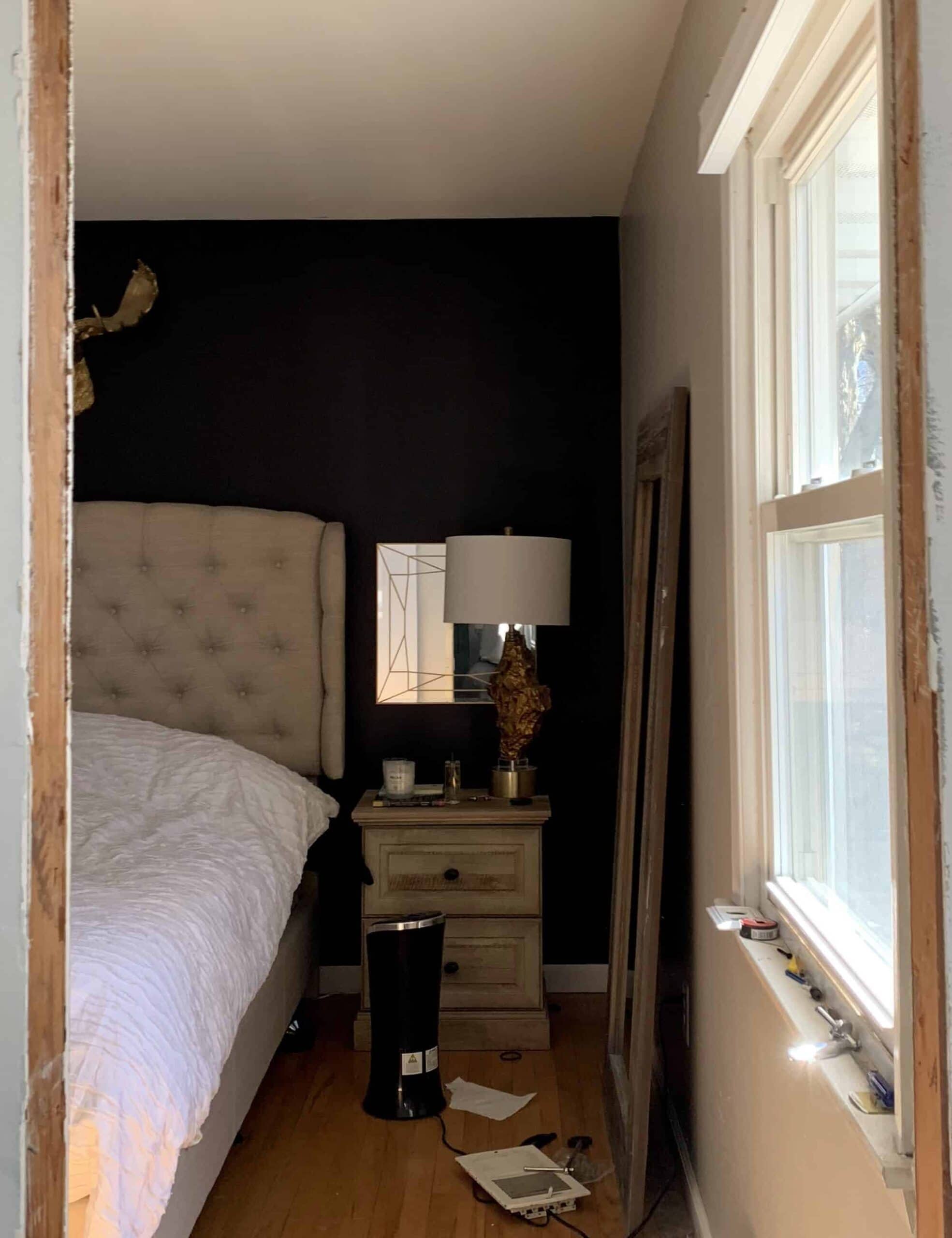
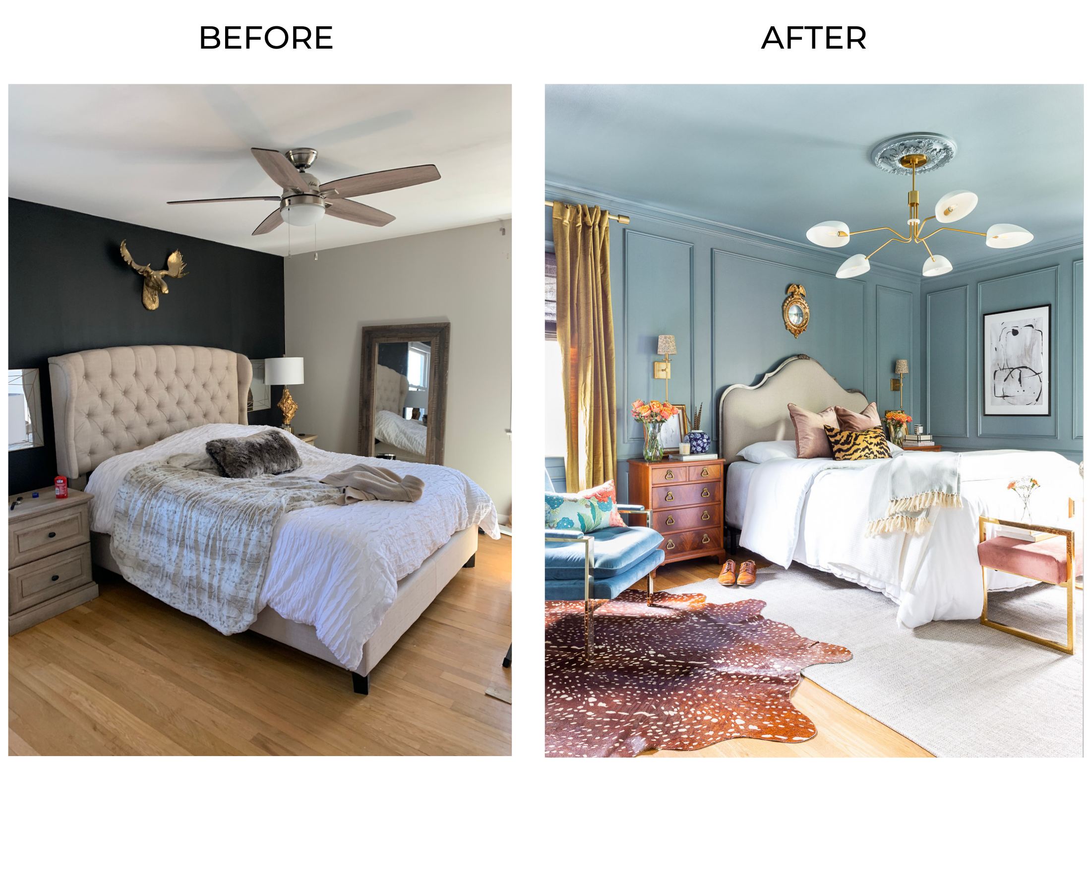
Without further ado, our master bedroom before and after shots:
BEFORE
AFTER
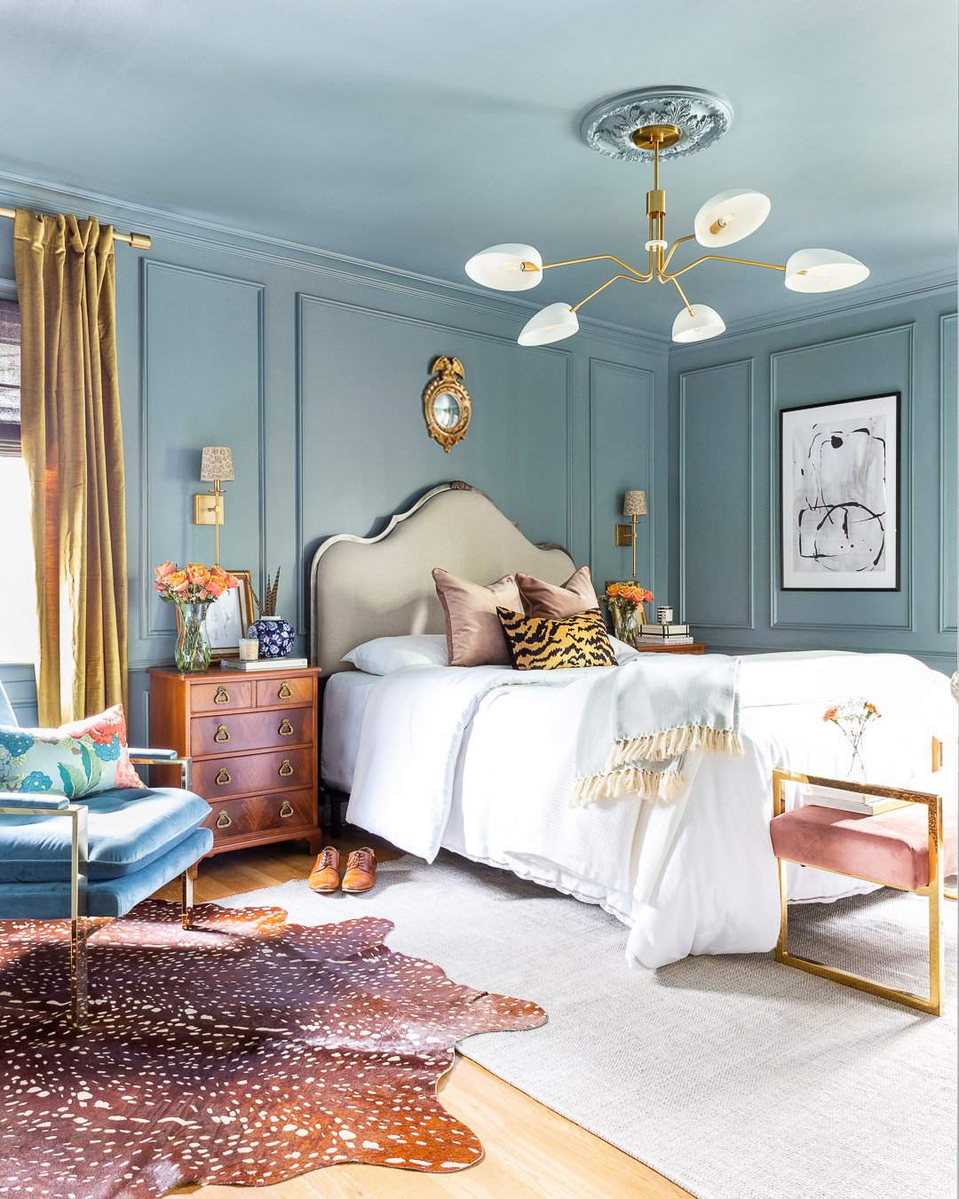
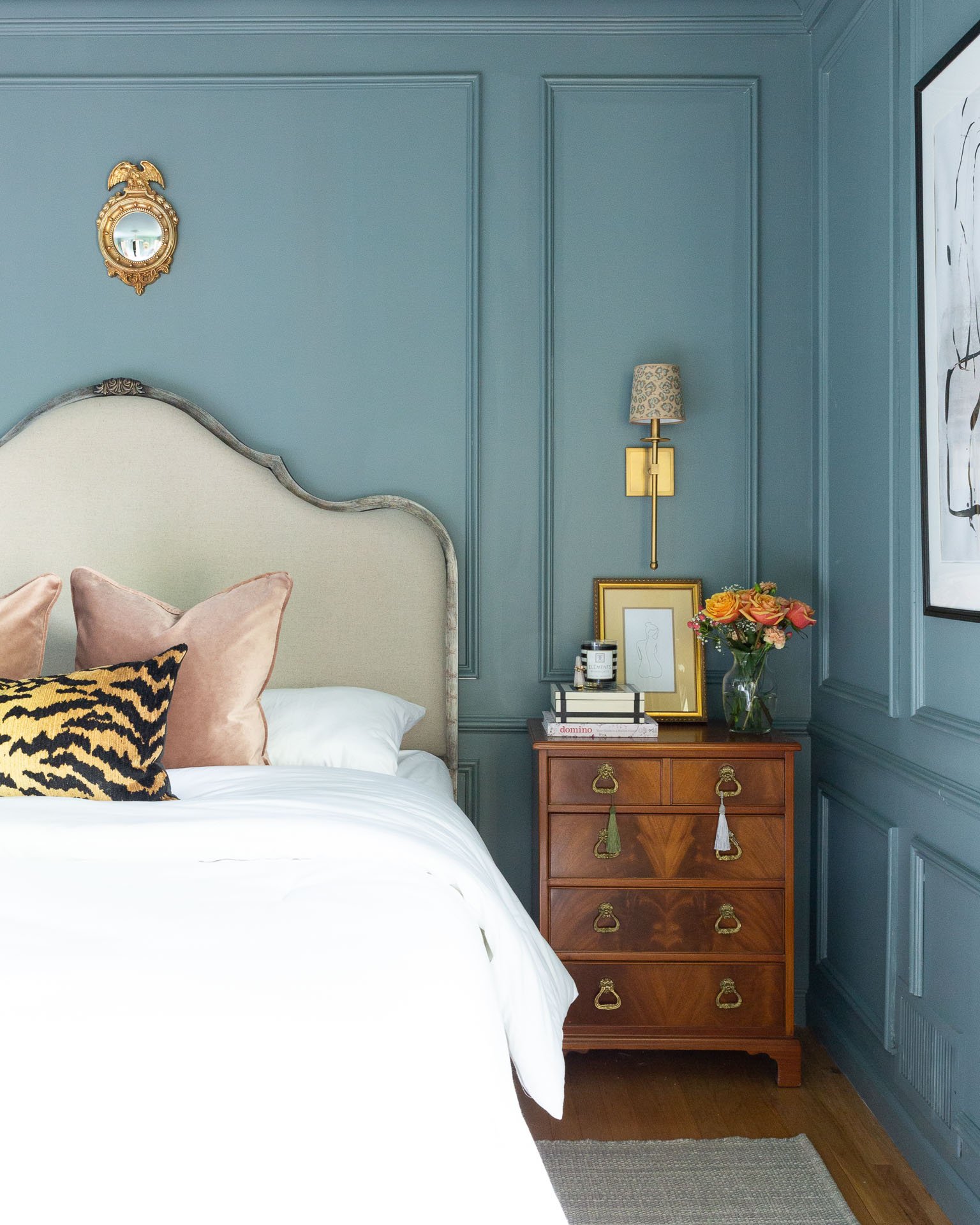
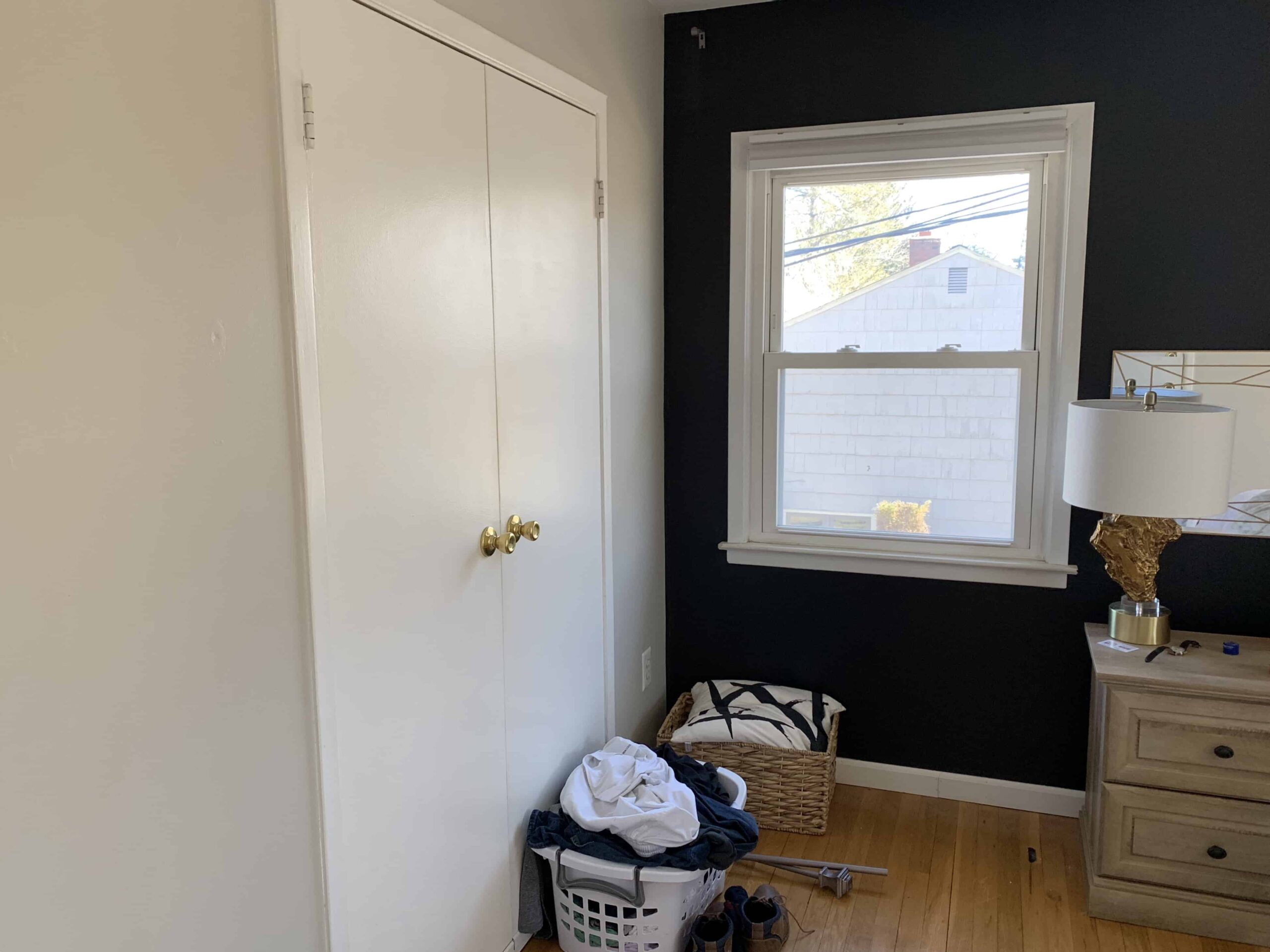
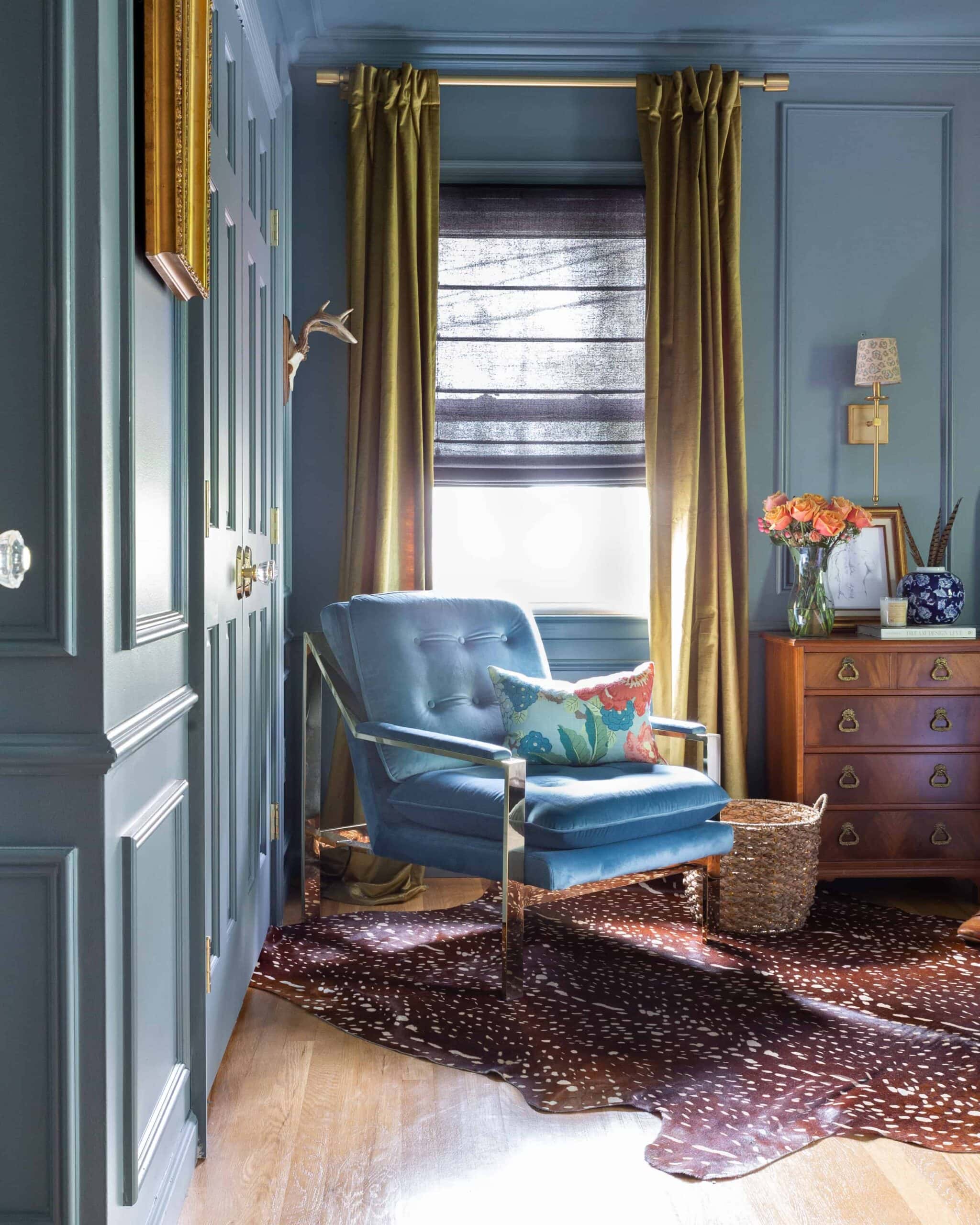
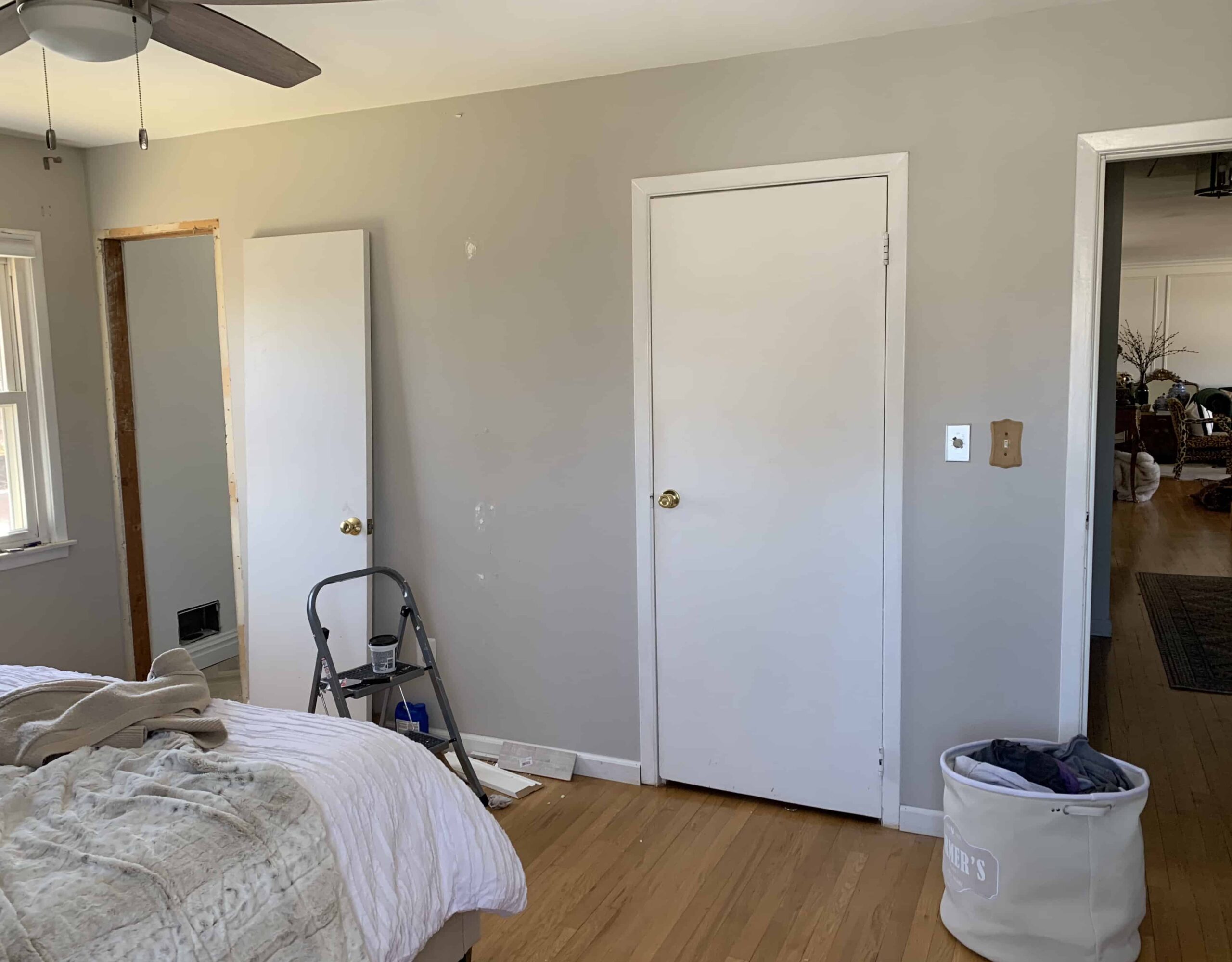
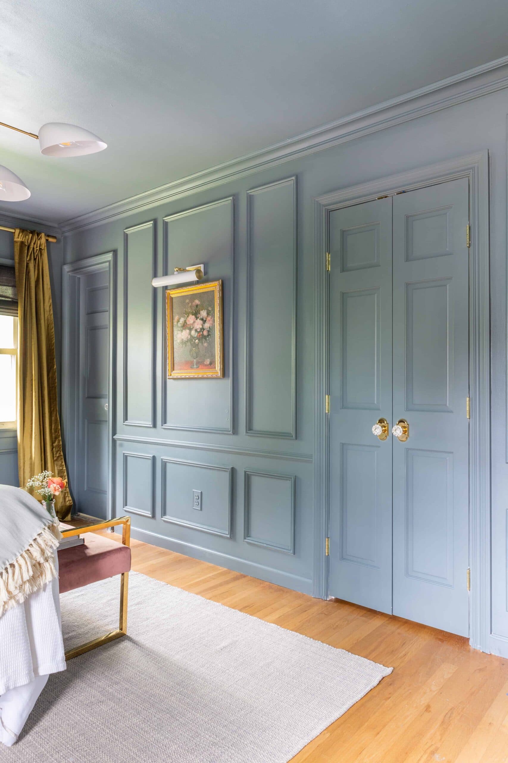
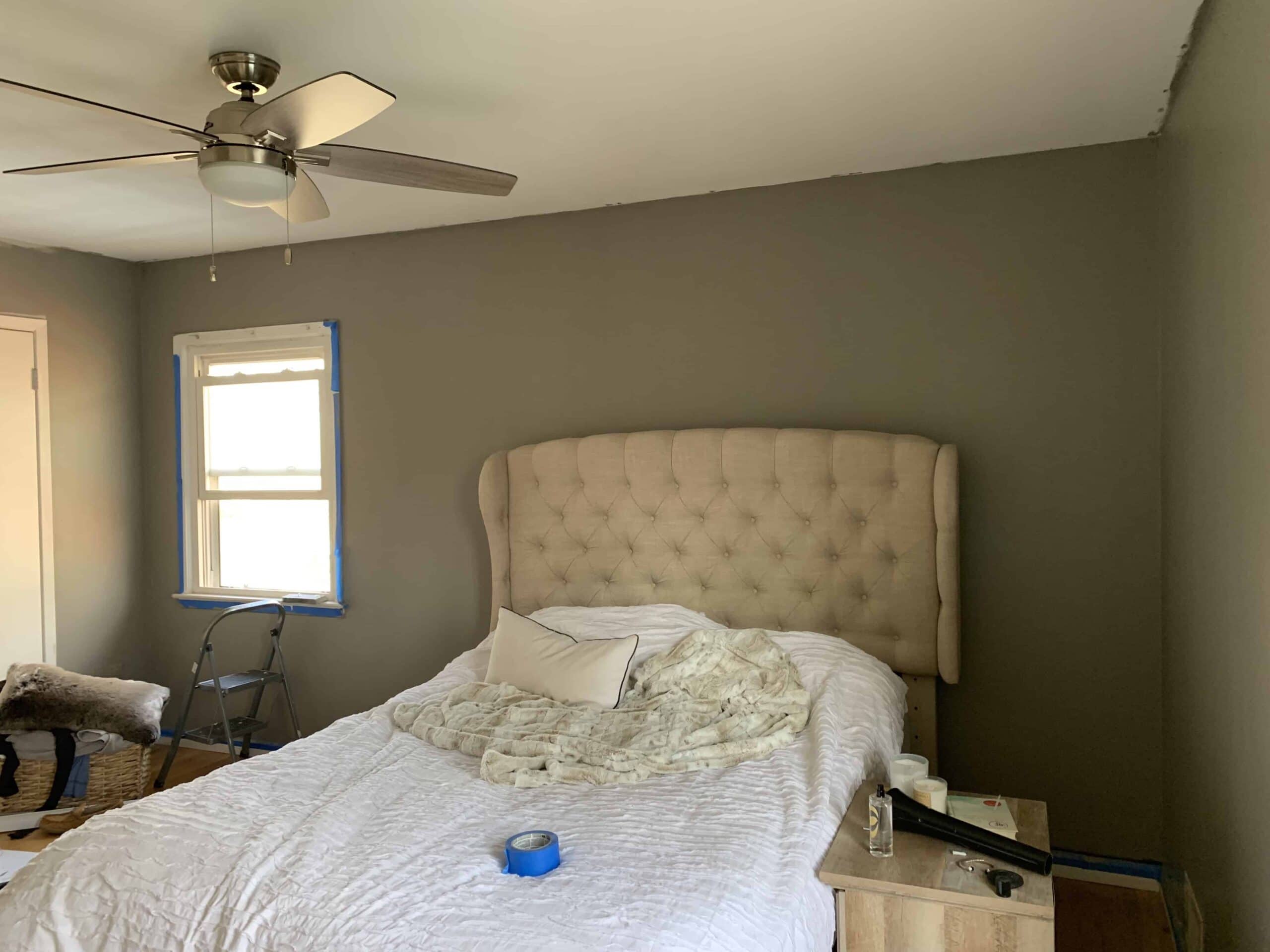
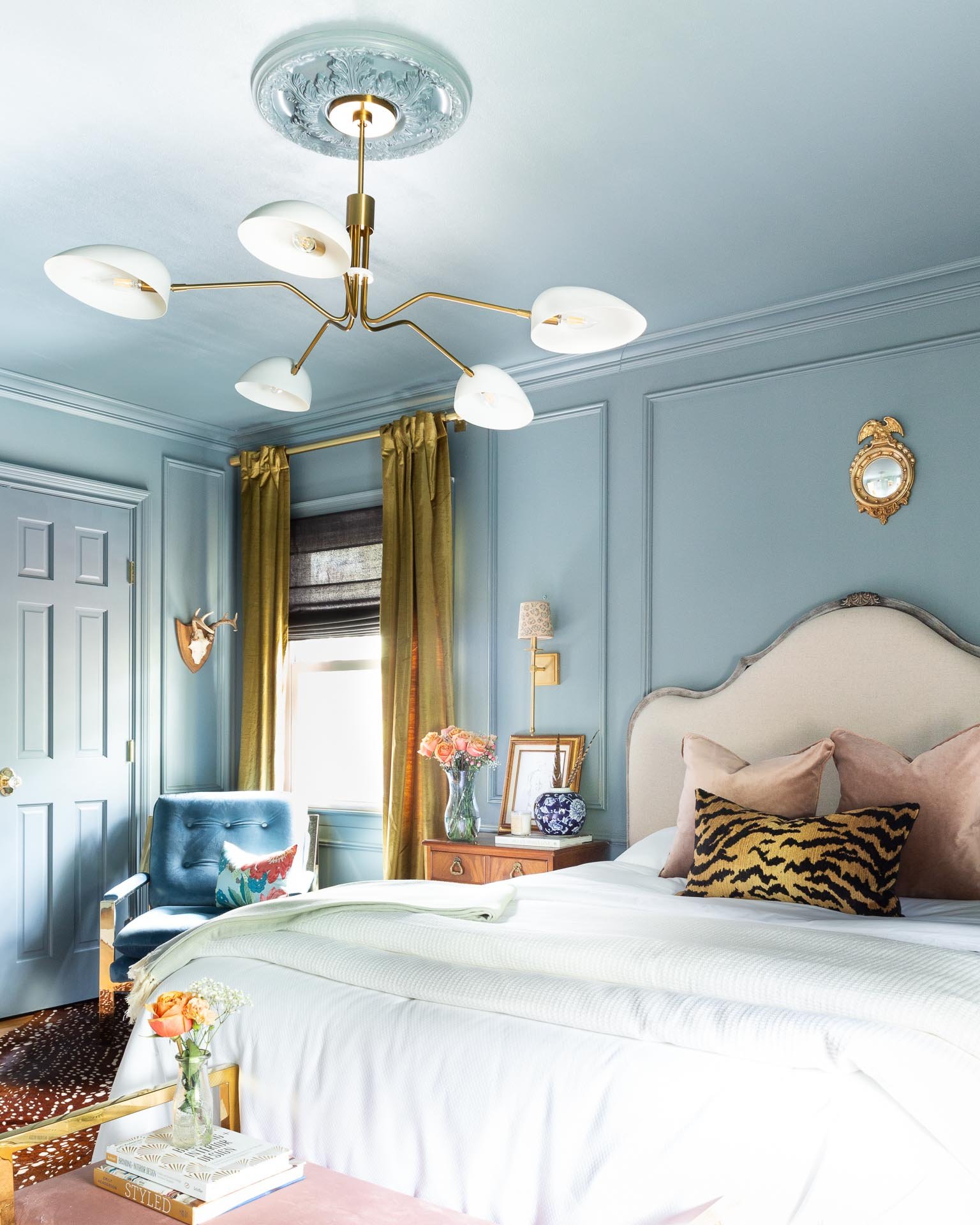
I know, I also can’t believe it’s the same room.
Let’s dive into the details
(psst…all products are linked at the end of this post)
THE WALLS
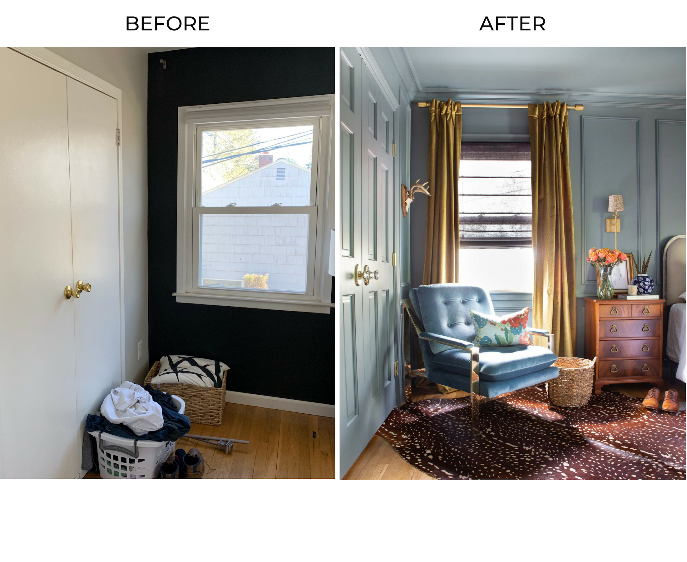
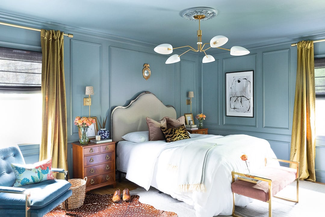
Since my focus for this transformation was to push my comfort threshold, I took the plunge on a color that I’ve never used in our home before – blue. Specifically, Farrow and Ball De Nimes in the Modern Emulsion finish. I decided to use it on the walls, ceiling, trim and doors, and I love how it makes the room flow/appear larger than it actually is.
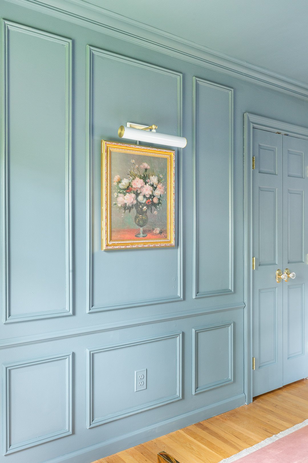
Depending on the time of day, it presents itself as a few different colors: blue-gray, blue-green, dark gray and what I’ve been calling a mermaid green. It’s not *too* dark and brings just the right amount of moodiness in to the space.
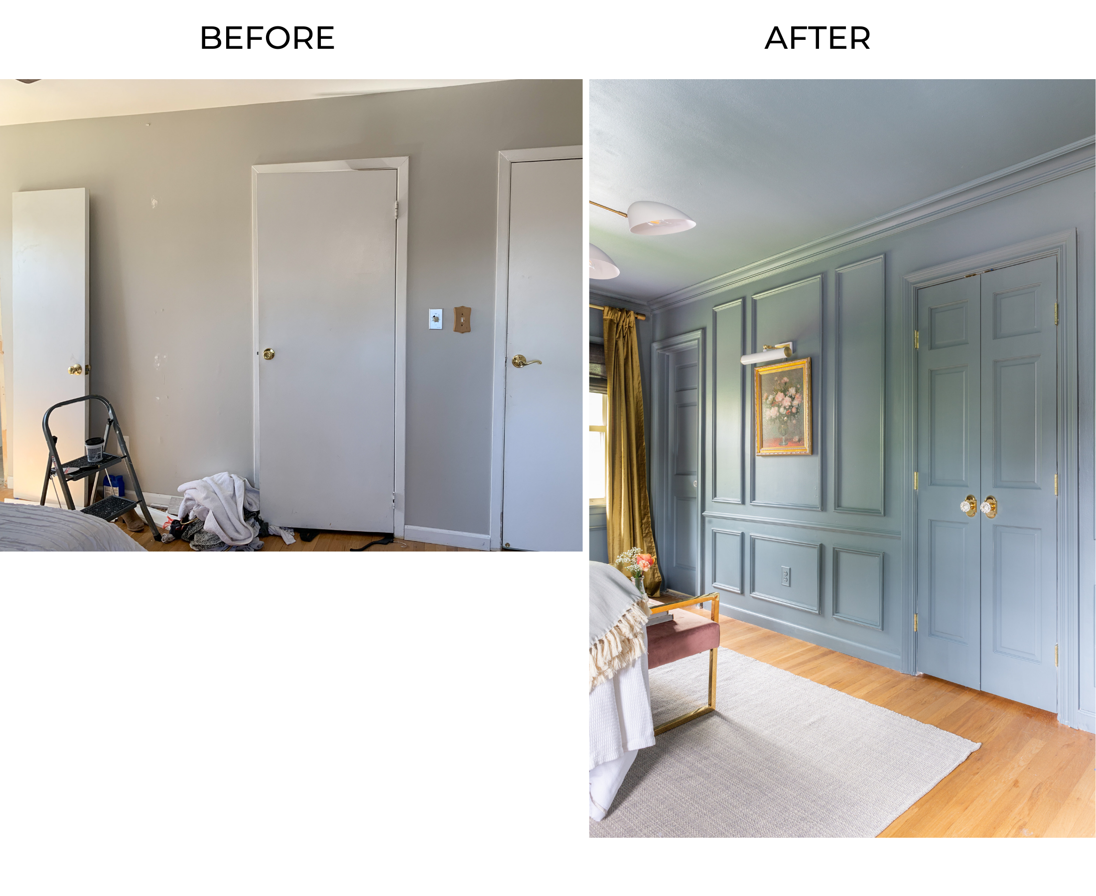
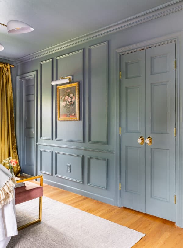
Cutting/installing molding and painting required the most amount of time and effort, but it definitely paid off. As usual, I’m blown away by how adding molding to a room can significantly change the entire aesthetic of a seemingly basic space. I opted for Metrie’s New Traditional molding and loveeee how it turned out.
THE DOORS
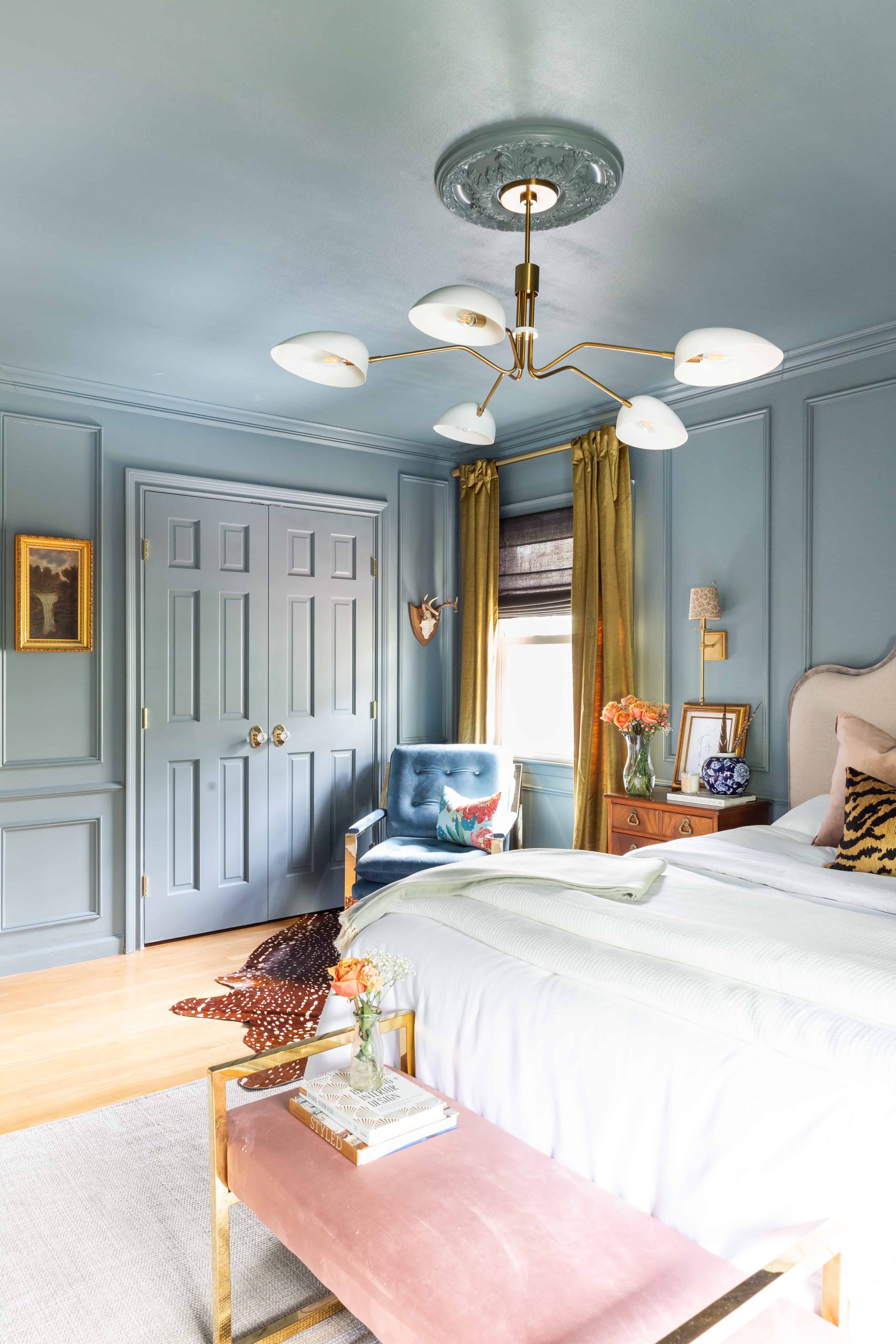
Installing Reeb doors definitely made one of the greatest impacts to the space. We haven’t replaced any doors in our house yet, but I honestly couldn’t believe what a difference replacing doors could make.
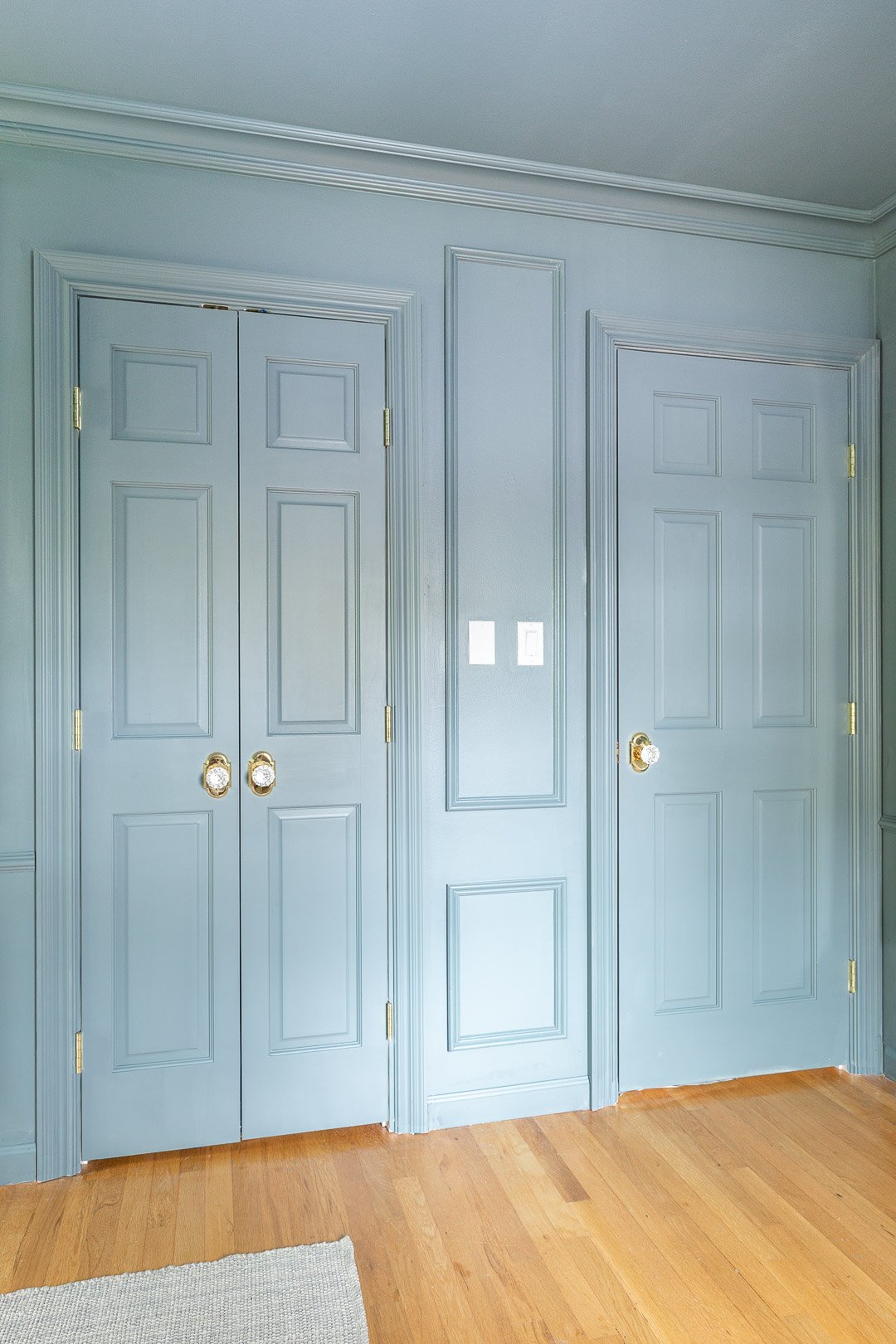
I opted for Reeb primed stile and rail doors which are solid wood and so easy to paint. Like I mentioned above, the doors being the same color as the walls creates a flow in the space and I love how the paneling on the door is cohesive with the molding on the wall. And yes, I still need to swap out those switch plates. Minor detail.
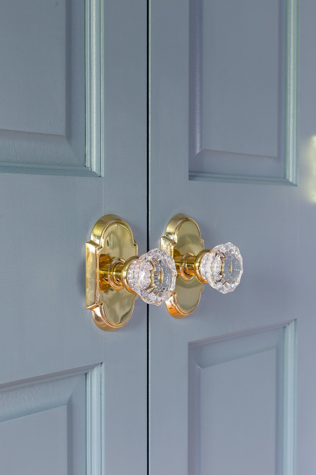
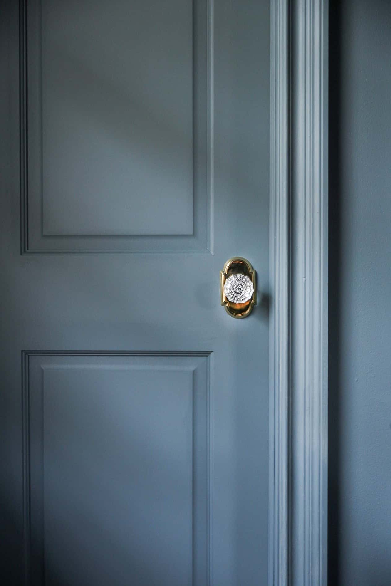
The Emtek unlacquered brass Astoria knobs are the cherry on top to these Reeb doors. I never knew how much I was obsessed with door hardware until I installed these.
Now I feel like I need them everywhere
THE BEDDING + PILLOWS
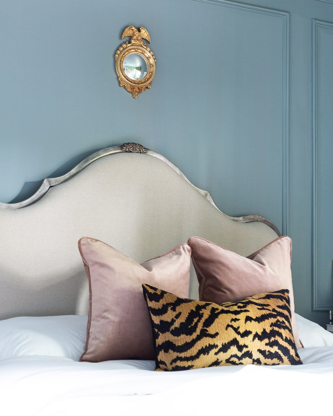
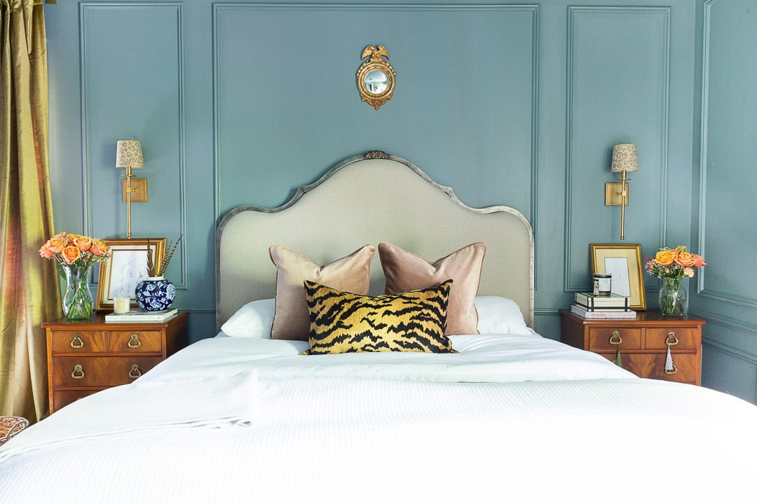
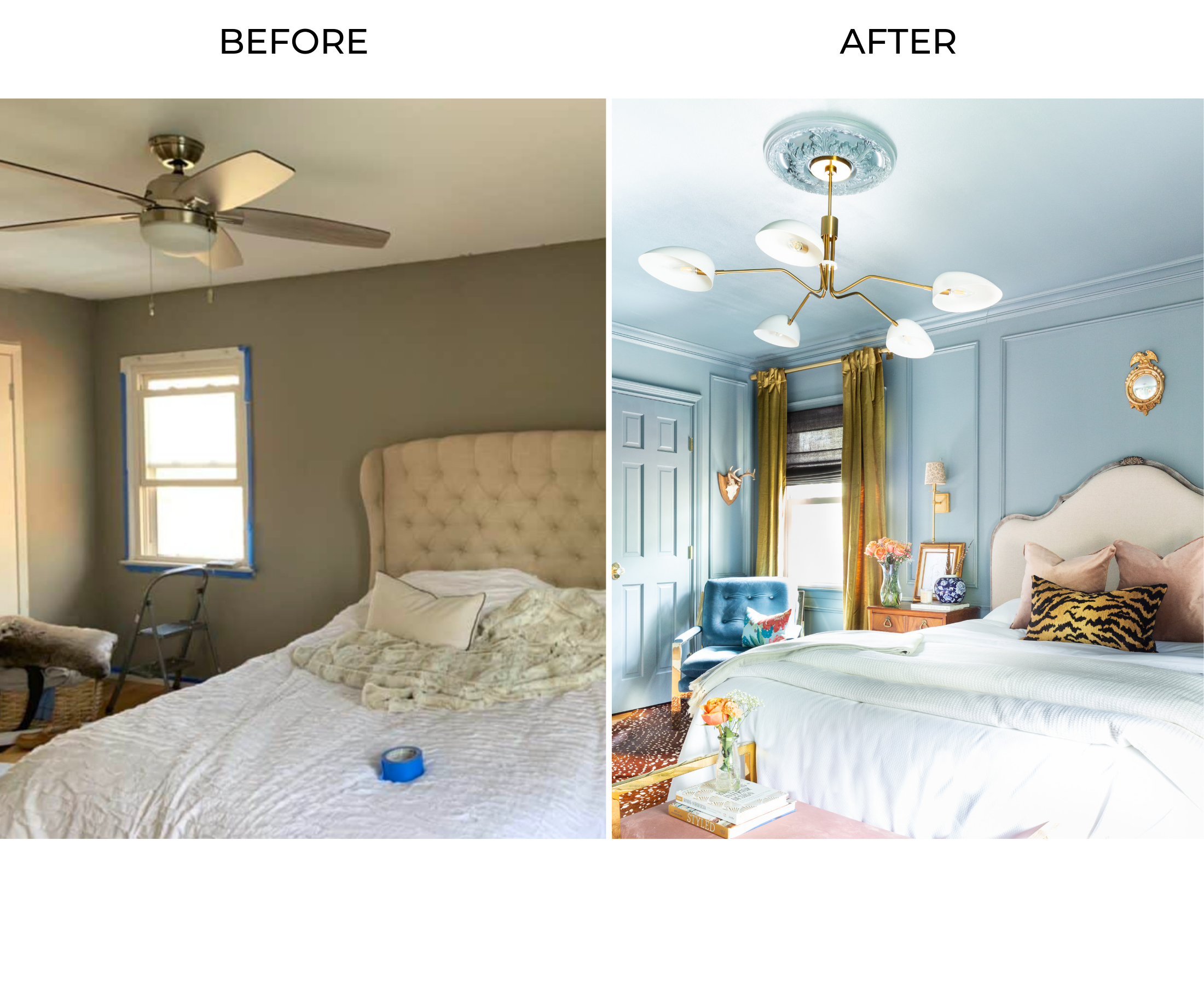
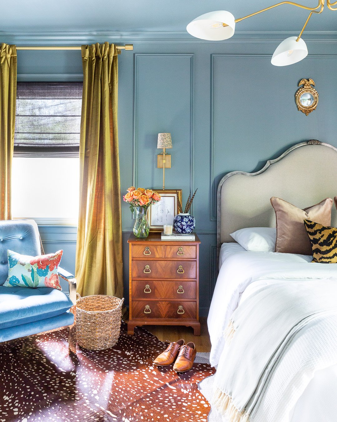
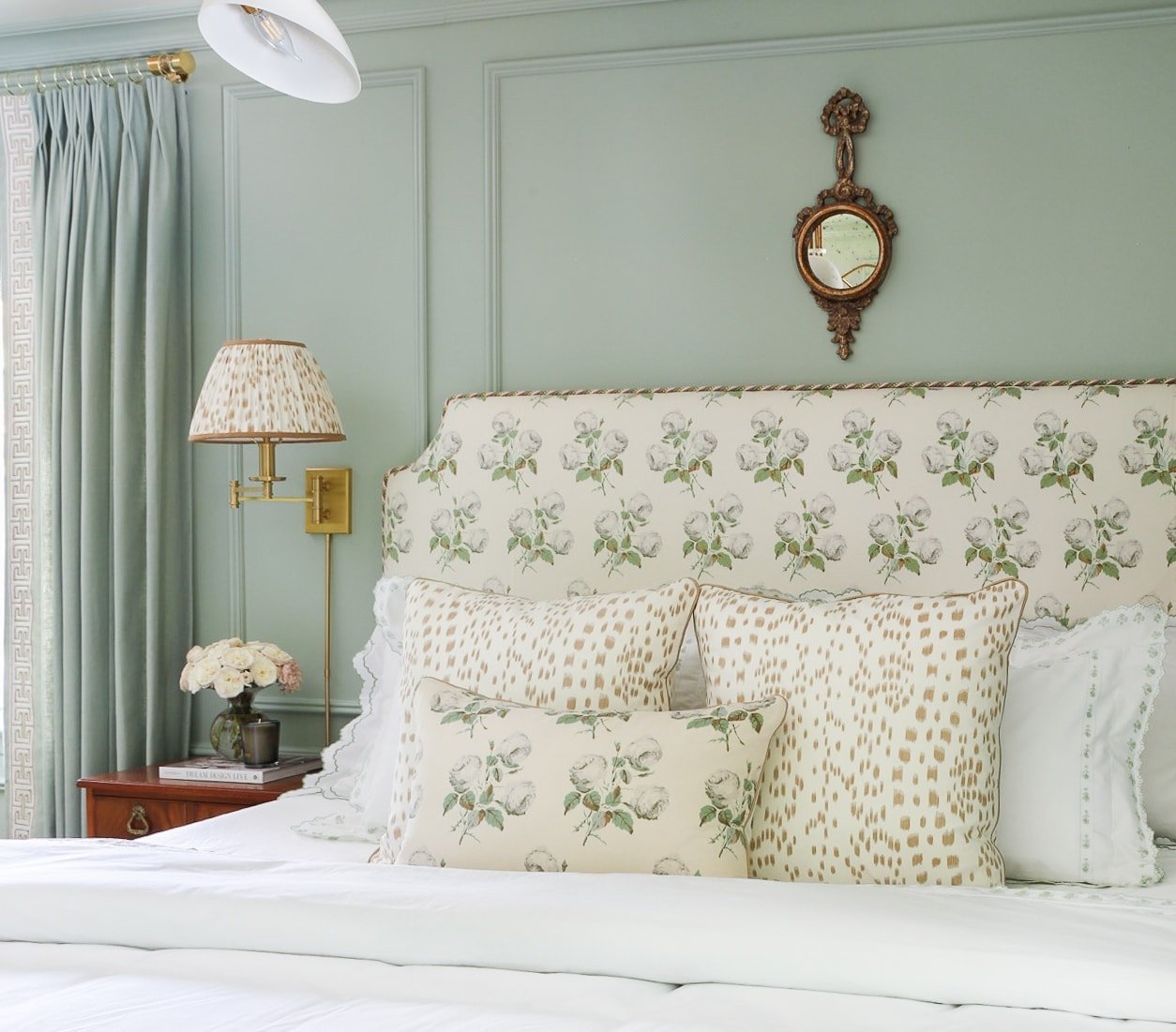
This tiger stripe pillow that I ordered from Etsy during the 11th hour is absolutely stunning and adds just the right amount of bold animal print to the bedding
I didn’t want to go too crazy with a bunch of throw pillows that I’d have to manage on a daily basis, and these mauve velvet pillows I found at Home Goods the night before the photoshoot are even prettier in person.
The Enchanted Garden Schumacher pillow is the perfect touch to the blue velvet chair.
 The bedding was also a last minute find from Home Goods, but since our bed is Queen size and we’re always playing tug-of-war with the comforter, I bought king size bedding and it’s perfect. It’s also a great bed-skirt substitute ;
THE WINDOWS
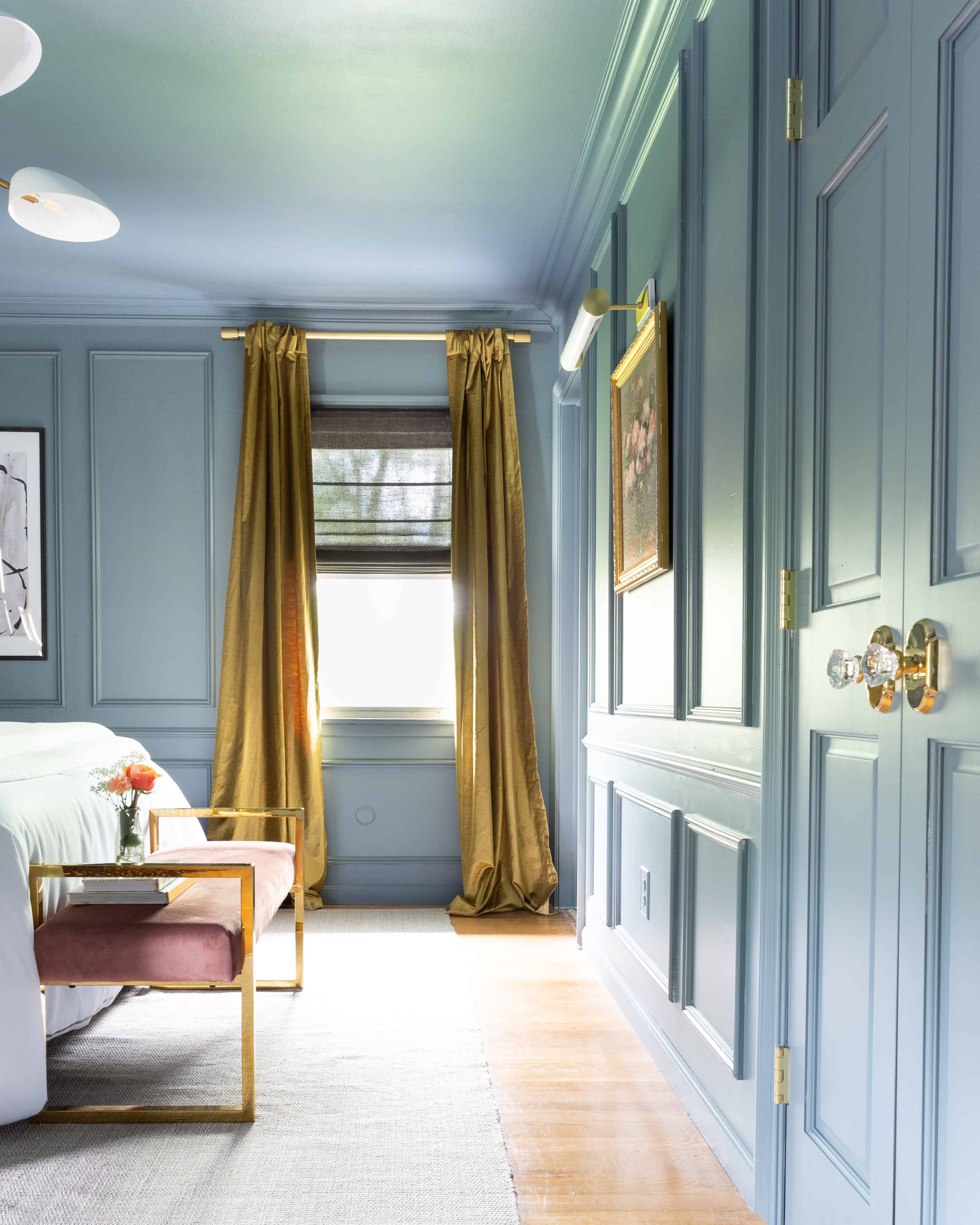
I’ve never used Chartreuse in our home, but when I spotted these velvet curtains from West Elm, I decided to take the plunge. Curtains are one of the most important (if not the most important) design element a room, so these had to be perfect. I can honestly say that I’m 100% satisfied with my curtain decision.
Originally, I ordered thinner brass rods to hang the curtains, but after stumbling upon these thick brass curtain rods from West Elm, I knew they would look so much better with the lush velvet curtains.
I wanted to layer the window treatments and worked with Select Blinds to order caviar light-filtering Roman Shades. Although I was hesitant about pairing black with chartreuse in a darkish-blue room, I’m so infatuated with how they turned out. The installation of the Select Blinds Roman Shades was so easy I’m really impressed by the quality of their shades.
THE LIGHTING
Who knew Ellen DeGeneres made this chandelier?? I don’t believe she herself made it, but it’s from her brand. Just wanted to clarify.
I paired this modern statement-making chandelier with a traditional medallion, similar to how Erin Kestenbaum does in her rooms. I don’t know how I’ve never used a medallion before, but my god what a difference this simple detail can make.
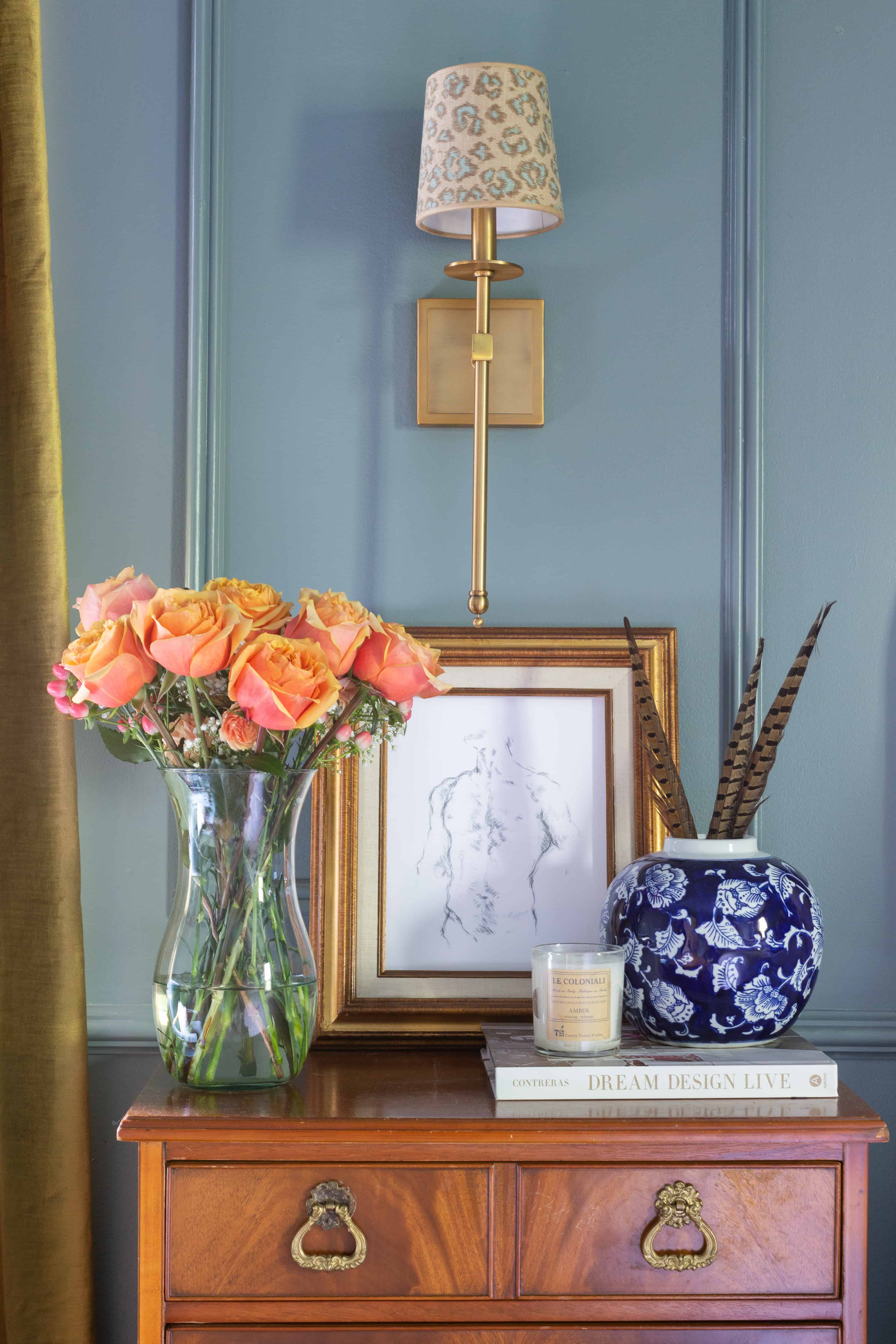 I opted for sconces over lamps and these brass sconces are just the right touch to either side of the bed. I didn’t want the white sconce shades to match the chandelier, so when I stumbled upon these blue leopard linen lamp shades from Shades of Light, I knew they would be perfect.
THE (SHORT STORY OF THE) NIGHTSTANDS
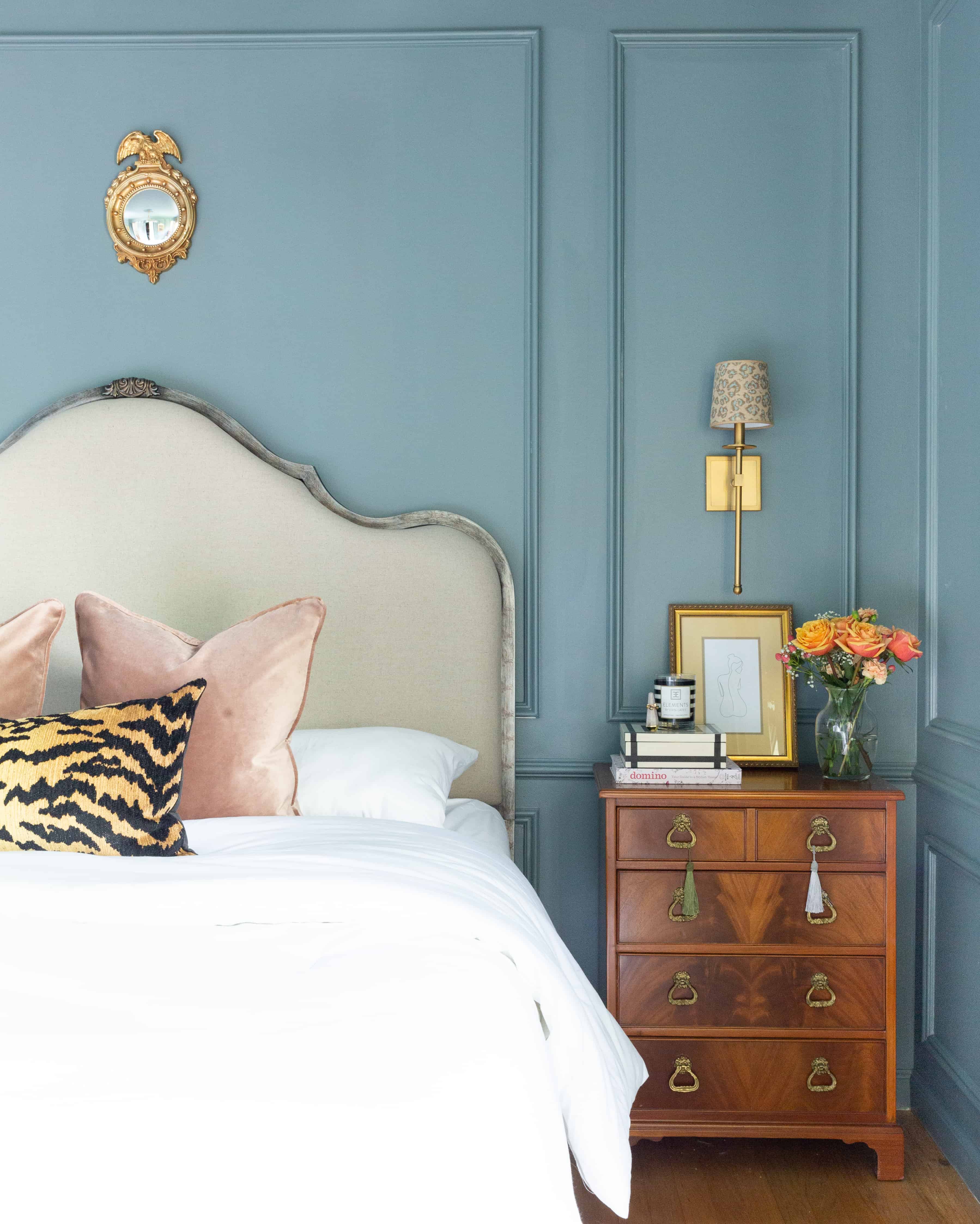
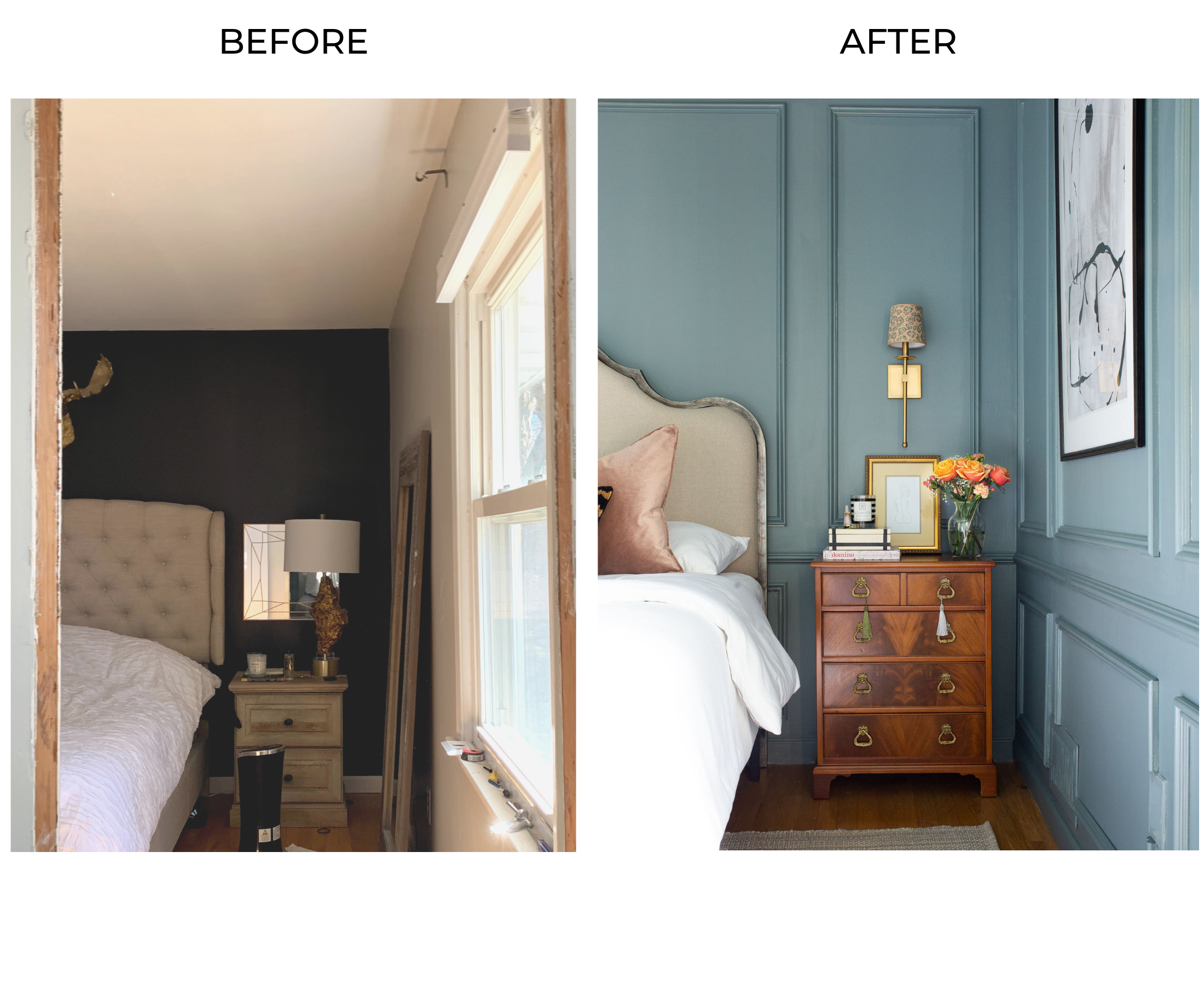
Once upon a time (3 weeks ago), these GORGEOUSSSS flame mahogany nightstands popped up on FB marketplace for SIXTY DOLLARS and within minutes, I messaged the seller asking if they were available.
“Sold.”
…k
I was so upset. I just kept thinking about how perfect they would be in the space even though I knew they were claimed. The combination of the flame mahogany nightstands against De Nimes kept me up at night, and when they weren’t keeping me up, they were haunting me in my dreams.
Fast forward to less than a week ago, these damn nightstands kept showing up on Marketplace. They were taunting me, so I reached out…again…because I’m relentless. And my gut told me to.
They were available!!! And over 1.5 hours away, but I was willing to fly to the moon and back for these.
Now here they are, nestled right where they belong. And that’s the short, pathetic story of how I don’t give up on something I just need.
/fin
THE ART
I was looking to blend modern and vintage art throughout the room, and I was able to pull off an even mix of both.

How perfect is this vintage floral oil painting? The picture light (linked below) from Hudson Valley Lighting is a luxe detail that also adds dimension and flows perfectly with the rest of the wall.
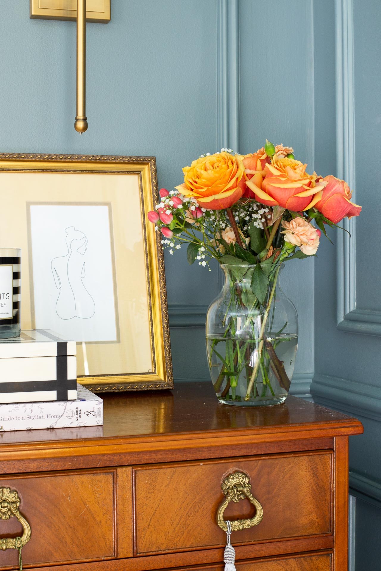
Using thrifted frames, I opted for risqué masculine and feminine sketches that I printed from Etsy to display on the nightstands. They’re subtle but I feel like they’re an interesting touch.
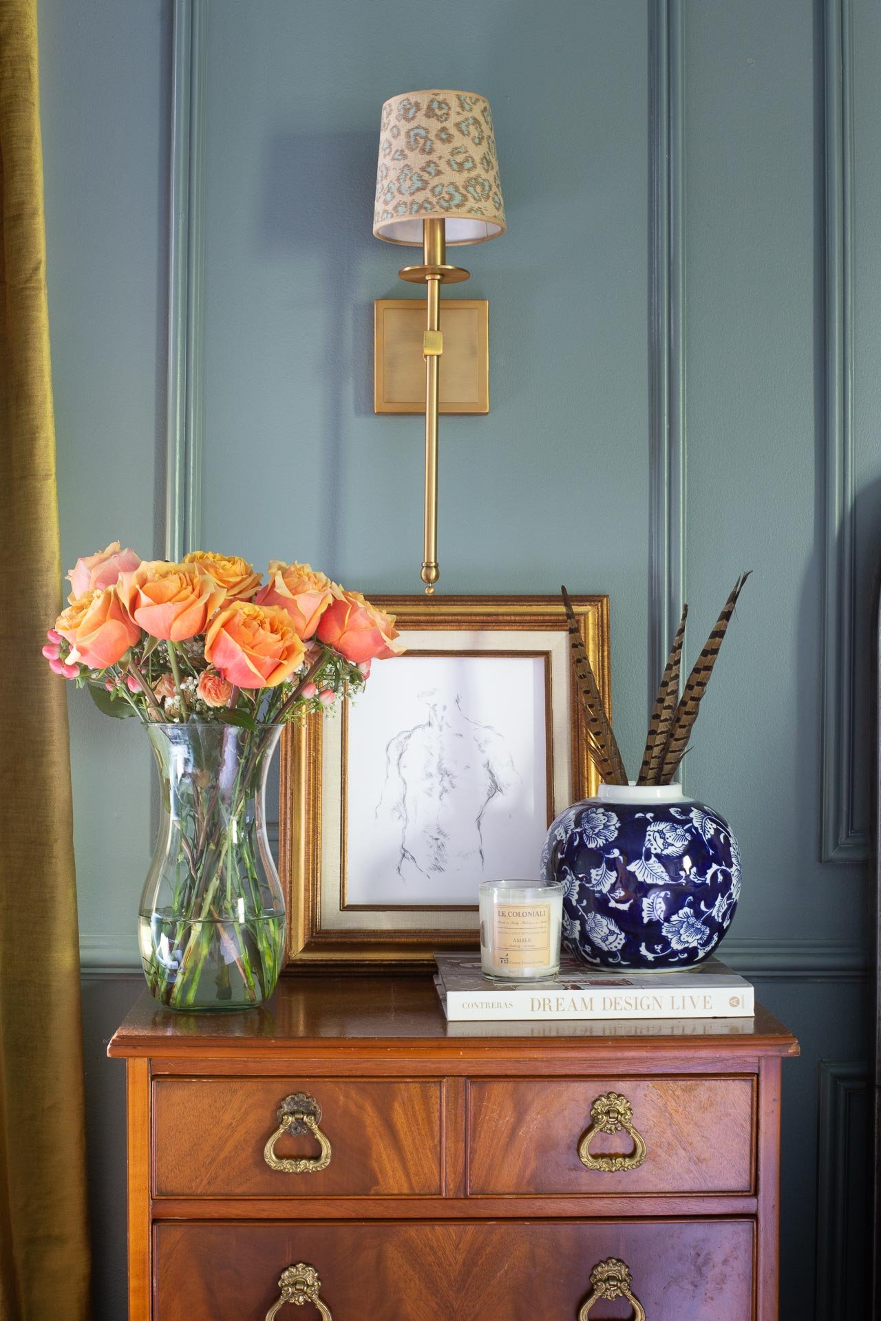
Ow owwwww
THE RUGS
I’ve seen many blue rooms with zebra cowhide rugs which I love, but I stumbled upon this antelope cowhide rug on Etsy and instantly knew it would be perfect for the room. It’s grounded (no pun intended) by the Annie Selke marled cotton rug that has just the right balance of gray and beige.
Since the room is predominantly blue with pops of jewel tones, I used plenty of browns throughout the room to ground all of the color, and the antelope cowhide is perfect.
THE MIRROR
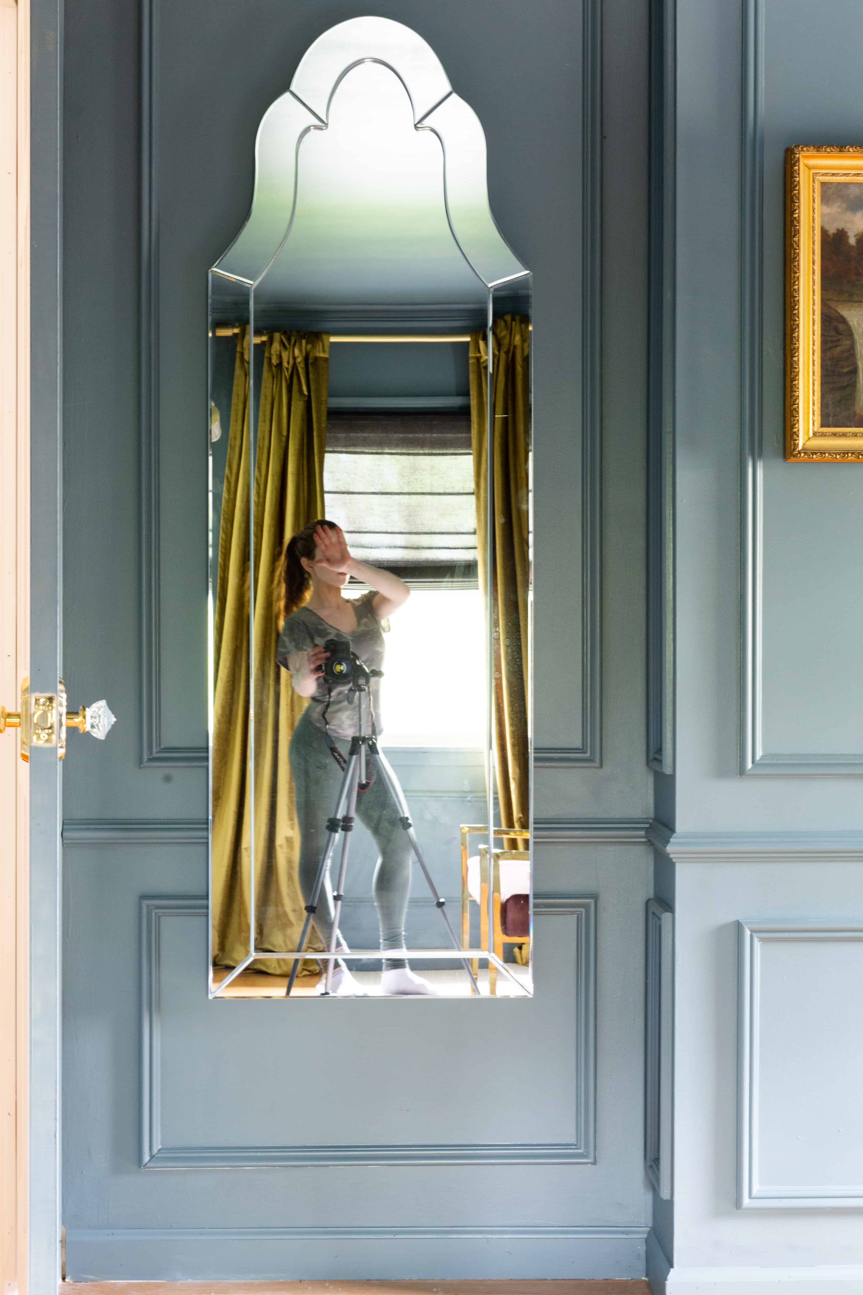
No pictures pls.
This frameless venetian mirror resembles the one installed in the bathroom and it’s the perfect full-length mirror. Yes, it’s right behind the door which I know you may be thinking “ummm, why would you put it there?” But it’s a recessed space and the chances of the door hitting that mirror are slim to none.
Angelo and I aren’t door-slammers. The cat, however…
THE HIDDEN GEM
I’d like to propose a game of “What’s behind door #3?”
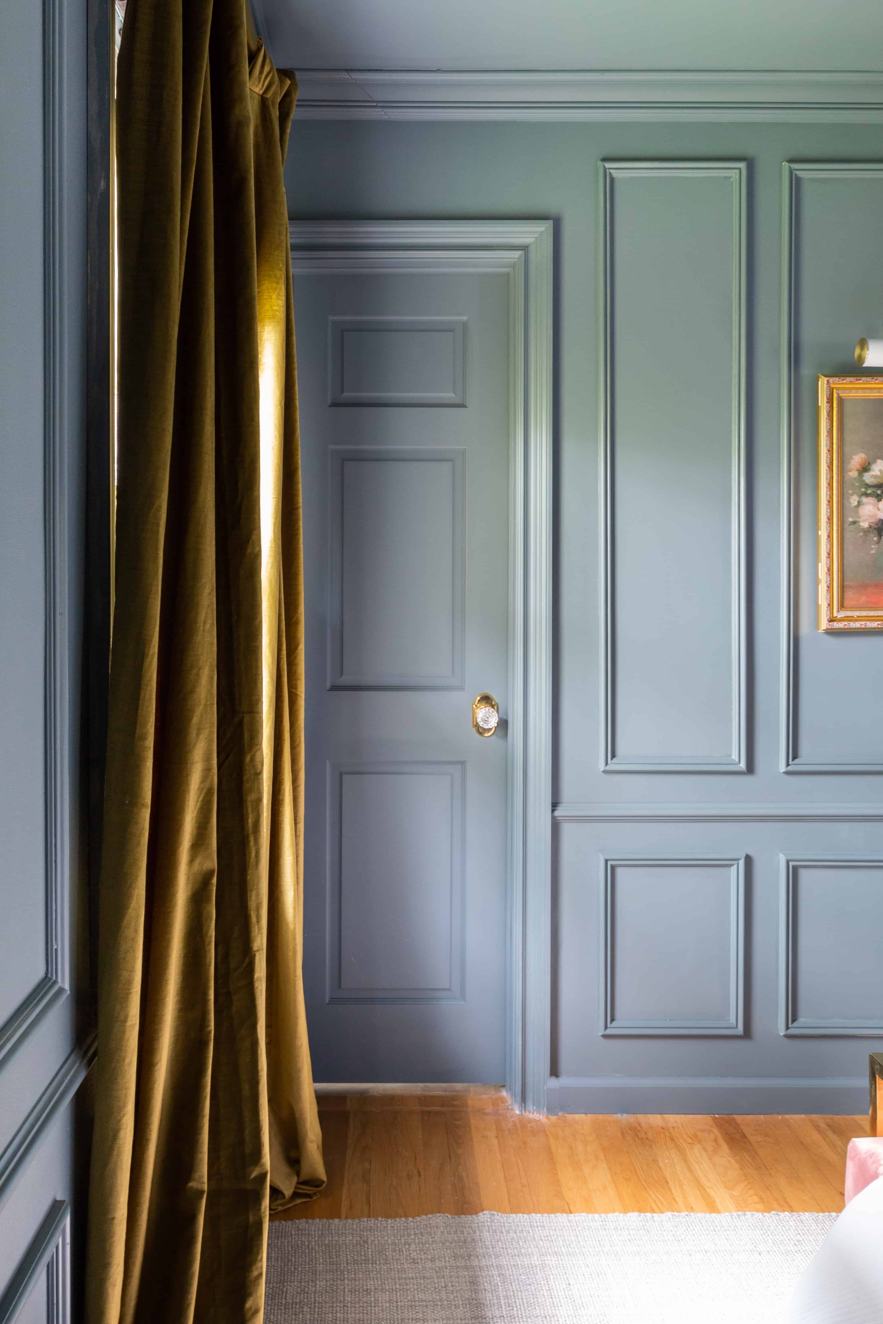
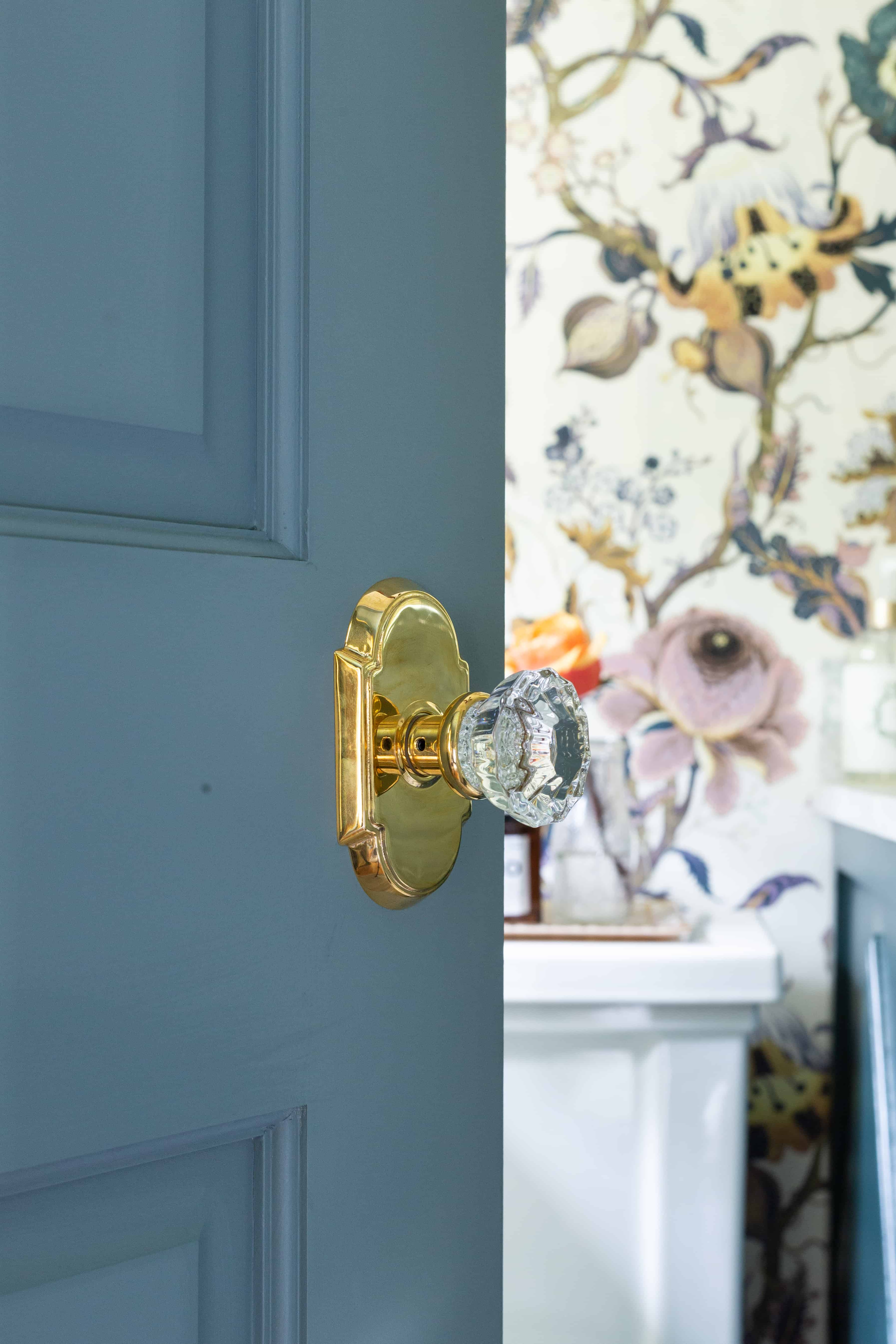
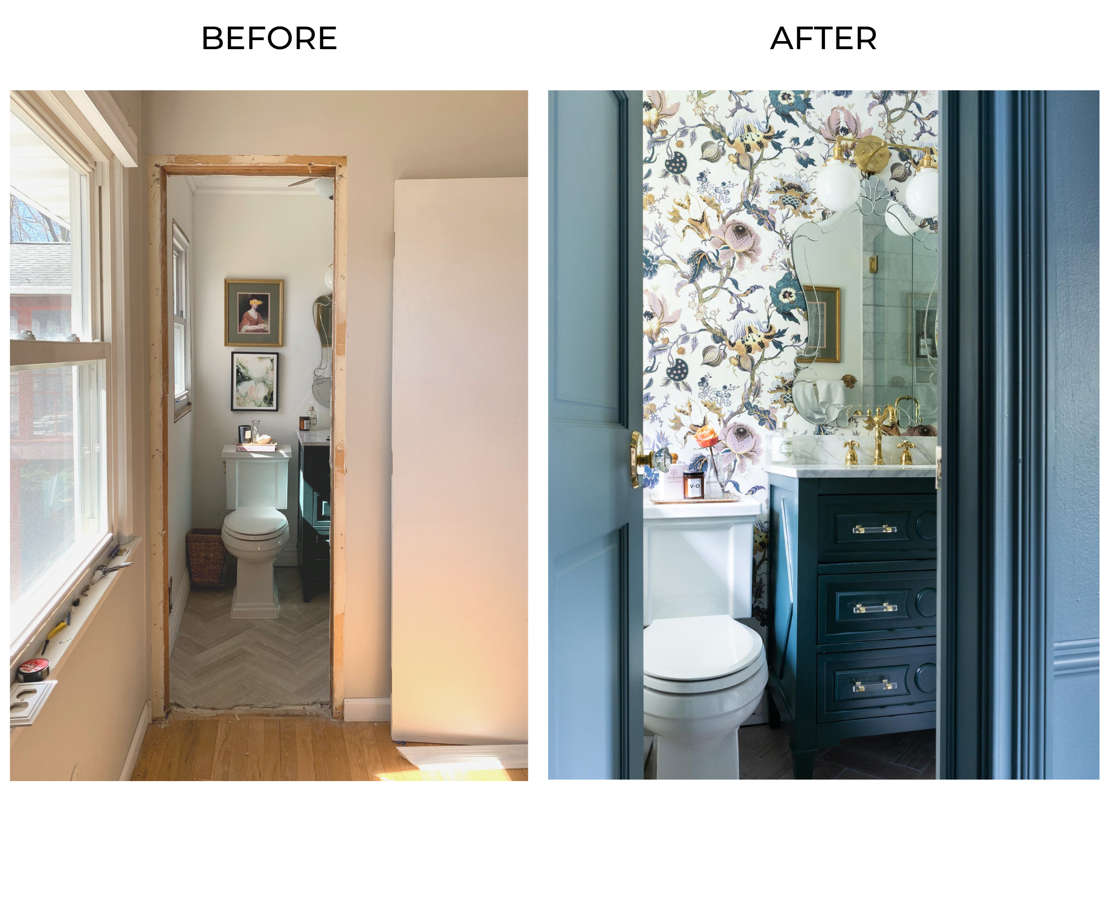
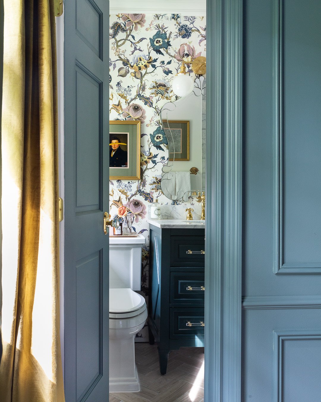 After mentally battling for weeks on where to hang the House of Hackney Artemis wallpaper (bedroom vs. bathroom), I ultimately decided that the recently remodeled bathroom would evolve as the hidden gem of our home.
I feel like the wallpaper is right where it belongs, and having bare walls in the bedroom allowed more pattern play throughout the room.
Now, the feeling of opening the bathroom door to this view is what gets me out of bed in the morning……besides needing to get ready for work.
Also, the vignette of the Reeb doors, Emtek knobs and wallpaper has me swooooooning with multiple o’s.

I mean, could you EVEN??
Nothing like a few good side-by-side comparisons to show how much this space has transformed:
All photos were shot with my Canon 6D and a 24-70 mm f 2/8 lens.
SHOP THE BEDROOM MAKEOVER

I want to take a moment to thank the amazing brands I partnered with and were generous enough to provide product for this makeover.

Also, a huge thank you to Linda of Calling It Home for organizing the One Room Challenge. Don’t forget to check out the other reveals here and here!
Thanks for stopping by! Until next time…

Girrrrlllll…REDICULOUS! What an amazing transformation! You did a phenomenal job pulling this all together!! You should be so proud because its breathtaking! That little gem of a bath with that wallpaper is the cherry on top! Kudos to you for going with your gut! It’s perfect there!
Thank you so much Jessica!!! I truly appreciate your kinds words. I’m glad you like everything!! <3
Gorgeous!!!!! I also discovered this wallpaper!!! I’m going to use on the inside back walk of glass cabinet towers!!! Thinking I might carry it again in my powder room. Love love your design decor!!!
YOU ABSOLUTELY NAILED IT! I’m so happy for you! Great job my friend!
What even…is this?! I am floored and you are so good. My favorite part is how you talked about pushing yourself outside of your comfort zone. I am officially letting my design freak flag fly and am going to stop worrying about pleasing the people and embrace doing my own thing. You did a brilliant job. Enjoy!
Hahahahah!! Thank you so much Meryl!!! I’m so glad I could inspire you to step outside of your comfort zone too 🙂
Holy cow, this is so glam and amazing. The paint color and those nightstands are meant to beeeee. GOOD FOR YOU!
LOL! That’s what I told myself when I was stalking the guy who was selling them. Thank you for the compliment <3
Your master bedroom transformation is SO stunning!! I love every detail, the room color, the vintage painting, doorknobs, pillows, its all so gorgeous. The hidden door to your bathroom is so perfect too. The wallpaper and all the details of it just flow so nicely with the room. What a dreamy space to call home!
Oh Felicia, thank you so sooo much!!! What a compliment. I’m so glad you love all of the details! <3 It's been so nice waking up to a completely different space!
/fin
Love it!! Love the wallpaper in the bathroom. Love the painted ceiling. Love it all.
thank you so much Christine!!! 🙂
Stunning! Absolutely stunning! My favorite of 20 designers AND all the guest designers. You really did an exceptional job with every.single.thing. Love the wallpaper in the bath, too.
Holy moly!!! That’s such a bold compliment haha!!! Thank you so much… I’m so glad you love everything! 🙂
WOW, WOW, and WOW! This room is breathtaking! Be still my heart with those night tables! Every little detail is amazing and THEN the piece de resistance, the bathroom paper!!! I’ll be rereading this over and over, finding new loves each time. Job well done!
Wow thanks so much Denise!!! You ‘re the best! I appreciate the support 🙂
Girl I cannot get enough of this space. You wanna come do mine? Holy smokes! The details are stupendous, and that wall colour is EVERYTHING
Thanks Ariel!! LOL!! I’m obsessed with the wall color too! 🙂
Wanted to let you know that out of all the ORC guest participant rooms, yours was the ONLY one I wanted to click on and take a look at. (I hadn’t been following any of the guests this time around, so I went to the main page and scrolled down all the squares in one fell swoop.) Fantastic job! The combination of colors, textures, and choices made for a gorgeous bedroom!!! And LOVE those night stands – beautiful!!
Wow, thanks so much Jim!! I really appreciate that compliment.
Ohhhh Wow! This is amazing. Absolutely stunning! You killed it my dear. My kinda space. And that bathroom….. gorgeous
Thank you so much, Veronica! That means a lot coming from you. I am also obsessed with your bedroom!! You never cease to amaze me!
Beautiful space! So glad you used the color on the ceiling — so enveloping! And love the used of vintage brown furniture. 🙂
Thank you Amy!!
What a stunning transformation! It’s so beautiful – I too, can barely believe it’s the same room! I also LOVE that you did the wallpaper in the bathroom. Gorgeous!
Thank you so much!!
Whoa those walls are stunning! I love all the moulding. And the doorknobs and bathroom wallpaper. So many fabulous details to enjoy!
Thank you so much, Corinna!! 🙂
Hello Im looking at painting with de nimes but it doesn’t look to be this beautiful colour. I just wanted to check that the walls and ceiling here are de Nikes or if it’s a different colour I should be buying? Thank you so much for your inspiration. You home is so so beautiful
Just WoW! Stunning!
The bed, woman, the bed! How did you get that gorgeous bed? I love it!
Hahah!! Here’s the link to the bed: https://rstyle.me/+WuP6COJ9Ue7nGljZMdZnzQ
I found you recently on IG (and sent you screenshots of my FB MP saved list lol) but our houses seem to be of similar eras.. and I literally just **GASPED** looking through this post(actually all of your room transformations). My bedroom layout is almost identical to yours… I even had a green accent wall (I recently just painted the entire room SW Nightwatch and am obsessed) but I just cannot believe its the same room. My style doesn’t lean *quite* as traditional, but I can feel myself being influenced! Its just so stunning. Such a great transformation
Thank you so much for reading Kellie!!! That’s so funny, I love hearing from people who have a similar style house because it’s definitely a bit of a challenge to try and turn into something beautiful.
This is very impressive!
hey I was wondering if your walls are textured? mine are and I was wondering if I needed to San dit before trying this.
Hello, I know I’m about a year late but just came across your blog. Love!! You are so blessed with such talent. I am just curious as to the gray area rug, the size you used and size of room if you may. Thank you
Your bedroom is GORGEOUS!! Everything about it, especially that paint color! Can you tell me the name if the color? I would love to paint my living room that same color.
Thank you!
Thank you so much for this!! You don’t know how many wonderful ideas you have given me. Many, many thanks! I wish my husband would let me do some of these things! He insists on getting workmen to do projects I am itching to do. Grrr. And they never do it quite like I would… 😉 Bravissima to you on this beautiful room!!
Thank you so much for this!! You don’t know how many wonderful ideas you have given me. Many, many thanks! I wish my husband would let me do some of these things! He insists on getting workmen to do projects I am itching to do. Grrr. And they never do it quite like I would… 😉 Bravissima to you on this beautiful room!! And I wanted to ask about you expeeience with F&B paint – did you like it? I have heard such a mixed stories on using it (actually putting it on) and it’s durability, and my painter says that it is DIY paint trying to pass itself off as a professional paint… I don’t know if that is just because he is Italian and likes using his same old full of VOC paint or what… Very curious about your experience. I ask, because I went to great lengths to get Benjamin Moore Advance high-gloss paint for a huge, huge book case/library, and it has been nothing but a nightmare! We had to wait AN ENTIRE MONTH for it to dry, and it still scratches easily with your fingernail. :-/
Sorry, Siri was drunk while I was dictating and sent the message before I was finished, to boot – I didn’t see all the typos until now! I DO know the difference between its and it’s! 🙂
I would do bad BAD things for those nightstands! Literally my dream bedroom.
Absolutely! Transitional style is often described as a balanced blend of traditional and contemporary furnishings and decor.
Wow! The room is gorgeous. Can I get the brand/paint color name. I’m obsessed. Thanks
what direction are your windows facing? Is it south & west facing?