
IT’S REVEAL DAY!
After living with a bathroom that appeared to be straight out of an episode of American Horror Story from the outcome of a wallpaper removal fail in early 2018, I think it’s safe to say this renovation has been a long time coming. And I truly am over-the-moon excited to share our brand new main bathroom with you today.
To provide some context, this project has been my MAIN focus (besides my full time job) since January when Linda, the creator of the One Room Challenge, reached out about being a featured designer. Excited to be on the big stage and makeover our main/largest bathroom, the pressure was on and I spent nearly every waking minute of free time obsessing over how to make the most of this space.
However, since we decided to not invest in the layout change (we received multiple quotes that were all just shy of five figures to swap the location of the tub/toilet), I always had a little alter-ego gently tapping on my shoulder, reminding me of the fact that this bathroom was small, awkward, and no matter how much molding I added or coats of Farrow and Ball I painted, I probably wouldn’t be able to create a show-stopping room because of the crappy layout.
But I kindly told that little voice to go scratch, and it wasn’t until I photographed the room yesterday when I realized that even with the less-than-ideal layout, this bathroom turned out to be better than I ever could have imagined.
As a reminder, here is the massacre….I mean…bathroom that we started with.
T H E B E F O R E
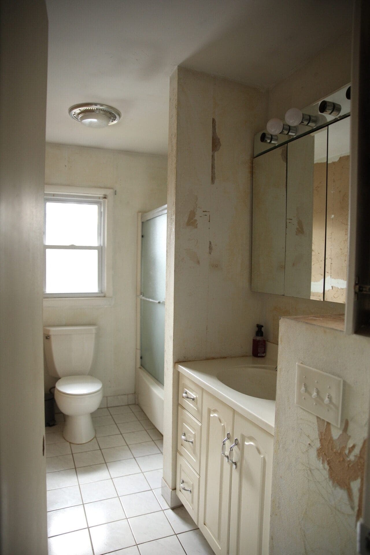
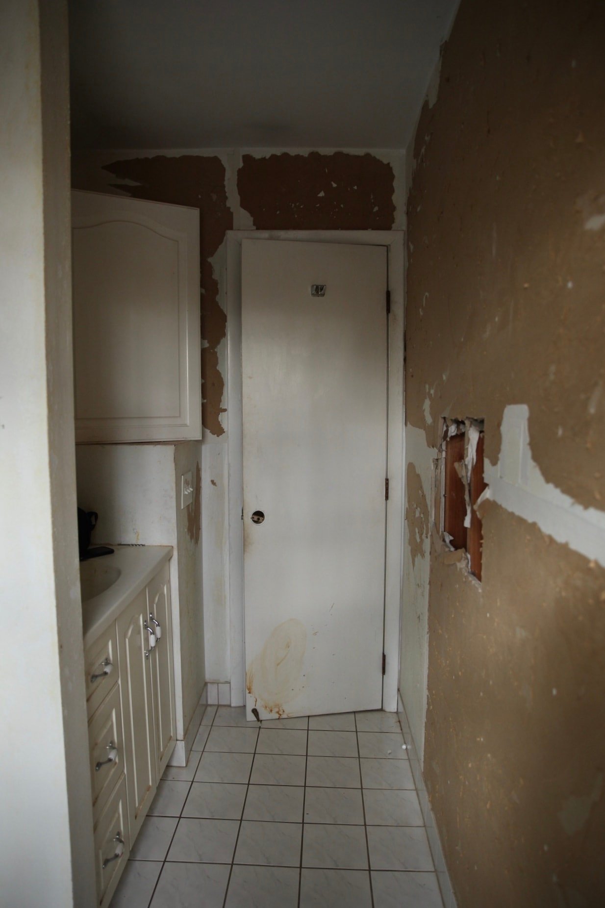
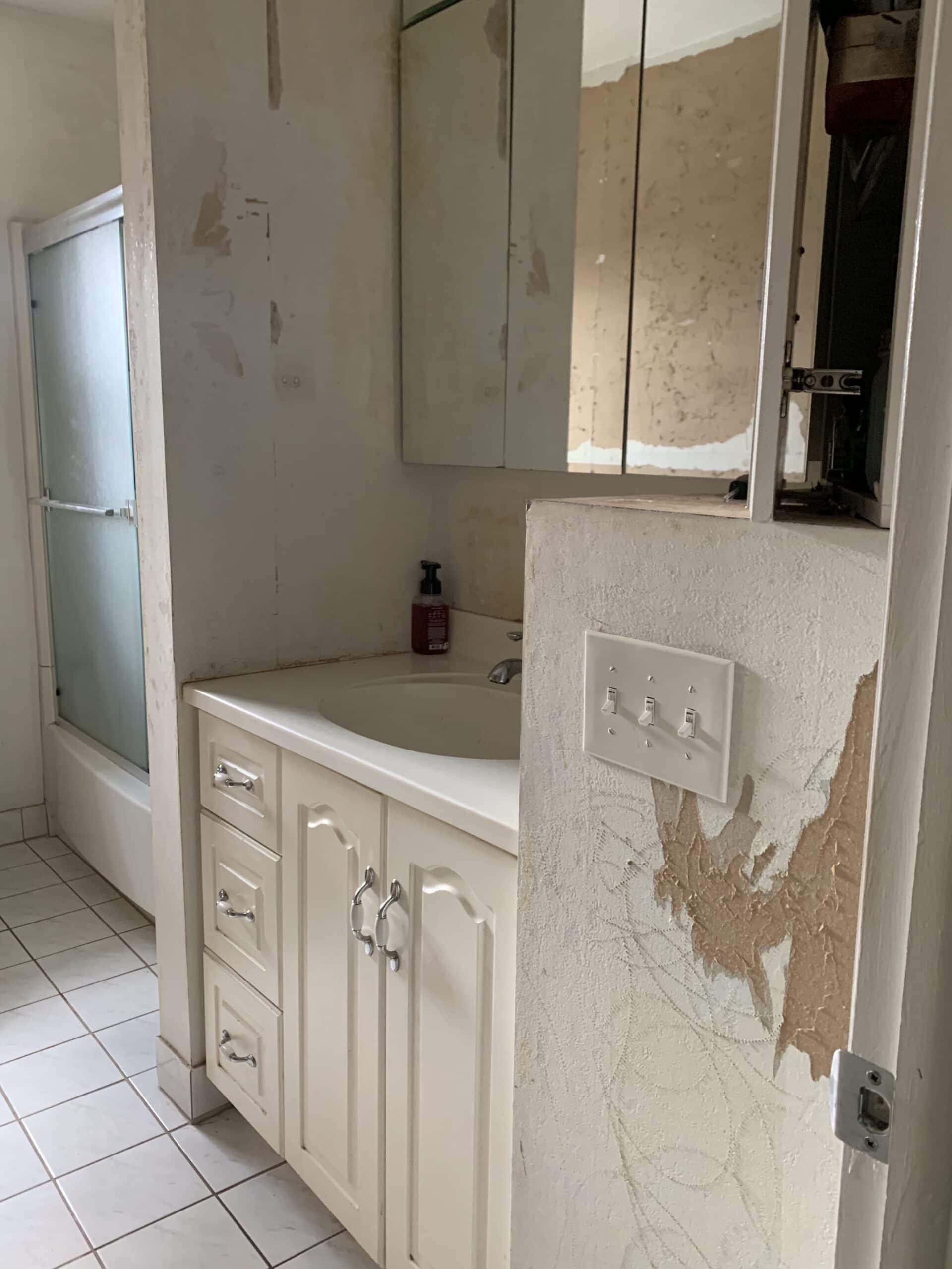
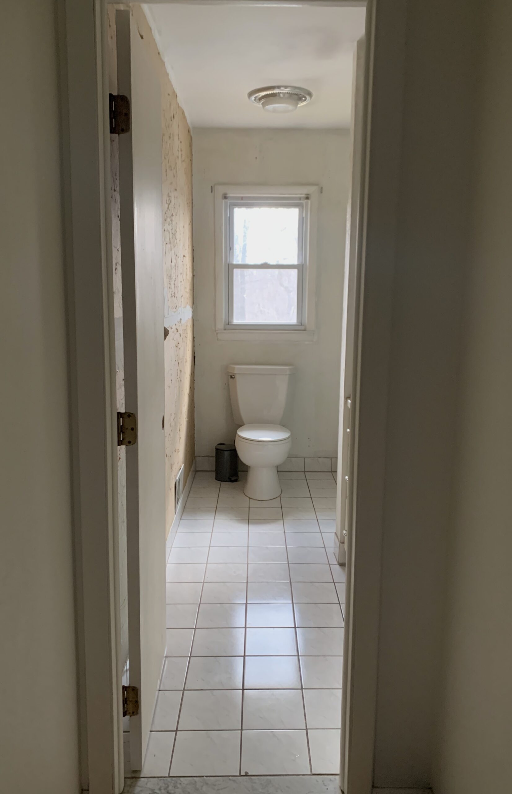
T H E P L A N S + I D E A S
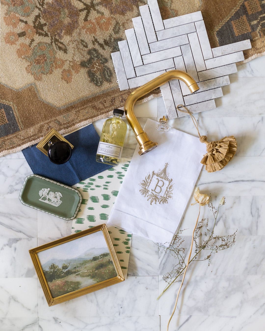
My main goal for this room was to make it appear intentional and cohesive, given the layout. There are a few things I did to make this happen:
- Like our master, I painted the ceiling and walls the same color. This is a visual trick to make a room appear larger – it will raise the eye up and make the space look more expansive. However, I went a different route with the crown and base, painting it a slightly different color than the walls and trim to add some visual interest and contrast
- I debated for a while about the vanity color and how to make the most out of the awkward vanity area. I wanted a wood vanity, but realized that with such a tight space, it would be best to have the vanity the same color as the walls to make the vanity recede, and therefore making it look intentional
- I added Novo trim everywhere, because molding somehow has a way of turning bare walls into something magical. I think the molding really worked wonders around the vanity area. After adding trim to four different rooms in our basic, boxy house, I have a new phrase: when in doubt, trim it out
- Similar to the thought I had with making the vanity recede, we built and tiled a tub skirt to help the whole tub/shower area look…dare I say…intentional.
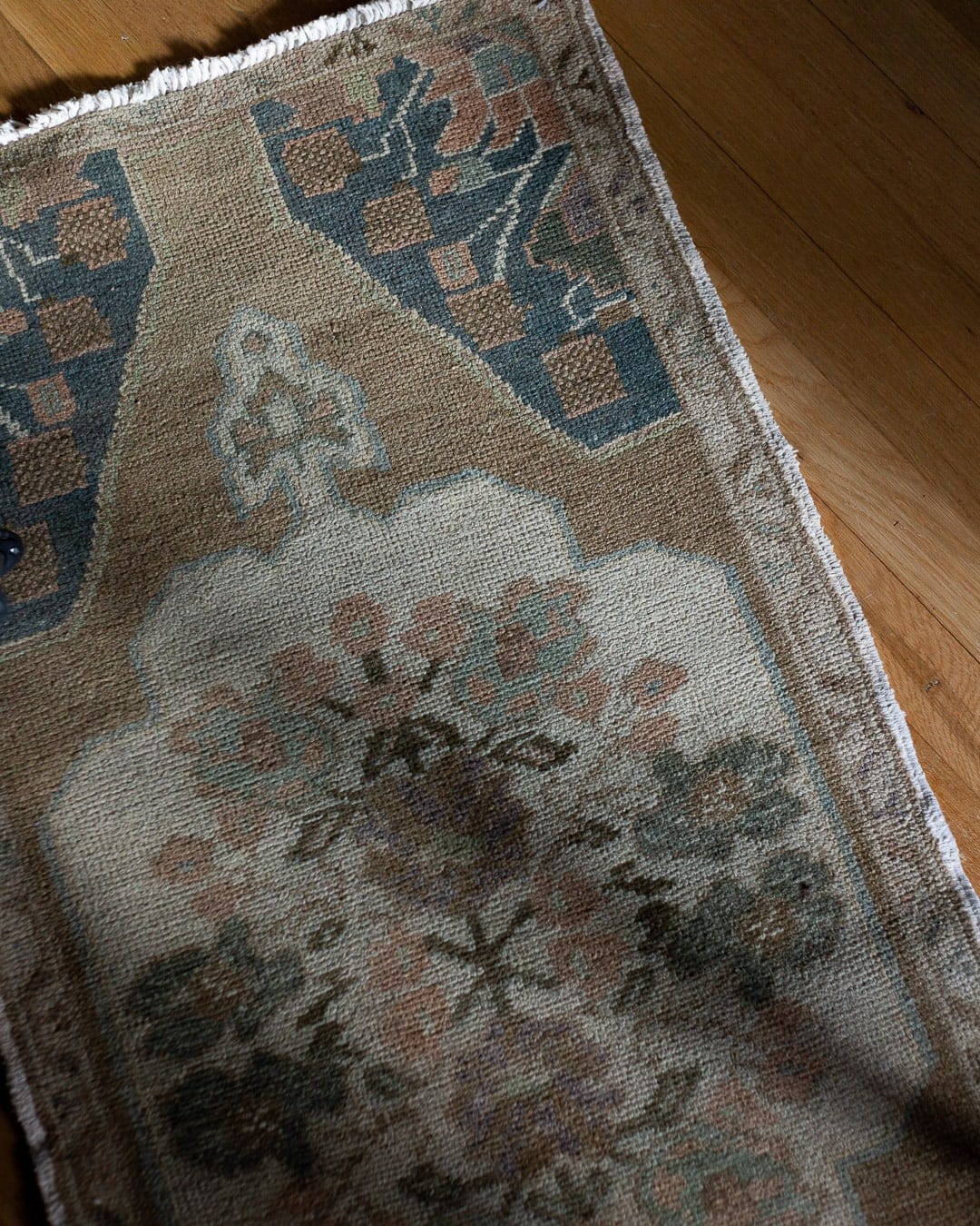
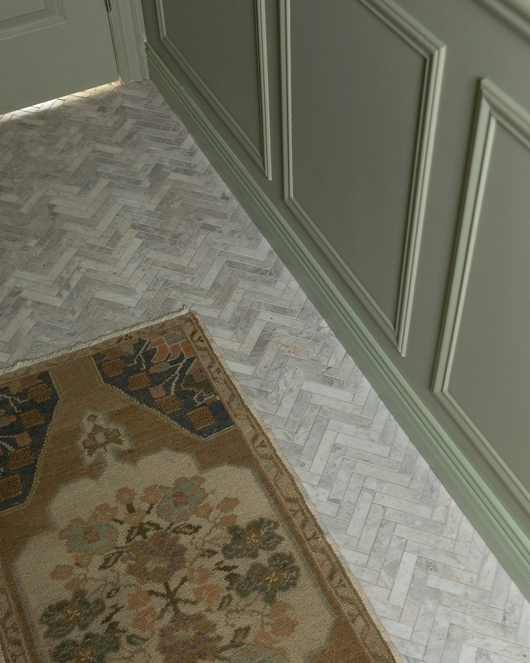
- Last but not least, I scored a vintage runner on Chairish back in January that I became obsessed with, and it set the tone for the entire space. You’ll notice in each photo that I pulled almost every color from the tiny runner into this room. ‘Twas meant to be
I know, you just want photos. Alright alright.

T H E A F T E R
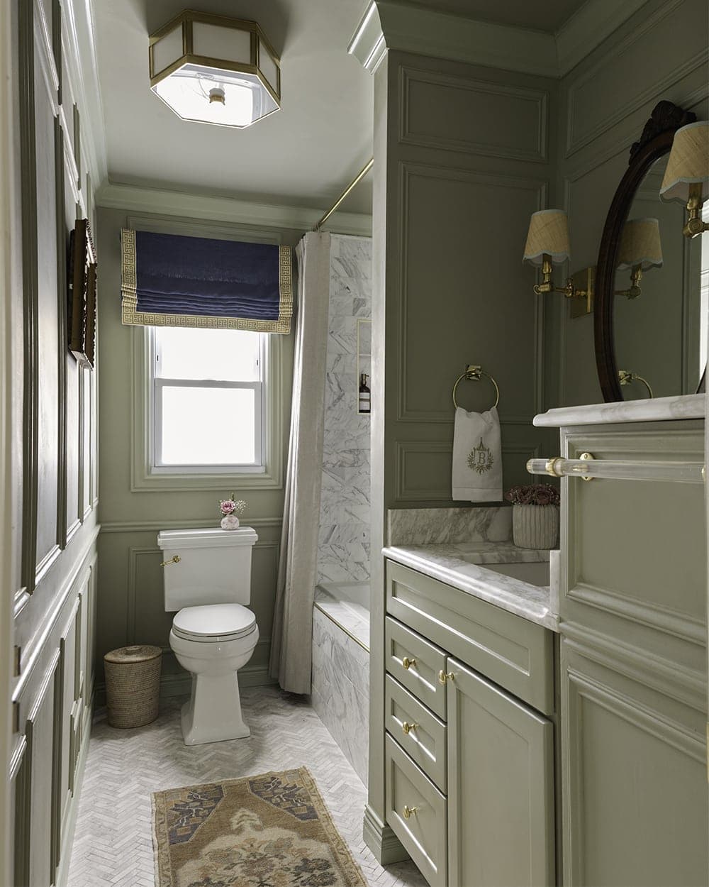
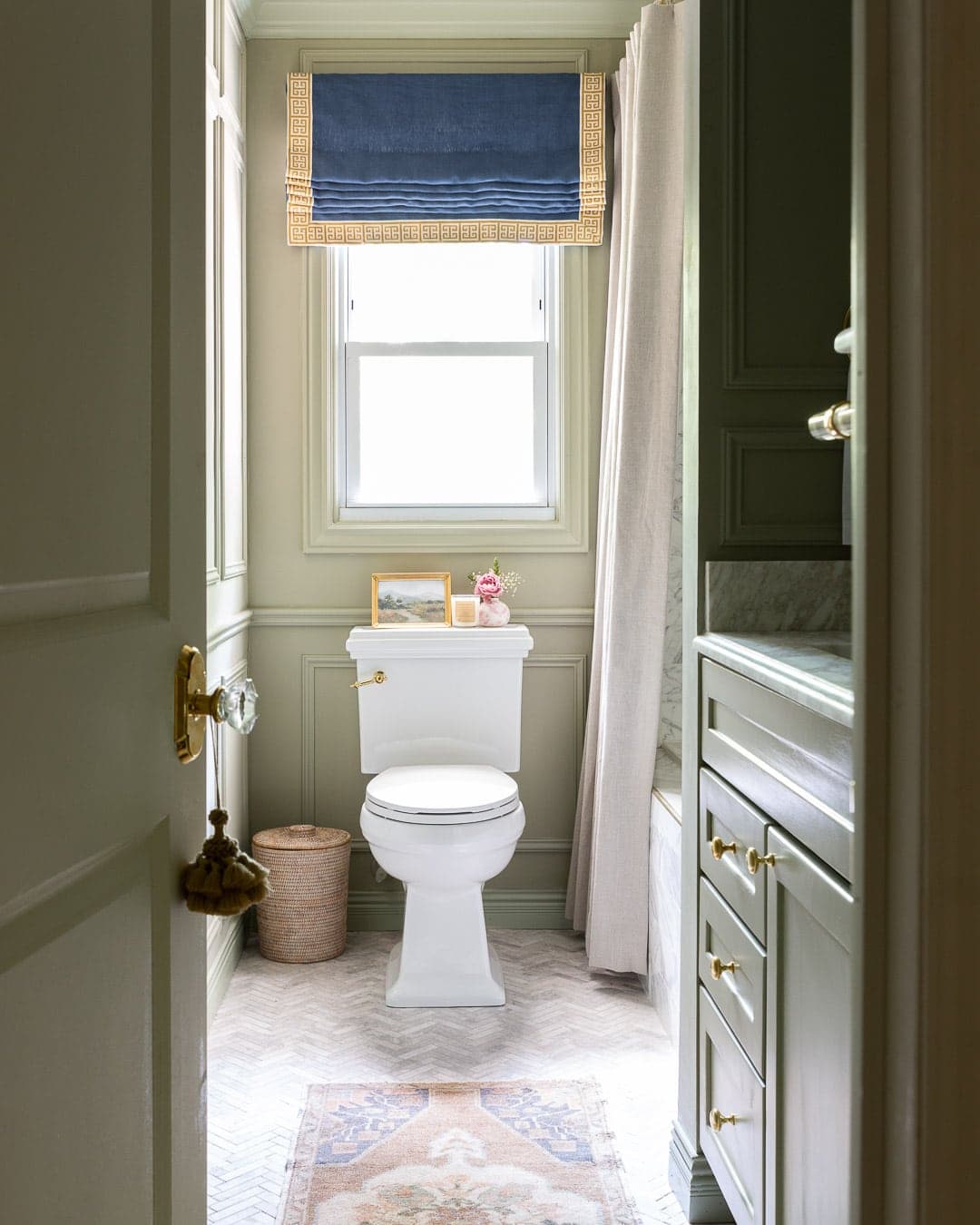
Are you the slightest bit surprised I chose a green paint color? The walls and ceiling are Farrow and Ball French Gray in the Estate Emulsion finish and the trim boxes + vanity is in the Modern Eggshell finish. Something compelled me to go with a slightly different shade green for the crown and base to add some depth and contrast, so I went with Vert De Terre in the Modern Eggshell finish for the crown and base.
Let’s dive into the details, shall we?!
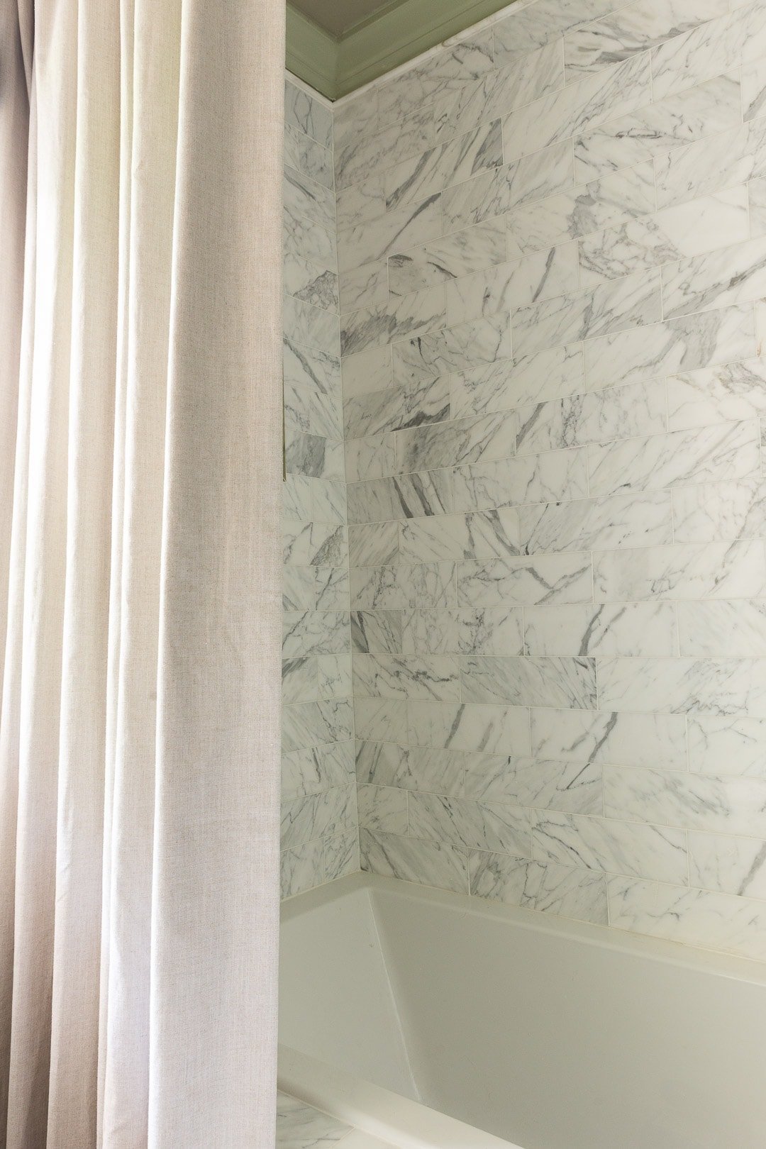
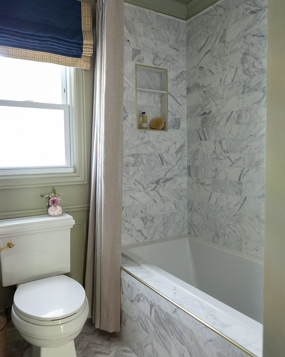
I partnered with Calico for the textiles in this room and I am so smitten with how the Roman shade and shower curtain turned out. Since I knew the shower walls would be this gold Calacatta stone, I opted for a natural warm linen fabric for the shower curtain. The fabric is called Sterling Linden and it’s the perfect neutral/ivory color, so well-made and substantial enough for the shower area. I seriously love how the warmth in the curtain and shower tile play together.
I knew the focal point of the room would be the roman shade, so choosing this Indigo linen with their gold greek key trim was the *risk* I took a few months ago when I had no idea what I was doing design-wise for this room. I know it doesn’t seem like a crazy leap, but I’ve never used this blue before and really wasn’t sure why I was drawn to it, but I was. In hindsight, I don’t think I could have chosen anything that would have looked better in this room, especially with the French Gray walls.
T H E V A N I T Y A R E A
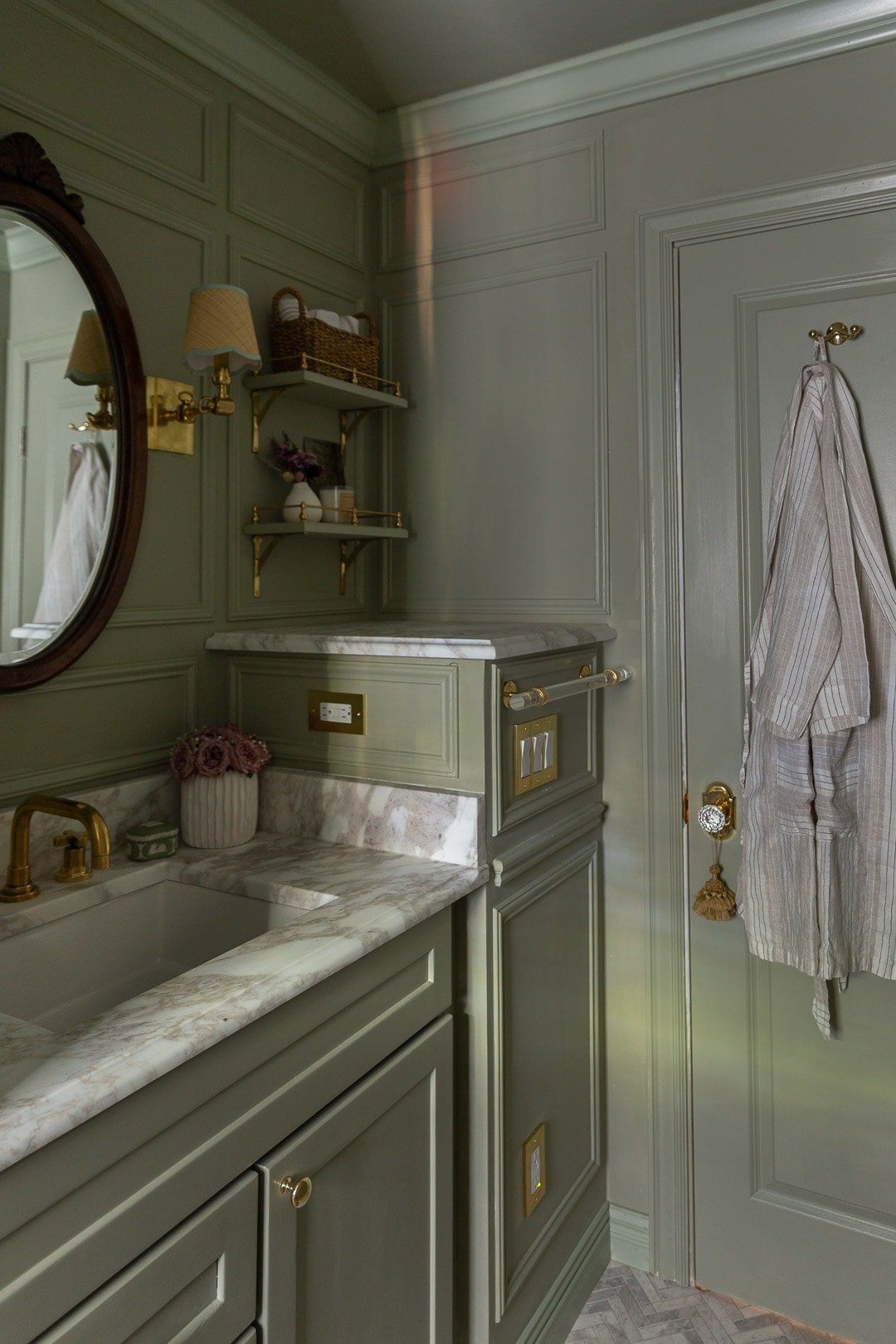
If there was something that could make or break how this bathroom turned out, it’s the stubborn vanity area. I won’t go into the history but long story short, there’s a second set of stairs running underneath the vanity, therefore causing the odd *obstruction* of a wall to the right of the vanity that can’t be removed.
I wondered about whether or not a cabinet would be a good choice on that small obstruction but ultimately felt that extending the counter space and installing open-shelving would make the vanity area feel way more open and less awkward (the decision to extend the counter space came in lieu of the secret cabinet, which we’ll get to later).
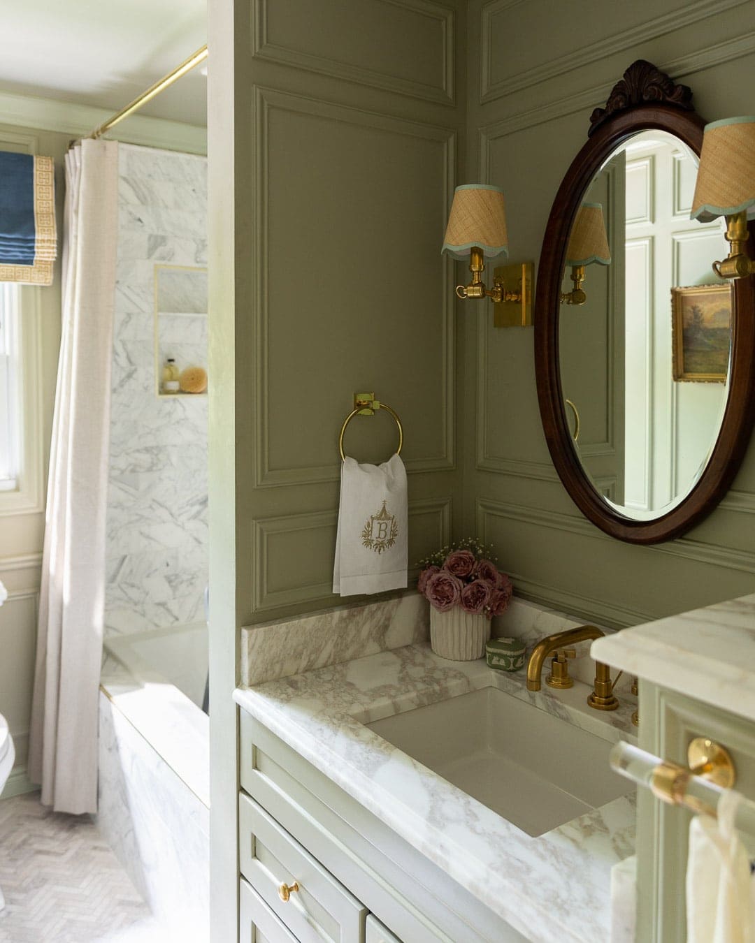
Build.com gifted a custom size vanity that I painted modern eggshell French Gray (same as the wall trim) and it looks so good with the Calacatta stone countertop.
T H E S H O W E R + F L O O R
For the shower and tub skirt, I chose my dream shower tile: 4×12 Firenze Calacatta from The Tile Shop. It’s quite honestly the most gorgeous stone tile I’ve ever seen and I’ll never get over the variation in pattern, color, and the specs of gold peppered throughout each piece – it’s what tile dreams are made of.
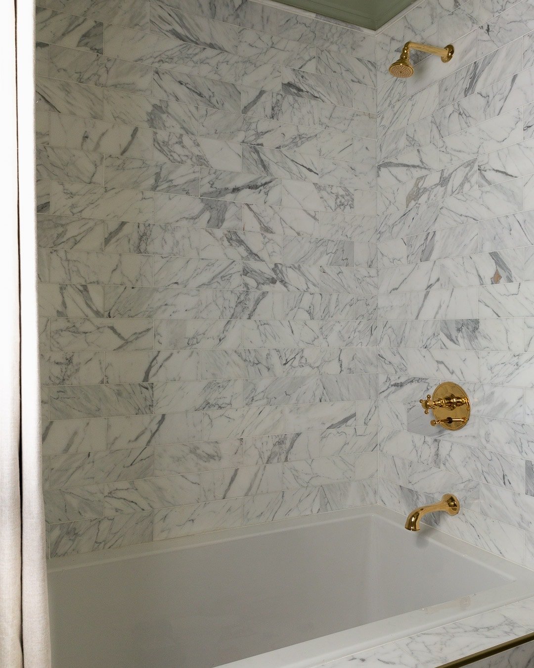
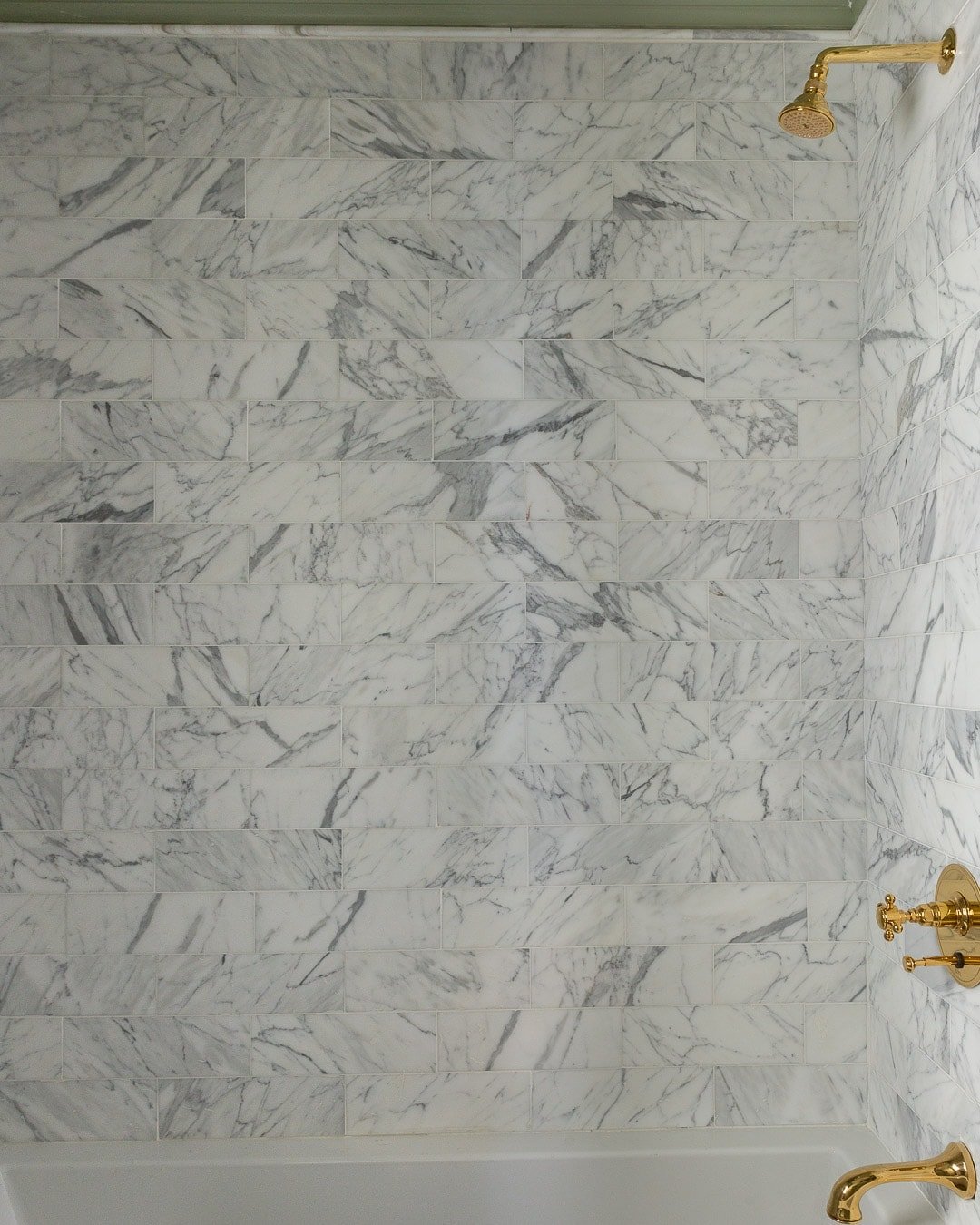
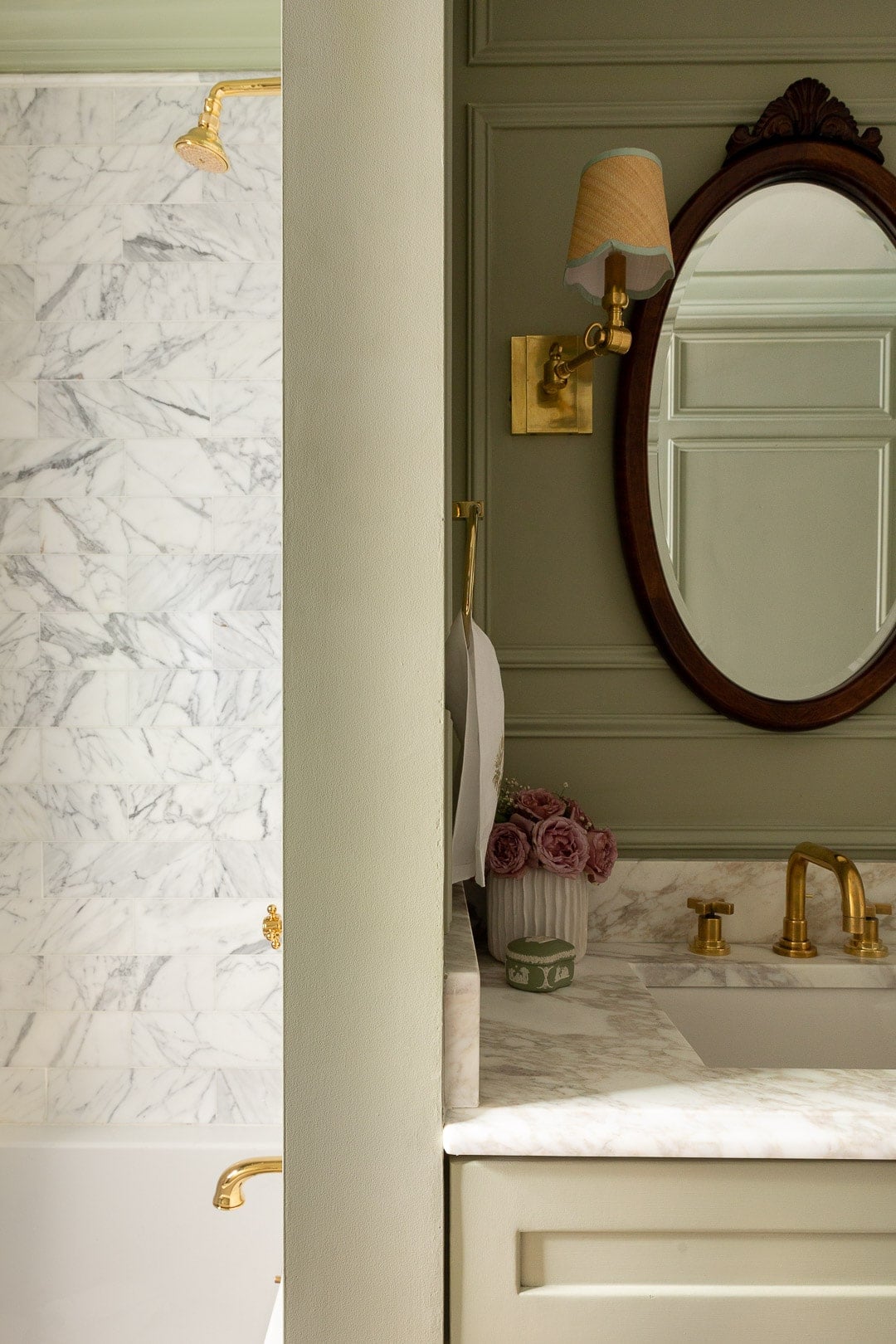
The shower hardware is also Rohl from Build.com in the Italian Brass finish and I have to say, the juxtaposition of the brass tones with the shower tile is just…unreal.
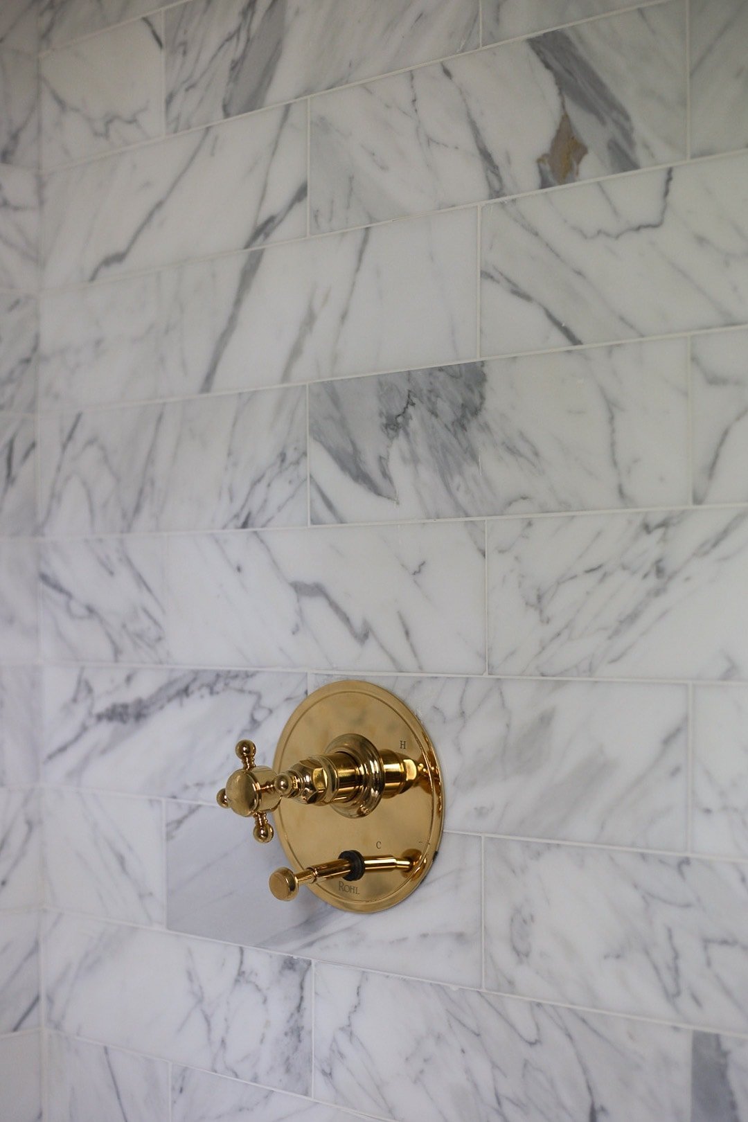
The trim around the niche and shower skirt are both brushed brass Schluters. The tub skirt required a bullnose Schluter Rondec and the niche required a flat-edge Schluter Schiene.
I received quite a few questions about the floor via IG, which is this Siberian Pearl Brushed Herringbone also from The Tile Shop. It’s a neutral stone, yet, contains so many different undertones, which is exactly why I chose it. Andddd because, you just can’t go wrong with herringbone.
THE TUB + TOILET
The Signature Hardware Sitka acrylic alcove tub was the perfect fit in this tight space and is a majorrr upgrade from the old fiberglass surround shower. I cannot *wait* to take a bath in here.
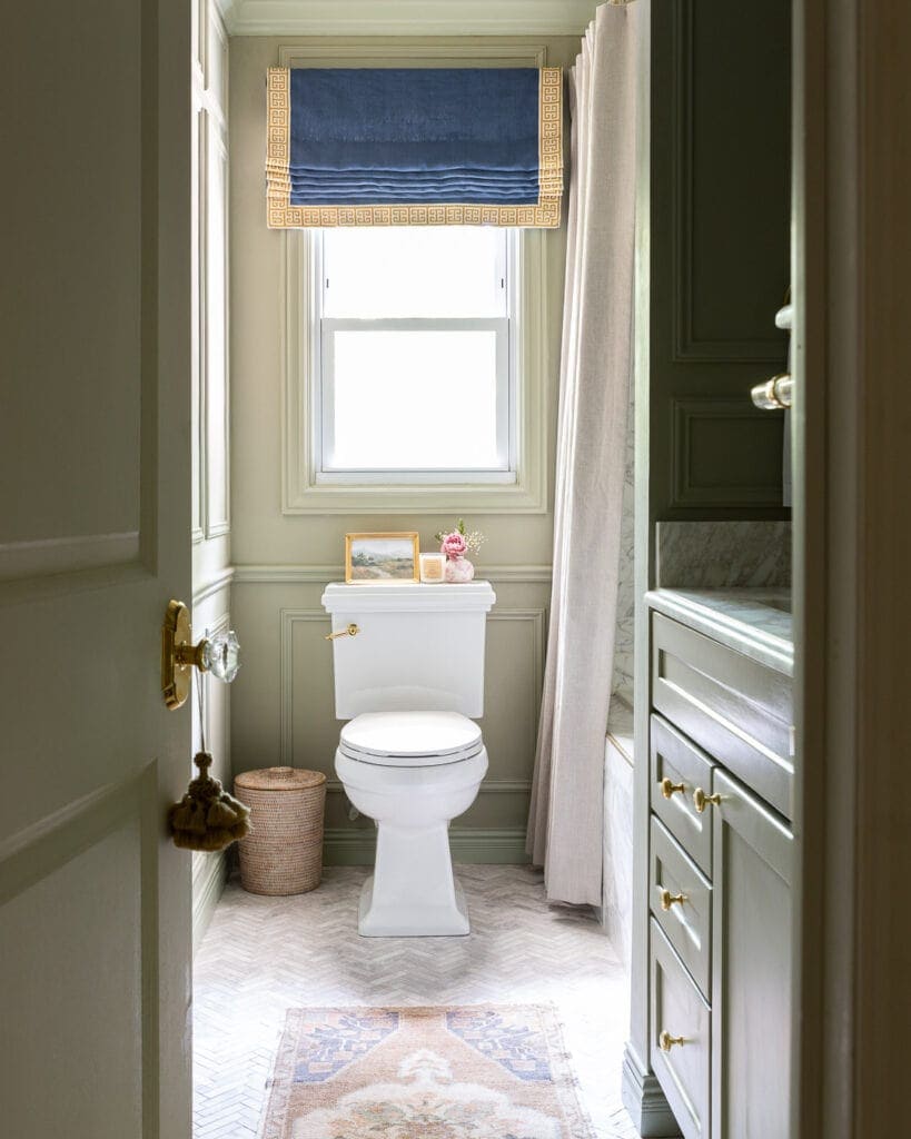
Knowing that the toilet would be the focal point, I fell in love (who says that about a toilet?) with this Miseno toilet from Build.com. Doesn’t it pair so well with the molding?
You may have noticed there wasn’t a toilet paper holder pictured. Symbolically, I wanted this to be remembered as the COVID-19 renovation, so I purposefully left out the toilet paper. Kidding. I somehow manage to break everything and accidentally smashed the part-ceramic TP holder into a million pieces and it was too late to get a new one. But yes, we will have a TP holder on the wall next to the toilet.
THE HARDWARE
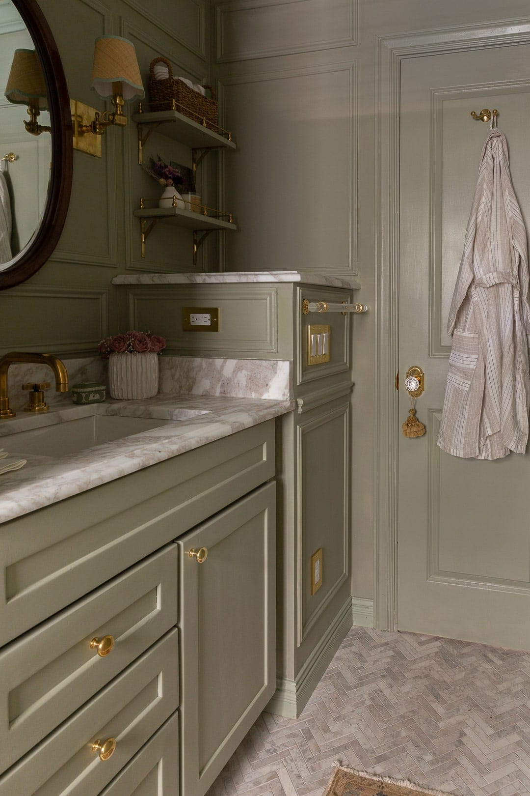
I will never pass up an opportunity to add unlacquered brass to a room, and Emtek’s products are my go-to for hardware. Like our bedroom, I sourced their Astoria doorknob and it’s like an *instant* upgrade to the room, without even opening the door to see what’s inside. Ha!
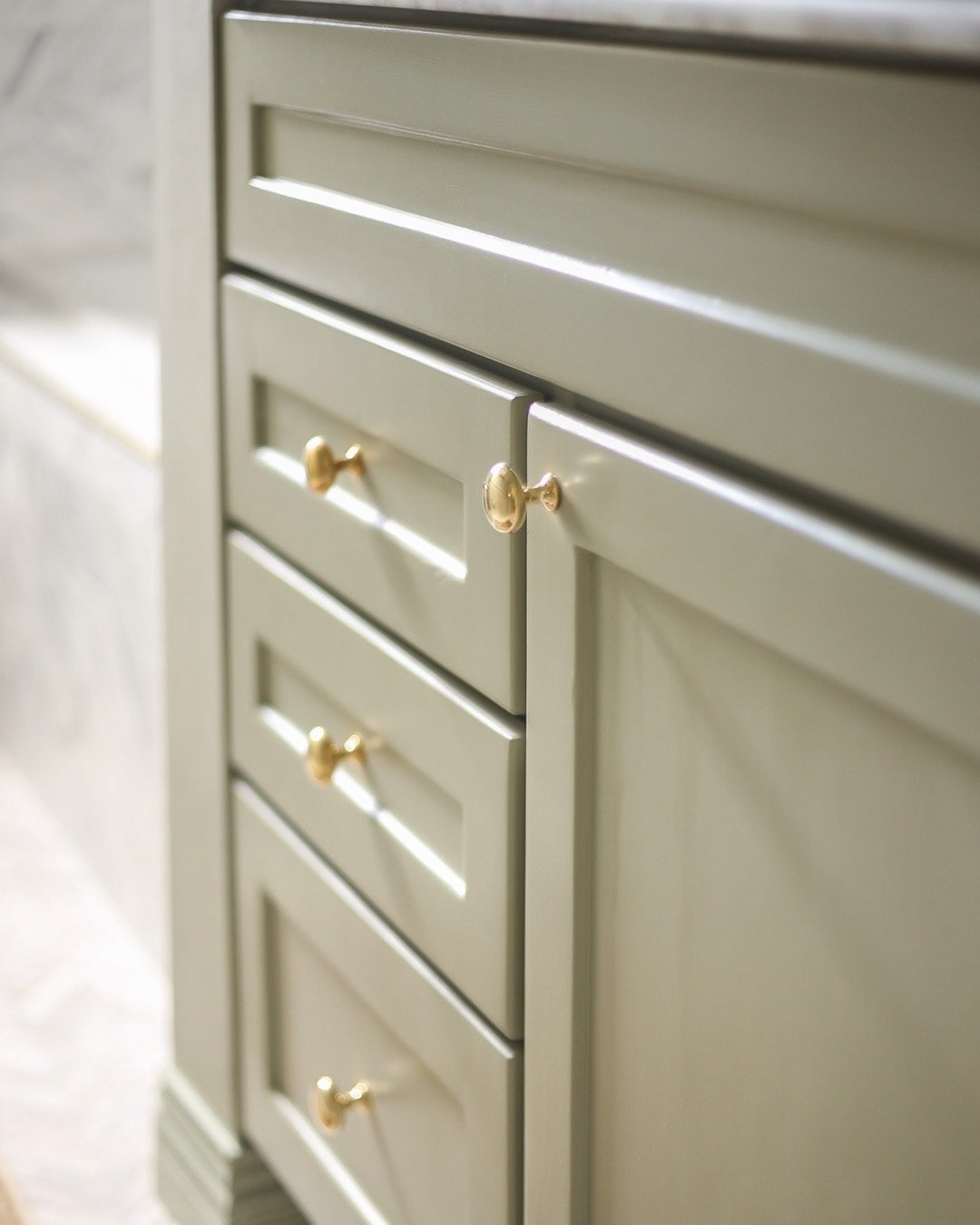
The Emtek 1 1/4″ unlacquered brass Providence knobs are the perfect knobs for this vanity. Aren’t they so charming?
THE VANITY FAUCET + SINK
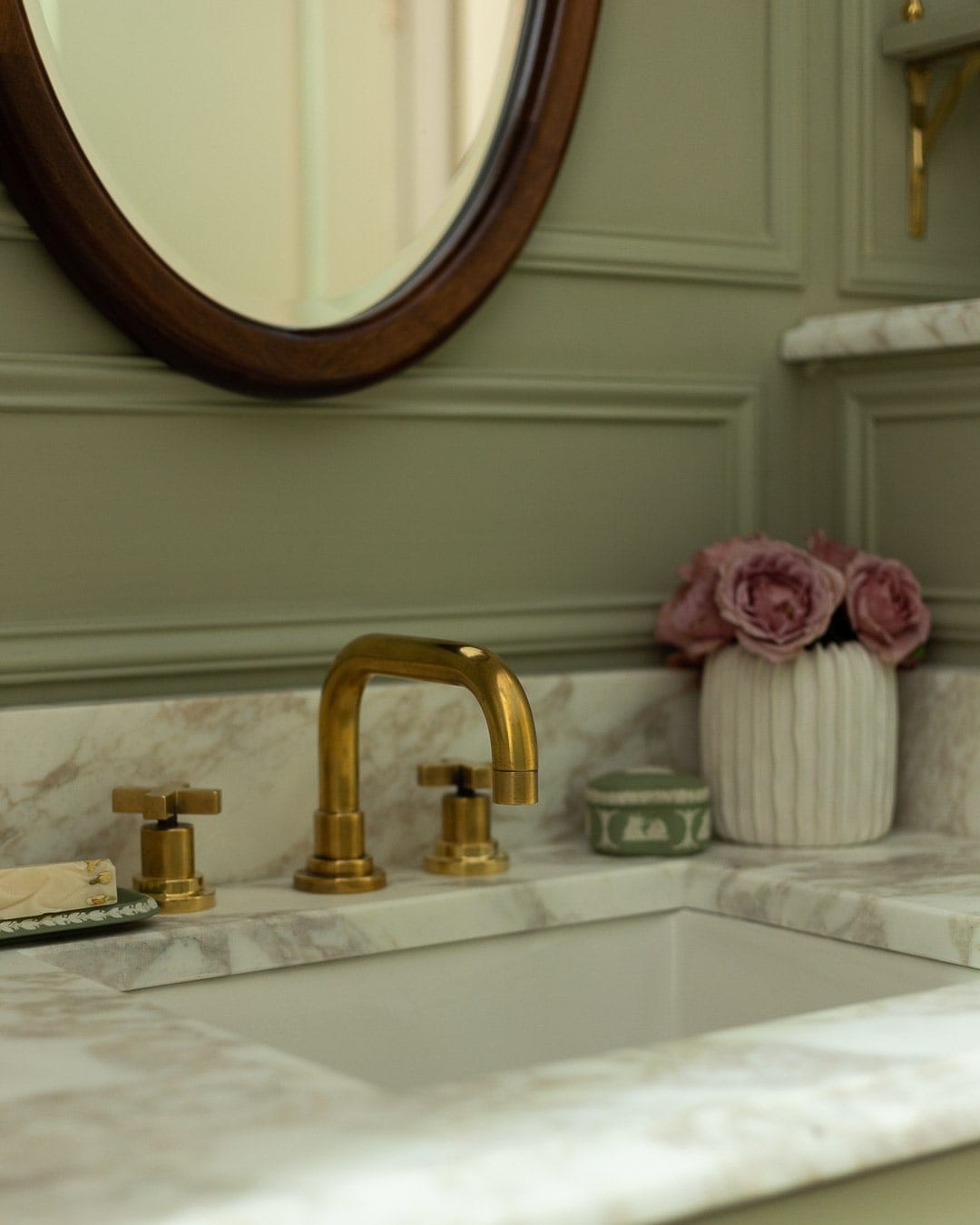
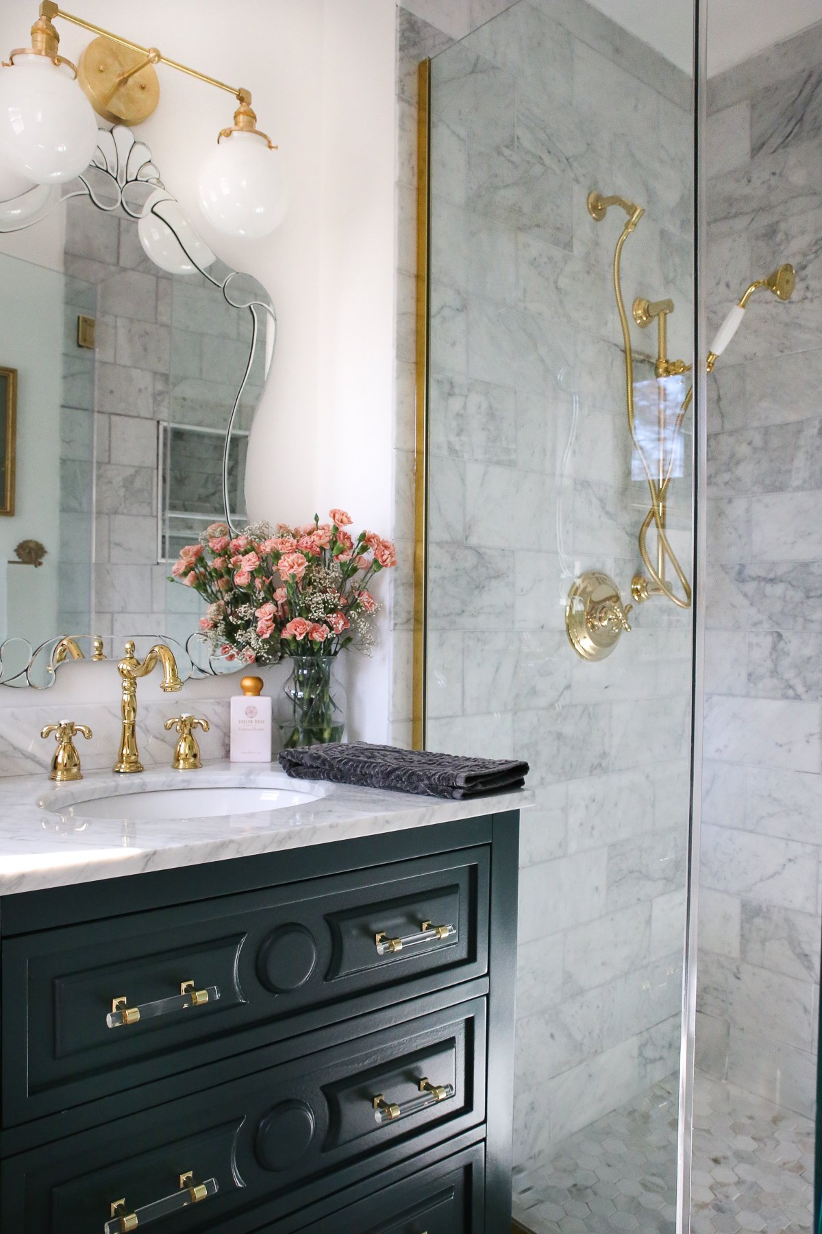
Build.com gifted us this Rohl unlacquered brass Lombardia faucet and it is dreamy, to say the least. The faucet appears as if it’s been used for quite some time because I sped up the patina process for this photoshoot (using this brass aging solution). I clearly can’t get enough of a good patina on unlacquered brass.
The Mirabelle undermount sink, also from Build.com, is just the right size for the 36″ vanity.
THE LIGHTING
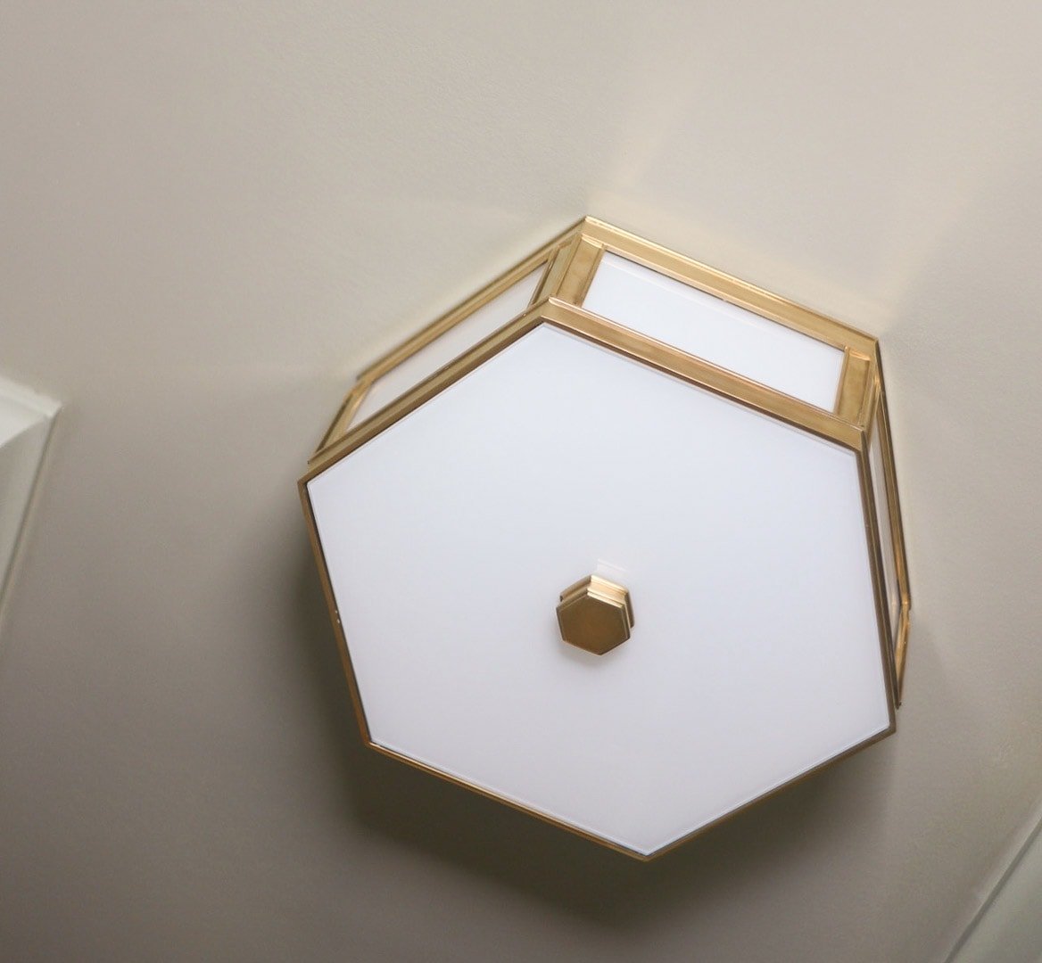
For the overhead lighting I envisioned a modern, medium-sized flush mount and the Nassau from Hudson Valley Lighting was the perfect fit.
I think it’s proportionately appropriate for the room and gives off just enough soft light throughout the whole room. The sharp edges pair well with the molding too.
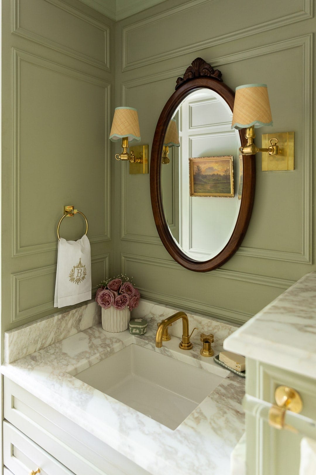
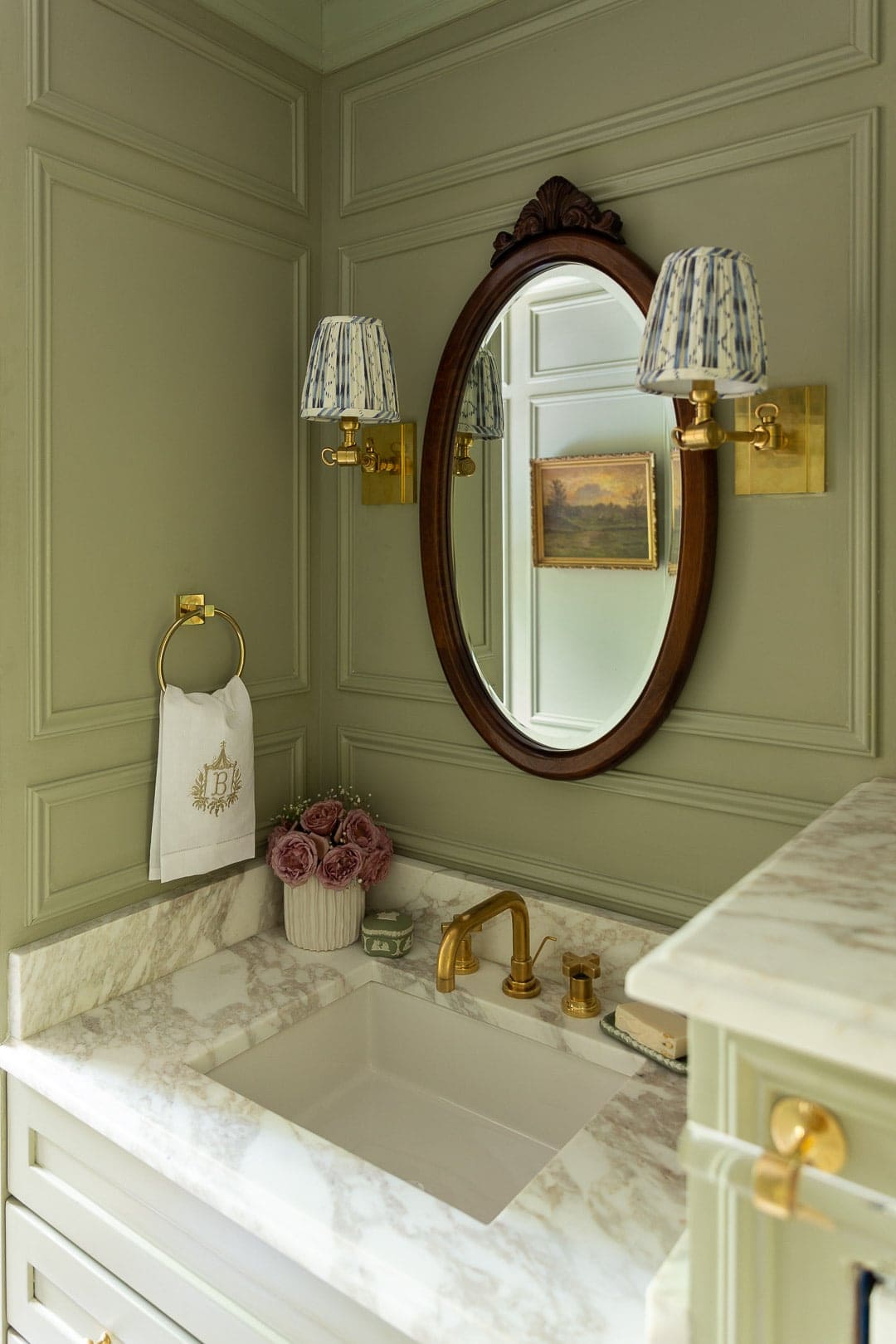
One of the questionable decisions I made early-on was to get rid of the overhead vanity light and re-wire the electrical to have scones on either side of the mirror. The vanity area is tight to begin with, and the sconces meant the mirror would have to be relatively small/narrow.
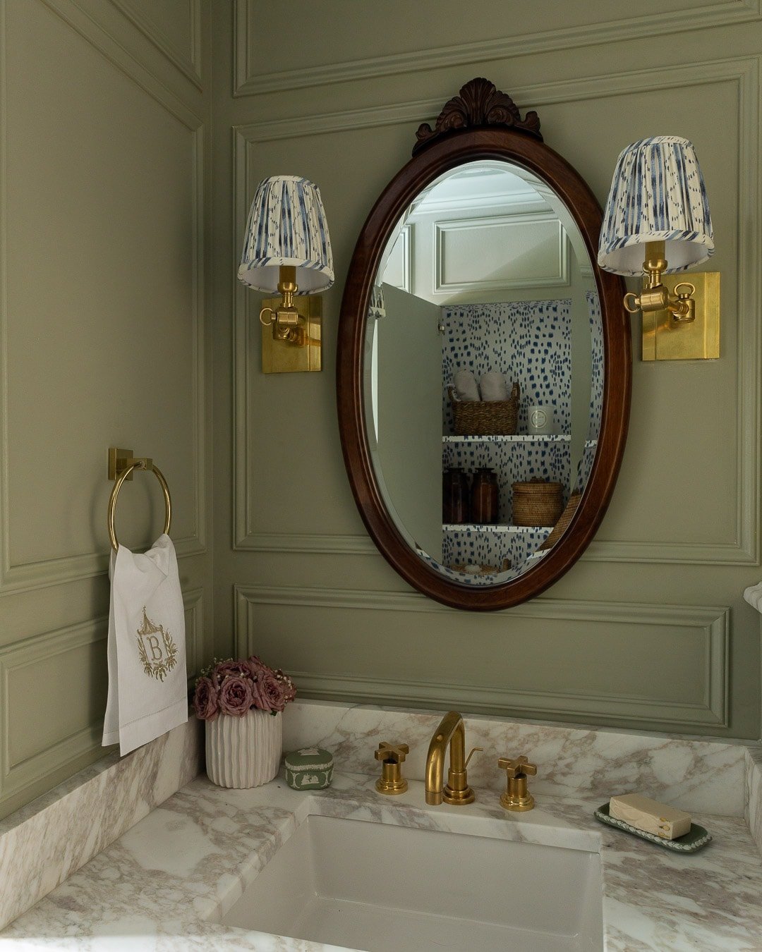
However, I couldn’t shake the thought of sconces in this room (and all the gorgeous sconce shade options to pair with them), so I opted for HVL’s brass Hillsdale sconces and I was still able to fit a beautiful mirror between in them.
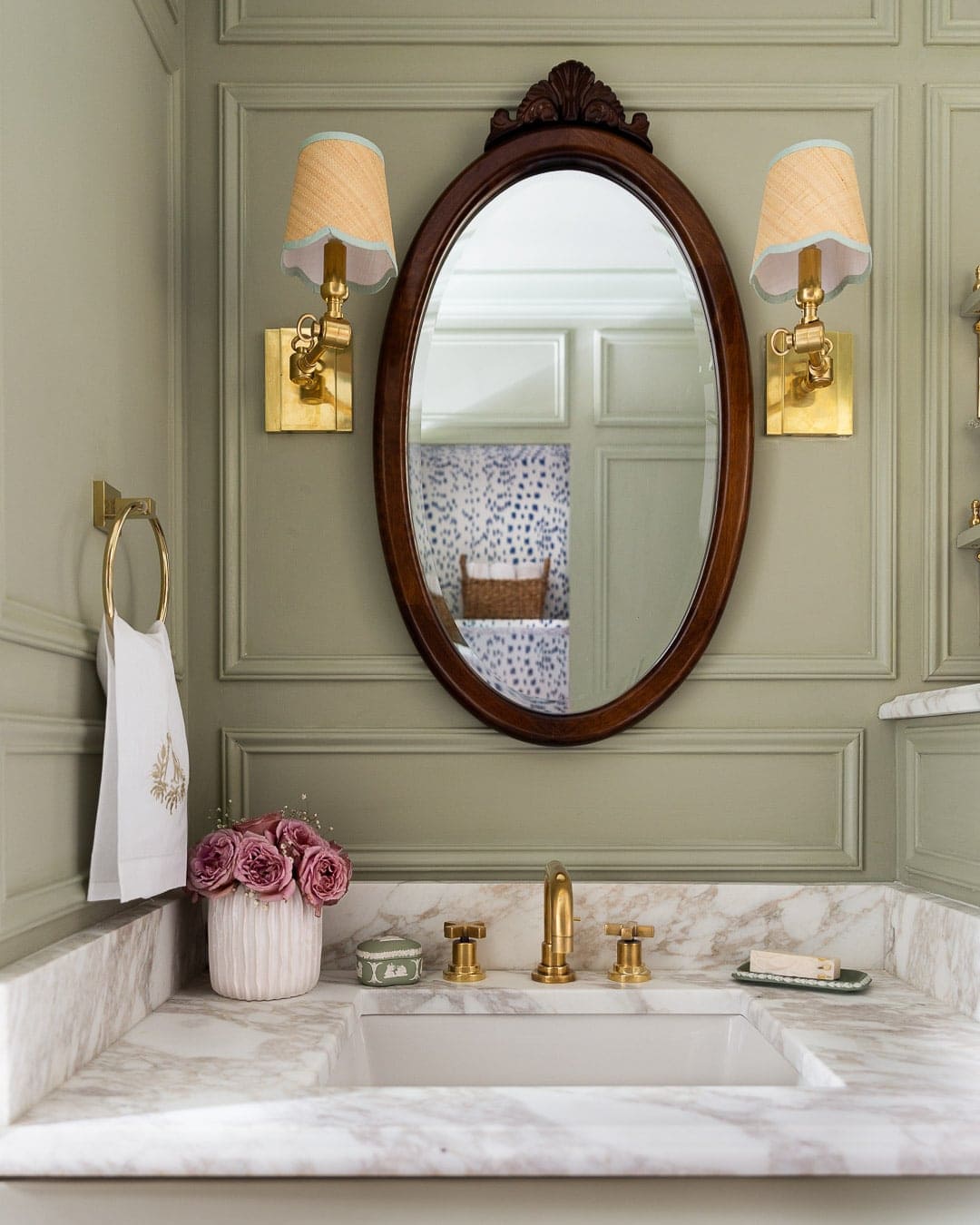
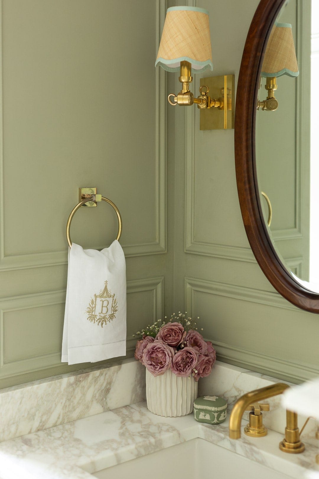
This mirror was a last minute Facebook Marketplace find and I love how the curves help to contrast the sharp molding lines and the wood brings some much-needed warmth to the space (thanks to my friend Sarah for convincing me it was *the one*)!
I ended up ordering two sets of sconce shades from Cruel Mountain designs and my god, their shades do not disappoint. The first set I ordered were custom pleated blue Lee Jofa Makassar fabric to tie in the blue from the roman shade. But then I noticed they were making scalloped cane shades and I thought oh dear god, these would be perfect for the bathroom. I chose a mint trim to tie in the mint from the runner.
It was so hard to choose which ones were the best fit for this space, so I swapped them out for different photos because…why not?!
THE WALLS + TRIMWORK
For monthsss I went back and forth on whether to do tongue & groove or box trim (like previous ORC’s) and green or taupe walls. You can clearly see the winners (and I’m so happy with the green walls + classic molding) but it was a hard decision to make.
I’m often asked “why Farrow and Ball?” and to that I’ll resort to the infamous SNL skit line: it’s a high-end British paint company that offers unparalleled depth and colOUR. The colors truly are richer and have more depth than other brands I’ve used. Yes, it’s on the pricer side but for me, it’s worth the cost.
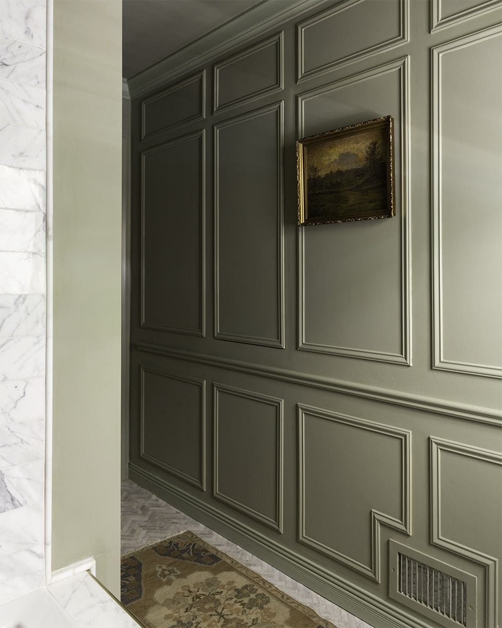
I really wanted to incorporate the 1×4 wainscoting and molding (similar to some of the inspiration photos I posted during week 1), but after consulting with my friend Lauren of StudioLaLoc, she helped me realize that I was over-complicating the molding situation and sticking with the classic molding that I’ve done in other rooms will make just as much of an impact. I think I became too focused on doing something different and a fresh set of eyes (and ears :D) helped me to understand that I was over-thinking and over-complicating.
I used the following Novo products for the molding (all sold at Lowe’s):
- trim for the boxes
- Chair rail
- baseboard
- door + window casing
- PVC crown molding
I love how chunky the chair rail is in comparison to the wall molding and how it works to visually divide the room.
I chose PVC crown molding (instead of the usual MDF) since the crown runs throughout the shower area, and I was nervous about the moisture with MDF. I thought PVC (which is essentially plastic) it would be a nuisance to paint, but I just used some Killz primer and it looks just as good as MDF!
Painting the ceiling the same color as the wall is one trick to make the room appear larger, but adding crown molding is (quite literally) the cherry on top. My sister-in-law stopped by to see the bathroom last night and she said she couldn’t believe how much bigger the room felt. I was like oh yes, that’s definitely the crown. Ha!

THE ART + ACCESSORIES
I kept the styling relatively simple for this room because I felt like the larger details spoke for themselves. But one accessory I was so over-the-moon about was this custom bud vase from Jill Rosenwald. Her gorgeous ceramic goods come in many different styles/colors/patterns and I think this small bud vase makes a big impact. The soft lilac color pairs so beautifully with the French Gray.
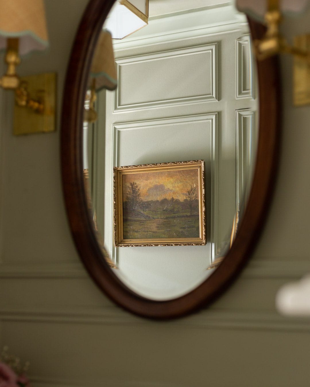
Landscape art was definitely a theme in this room, and I fell head-over-heels for Hannah Winters landscapes which I purchased from Shoppe Amber Interiors.
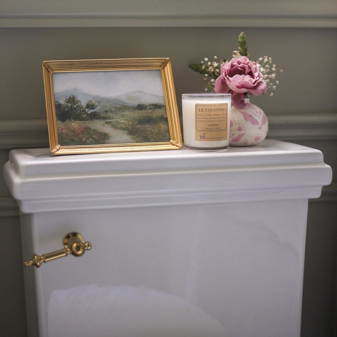
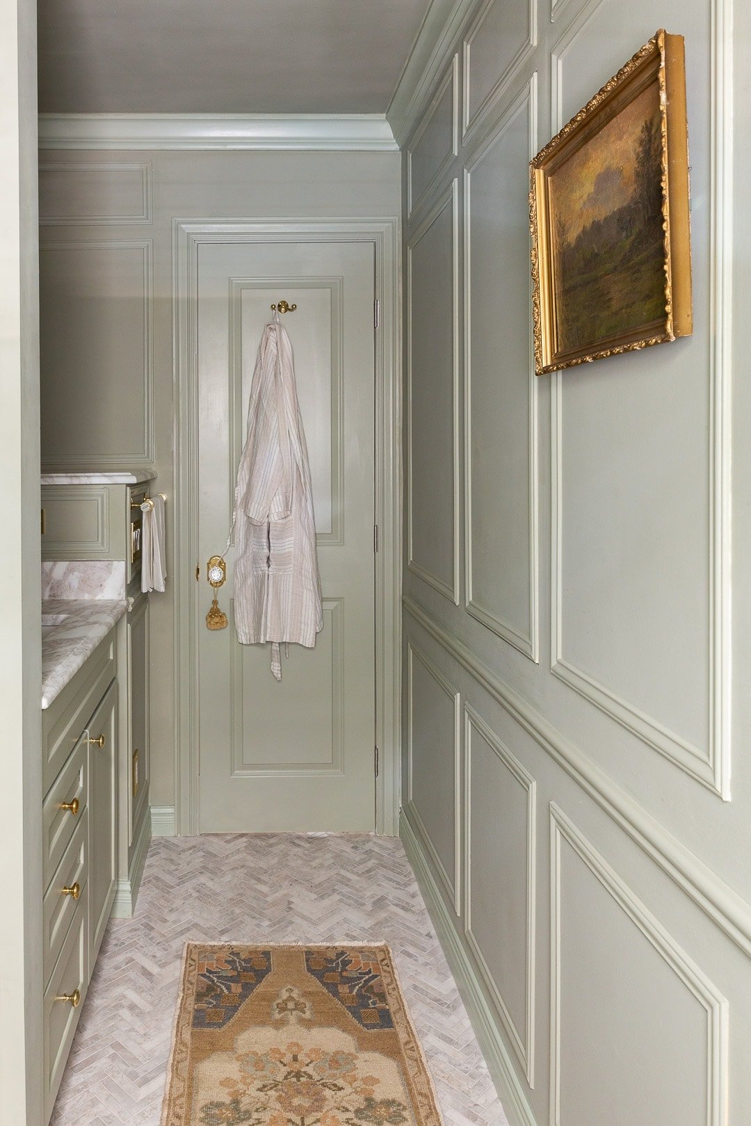
This colors in this antique landscape could not be a better fit with the French Gray. I snagged it on eBay (my go-to place for antique paintings) a few months ago and lucked out that it looks so good in here. Like it belonged.
LES TOUCHES SECRÉTE
When we demo’d the room, we noticed there was a space in the wall that almost seemed like it used to be a doorway, but it was right in front of the master shower. The thought of adding much-needed storage there came to mind but the idea didn’t get very far before we decided to put up drywall and called it a day.

But the thought of extra storage kept popping in my mind and although it took a lot of effort, I was able to convince Angelo that we should open up the fresh drywall and build a hidden cabinet there. He was not amused and after doing some research we realized it was not going to be an easy feat to get a functioning cabinet that sits flush with the wall that also somehow incorporates the molding we were planning to install. There were many nuances and details to figure out and at one point it didn’t seem possible to do in time for the reveal.
Angelo is into carpentry but hasn’t tackled anything like this, so he spent hours of his free time figuring out how to build this cabinet and it definitely paid off. The steps he took to build this hidden feature in the room is beyond me and I am forever grateful for him, his determination and attention to detail to get things done impeccably. I have to take a moment to give praise to him. He’s let me do my thing during previous ORC’s but this time around, we were a team. He’s been incredibly patient with me while I run around the house like a madwoman and is always asking “how can I help?” He grounds me. I’m not one to gush about how amazing my husband is but, he truly is a gem and this bathroom would not be what it is without him. id

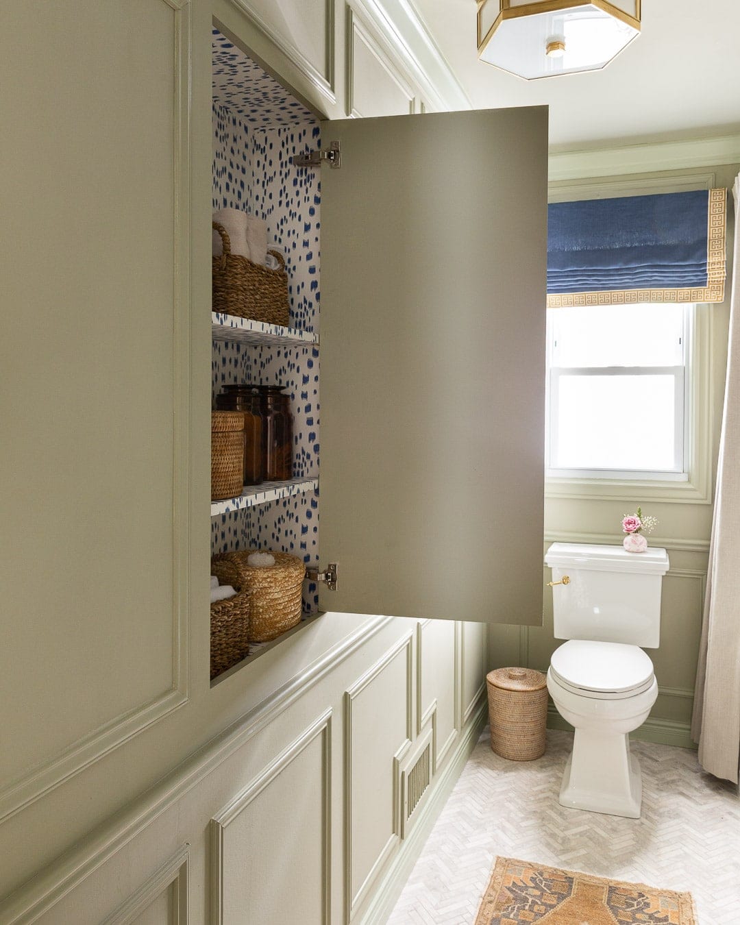
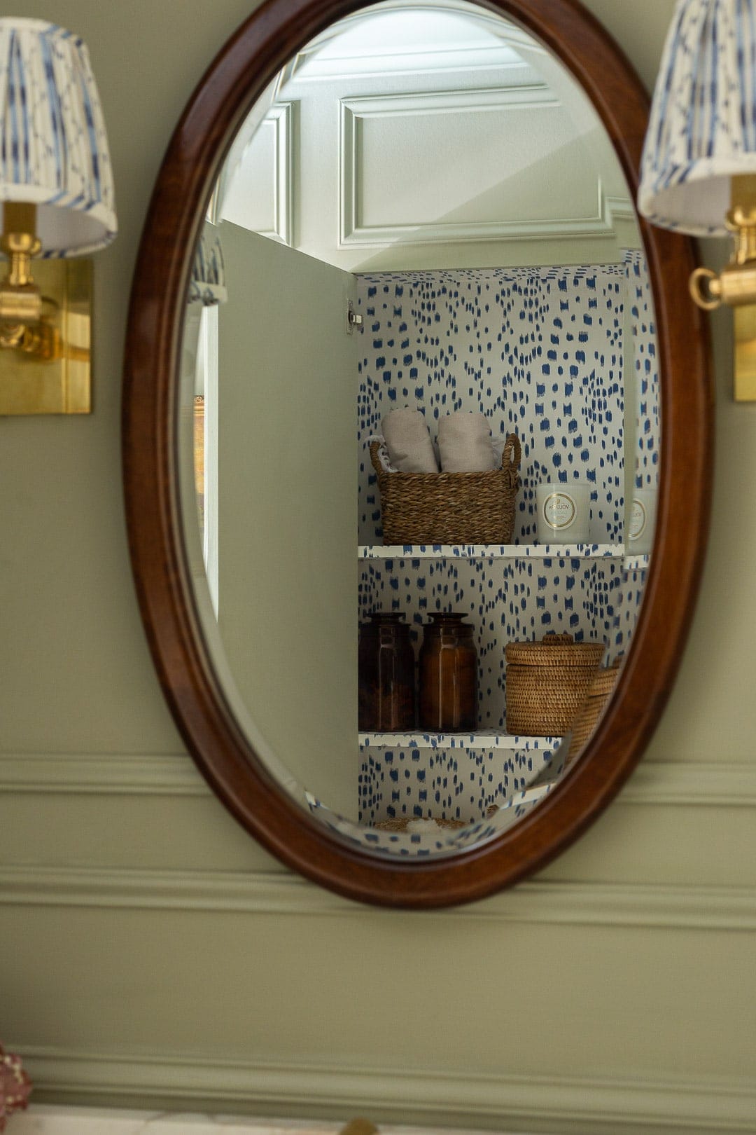
For the cabinet wallpaper I wanted something classic and fun, and decided on Brunschwig & Fils Les Touches in the blue colorway. Did you know “Les Touches” means the keys in french? At least that’s what the Google told me. But there aren’t any les touches to this cabinet because it’s a push system, LOL.
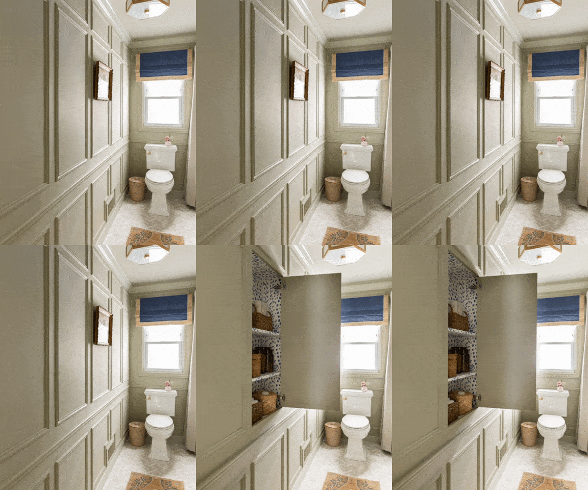
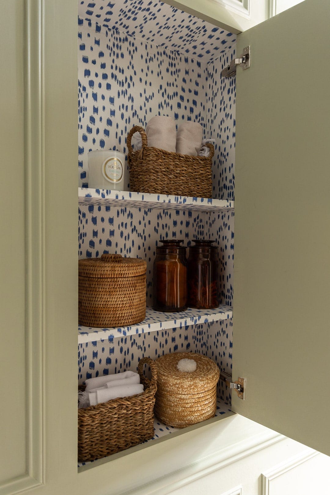
This cabinet definitely allows for a good amount of storage and makes up for what used to be the storage in the old cabinet that was over the vanity.
THE OPEN SHELVING
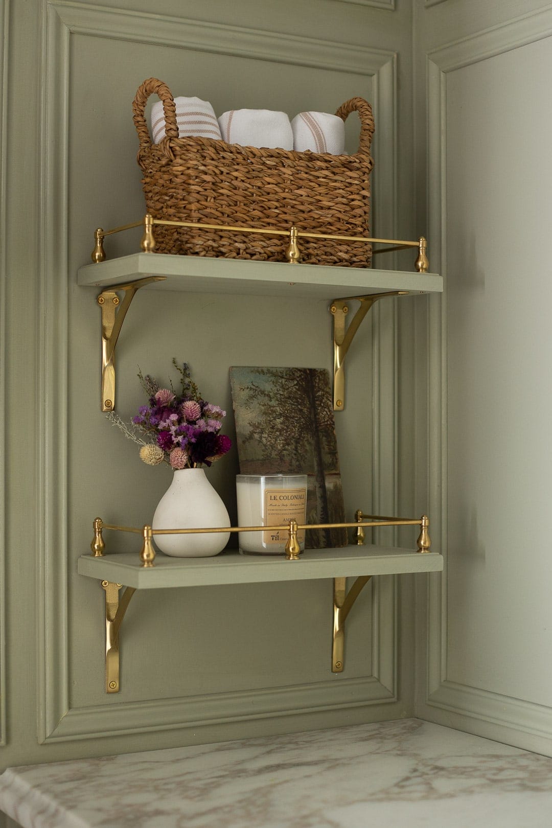
Last week while I was installing molding like an escaped psych ward patient, Angelo built the open shelves next to the vanity along with installing the brass rails.
He used poplar, cut them to size and used a router bit to make a subtle detail around the edges. In the words of my own mother, how stinking cute are they?! I think the brass rails are such a lovely detail to plain wood shelves. They’re from Vintage Hardware and you can purchase them here (for reference, I bought the larger brass gallery rails). If you want to see a tutorial on this, let me know!
Emtek’s Robe hook was perfect for the back of the door.
Every time I finish a room and reflect on the work that went into it, I always think to myself “oof, this was a labor of love” but guys, this room was truly a L A B O R of L O V V V E and for those of you who have followed along via IG, thank you for your kind and encouraging words and support over the last few weeks. It’s what kept me going!
A few before + after comparisons to show just how much this room changed…
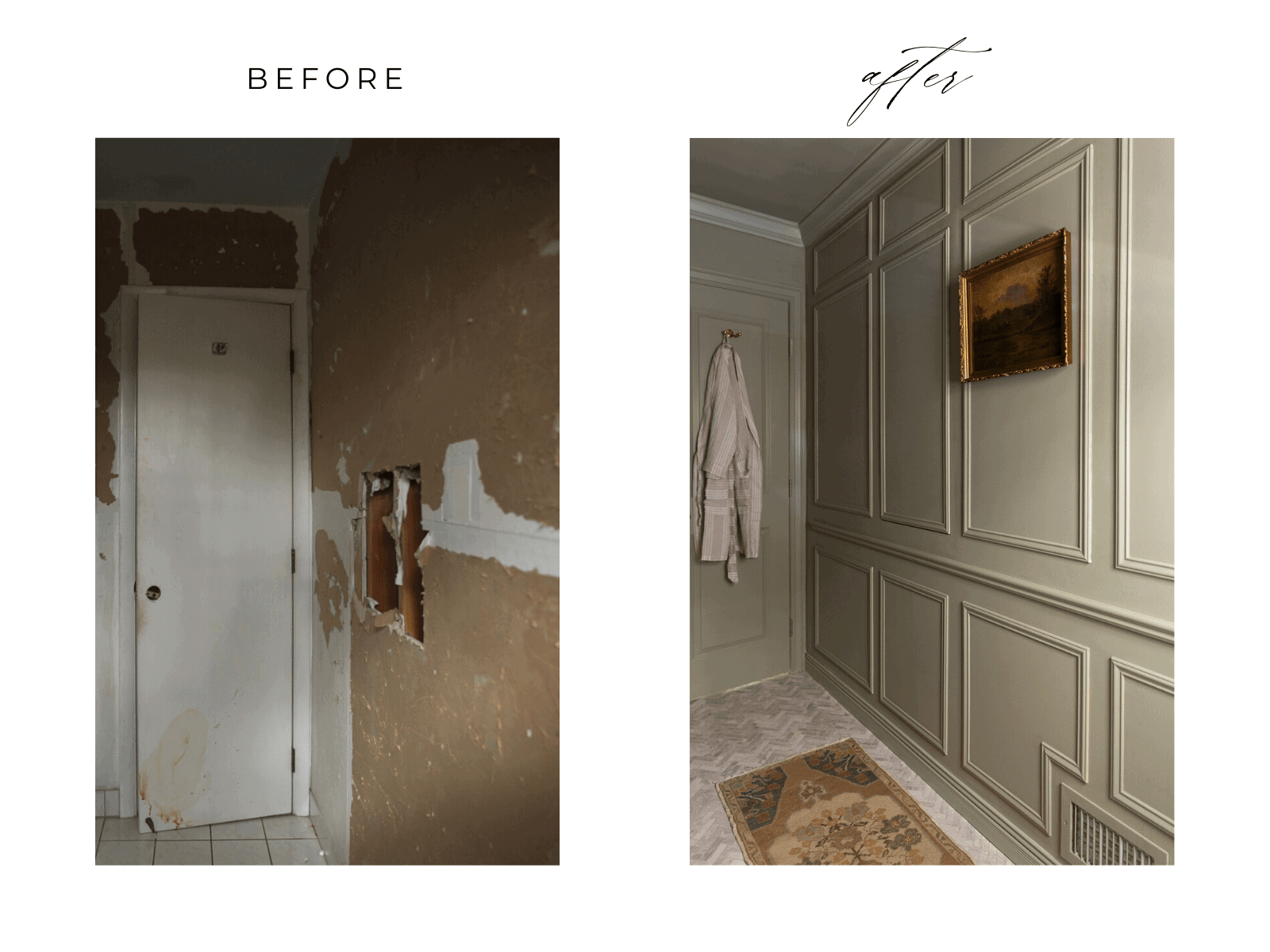
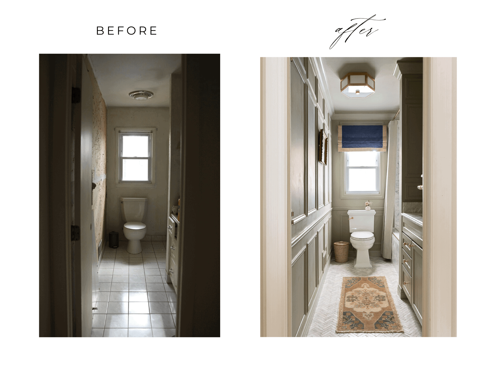
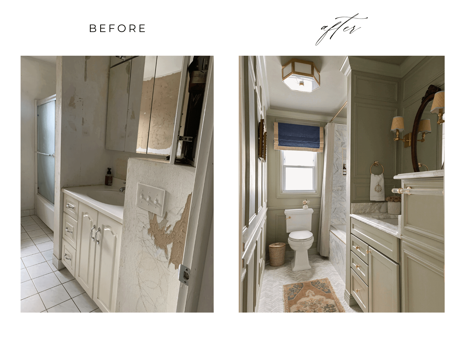
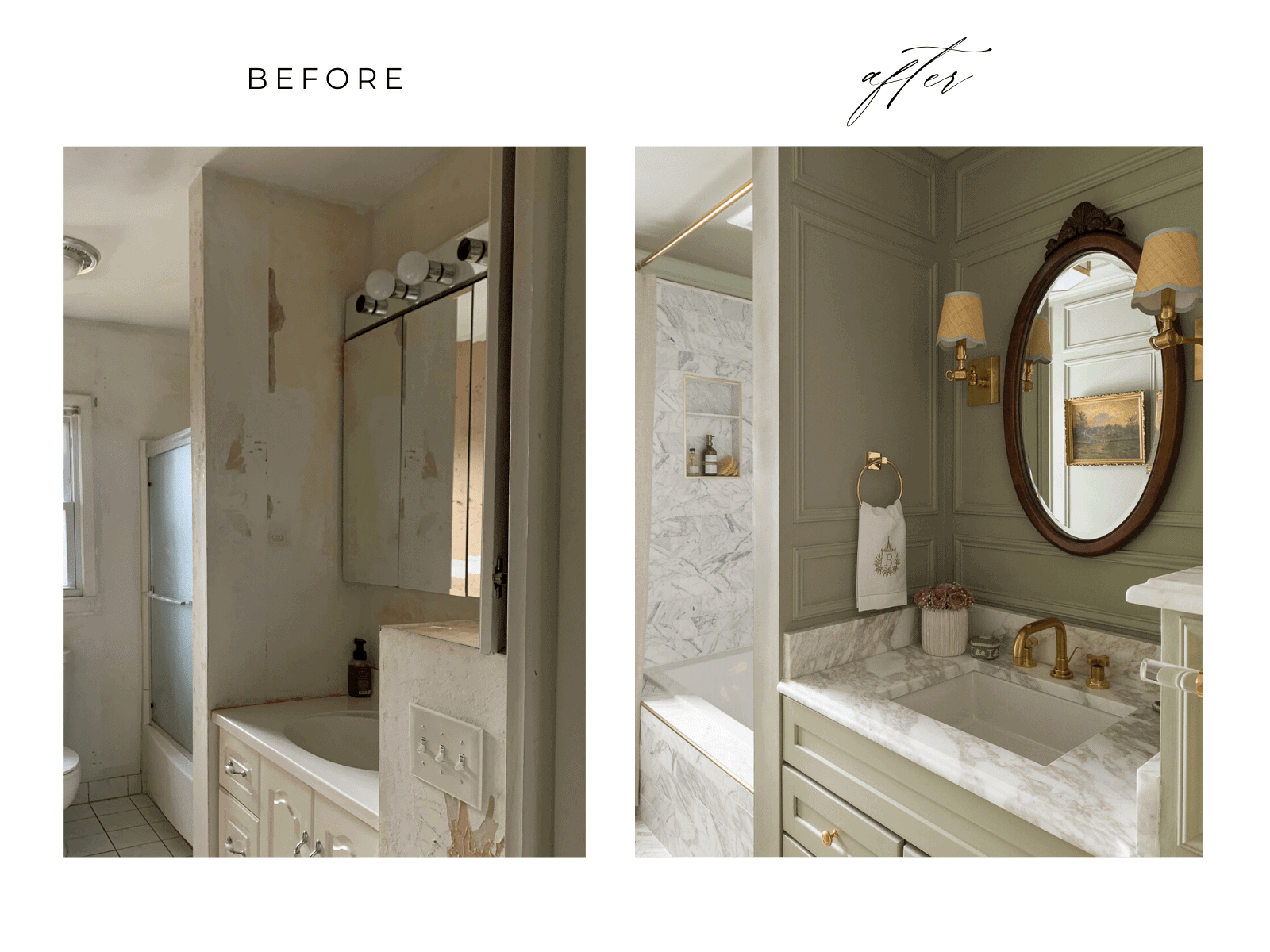
I’d like to give a HUGE thank you to Linda Weinstein, the creator of the ORC for starting and managing this bi-annual event. There is so much that goes on behind the scenes and I cannot thank her enough for doing everything she does. And I also want to thank the media partner of the One Room Challenge, Better Homes & Gardens!
This project came together in a way that completely surpassed all of my bathroom design hopes + dreams, so I want to thank the amazing and generous brands that I’ve been working closely with and am fortunate enough to have partnered with for this One Room Challenge.

Please don’t forget to check out the other featured designers’ reveals and the guest participant reveals starting tomorrow!
A Glass of Bovino | Beginning in the Middle | Beth Diana Smith | Clark + Aldine | Coco & Jack
Deeply Southern Home| Design Maze | Dwell by Cheryl | Erika Ward | Home Made by Carmona
House of Hipsters | Hunted Interior | Kandrac & Kole | Kate Pearce | Katrina Blair | Liz Kamarul
Veneer Designs | Rambling Renovators | Renovation Husbands | Studio Plumb | Media BH&G
To say you nailed it would be an understatement. This room was so awful and now it’s giving me butterflies. A bathroom gave me butterflies.
Quit your day job. You’re about to blow up, lady!
THANK YOU TRACEY!! 🙂
Love this gorgeous makeover, especially the hidden cabinet (genius) and the open shelves with brass rails! (Perfection!!) Those need to be showcased close up on your IG is well!
Thanks so much Janine! Oh, they will get there. Ha!
Alisa to say this is beautiful would be an understatement! You have outdone yourself! I was expecting so much from you and you blew my expectations right out of the water. Well done, so so very beautiful.
thank you so much Erin!!!
YESSSSSSSSSSSA GIRL!!!!!! This bathroom is amazing! Nailed it! I love the moulding and the wall color. Might be using this as inspo in the near future =)
thank you Kyla!!!!
I knew this would be a stunner! Wow!!! What a timeless and beautiful bathroom! Love every single detail
thank you so much Veronica!! That means the world coming from you! 🙂
I look ay DIY posts all the time, all over the web. I can honestly say this is beyond anything I’ve seen. It looks like a professionally created and executed design in a VERY posh home. I am utterly floored.
Wow!!! Thank you so much!!! What a lovely compliment ????????????
Beautiful! I would definitely love to see a tutorial on the shelf rails, I’ve always wanted to do that in my home!
thank you!! I will definitely be writing a post on that in the future!
Gorgeous girlfriend!! Love the way this turned out- amazing job! xo
thank you SO MUCH Sarah!! And thanks for your help + tips 🙂
So so pretty and perfectly moody. You made every space look so perfectly planned and intentional. My favorite space of yours yet!!!
thank you so much Jessica!!! <3
Fabulous! Your attention to details is goals! The moldings, wall color, the pops of brass (even on the tub surround and nook!) the hidden storage! Awesome.
thank you Cynthia!
S.T.U.N.N.I.N.G!!!!
thank you Arli!!
This room is exquisite, it is a truly unbelievable change from what you had. So polished and serene.
But we have got to talk about your husband’s carpentry skills — that hidden cabinet in the molding is INSANE!! And when you say he had to figure out how to do it??! Wow!! And I love the playful wallpaper inside — so fun.
Congratulations on a gorgeous accomplishment.
thank you Kim!! I know, I seriously couldn’t even wrap my head around what he is capable of! He is so skilled and it blows my mind.
OMG Alisa this is beyond gorgeous! the marble (can’t believe you scored that for a song), the DIY finish on the faucet, the vanity totally looks whole and zero compromised due to the staircase … best of all, I felt like I just got transported to a super chic home in Paris!! don’t be surprised if I come for a visit one day .. even just to hang in that gorgeous tub!
What an honor to work alongside with you … so much fun to follow along and yay the final color choice is perfect!
wow, thank you so much Tim! I truly appreciate your support over the last few weeks and it was an honor to work alongside YOU!
Your husband did an AMAZING JOB on the medicine cabinet. I followed your renovation didn’t notice the cabinet in the final reveal until I saw in the picture w/ the door open. Magazine worthy. ????????????????????????❤
oh goodness THANK YOU!!! Isn’t it so cool?! I’ll never get over it LOL.
Love this bathroom – and I just realized it’s the same layout as our bathroom. I also wanted to swap the tub/toilet location – but this makes it look good, and the tucked-in vanity is definitely intentional (as you say!).
thank you Nicole! Ugh, isn’t it frustrating?! I think working with what you have can turn out to be a challenge but more rewarding in the end!
(Quiet tears falling down my face) I am so fucking proud of you and your hubs. What an amazing accomplishment. When I think back to our private IMs and my horror at the bathroom vanity weirdness. Those darling shelves and rails, now it can be said, what weirdness? The secret shelving too. Gahhhh, the blue is strong but ohhh so great. The inspirational runner is so luxe and such depth of colors, that the art mimics. I am so in love with the sconces and woven shades with mint trim. WHAT a classic. I have been with you thru 3 previous ORC, you get better and better. You’re still insane but you are also ???????? I love your madness to ⚰️(most days) ????. I will continue to gush. Enjoy your space and accomplishment. ????
hahah oh my GODDDD you just made my day!!! THANK YOU 1. for the kind words 2. for sticking by all these ORC’s while I continue to lose more and more marbles and 3. for your support! I truly appreciate it.
???? love everything about it.
Definitely would love a tutorial on the cute shelves!
yay! thank you so much Allie!
It is absolutely stunning. I love every detail. Congrats.
thank you, Deb!
To be honest, I was not sure how that vanity situation was going to look awesome. But, OH MY GAWD. You did it. The tile, the secret cabinet, the brass, the vintage landscapes, the sconces! Every detail just sings, but the two paint colors make me want to do somersaults! I love, love, love, love the subtly different shades of green SO MUCH. This is the benefit of paint obsession, and I am here for it. Bravo!
Oh wow, thank you Peggi!!! I truly appreciate that. The different greens were a spur-of-the-moment decision and I’m glad I did that!
You absolutely KILLED IT!!! So many beautiful details and creative workarounds for a small space. The vanity is sheer brilliance! I wasn’t crazy about the paint colors at first but the more I savor each photo it’s grown on me and now I’m loving it! I would love to see a tutorial on the little shelves – we are about to renovate our master bath and I think something like this would be perfect in one corner!
This is the most stunning transformation! You must walk in every day (now that you’re done) and just grin. I love everything, especially the secret cabinet and the way you kept the same layout.
thank you very much Jennifer!
This bathroom takes my breath away and I would absolutely love a tutorial on the floating shelves with the brass rails! Gorgeous!
thank you Carley!!
I seriously forgot what the before looked like and all the issues you had to work around!! There are so many details that take this bathroom over the top. I cannot believe how much personality you packed into this small space
This looks amazing! I am so impressed. I am inspired by so many different things. First up, those adorable shelves! I would love to see a tutorial. Second, the molding is so elegant. I will be referring back to this post to look closely at details. Third, the herringbone floor! Wow! I have been a fan of the ORC for years. I appreciate a good reveal. Your reveal is one of the best I have ever seen!
WOW, thank you so much Jennifer!!!
This transformation is amazing! I loved following along with your design decisions and hearing about how you made your choices. I’d love to see a shelf tutorial. Congrats on a great room!!
thank you so much Frances!!
I KNEW you were going to deliver an amazing makeover! The bathroom is STUNNING! So elegant, regal and classic.
THANK YOU OSCAR!!!!! 😀
So gorgeous and thoughtfully planned, couldn’t expect anything less from you! Btw, I think “les touches” means brush strokes in this case, as in the way the pattern looks like brush strokes! Anyways, love it all!
oh, crap. hahah!!! thank you Estie!!!
This is REMARKABLE! Absolutely beautiful! love all of the details. That hidden storage is brilliant! Congrats!
thank you Haneen!!!
Oh Honey, you spared no detail. I love how you gave so much architectural interest in such a small space. Even with all the lovely details, nothing feels overbearing in any way. And your choice of paint color, perfection!!
thank you so so much, Erika!!!
You and your husband are incredibly talented! I really love this transformation along with your other spaces! Every little detail feels intentional and cohesive. That hidden storage is genius. Classic design at it’s finest. Can’t wait to see what you do next!
wow, what a compliment! thank you so much for the kind words 🙂
Stunnning! I love the color of the cabinets and walls so much
thank you SO MUCH!
Thank you Julia!!
Very beautiful. I want to add trim to my powder room and I see a link that you posted, but the link says “chair rail.” Is that what you used or did you post the wrong link? I love this look! Thanks!
Hi! That’s the right link. It can be used for chair rail or wall molding!
GENIUS! THANK YOU SOOO MUCH!!
Beautiful bathroom but why didn’t you raise the shade over the window to cover the top molding on the window?
Hi Mary. The style of Roman wouldn’t have looked right if I hung it above the molding. I also wanted the molding to peek through the top of the Roman, because it visually aligns with the rest of the room 🙂 🙂
I noticed that it aligned with the shower curtain. I have the same type of shade in my bathroom and it looks fine about the molding. I have never seen it hung like that unless it was an inside mounted shade.
This is glorious! I love how it all came together. I am especially O B S E S S E D with that hidden cabinet! Any chance Angelo could write up a DIY? I have a bathroom that needs to be gutted with no storage space and it’s crying out for the same solution!
Thank you Lori!!! I would love for him to do that.
It turned out great!
Thanks Jami!
Wow. What a transformation! It is gorgeous! I love all the details. I’m really enjoying watching your home come together into the style you love. It’s really tying all together so beautifully! I’m inspired by this as I try to figure out a style I truly love in my own home. Your hard work and attention to detail are remarkable.
Thank you SO much Nikki!
Thank you so so much Nikki!!
This is so lovely and romantic! The before and afters, wow! I think the sink/vanity is my favorite spot. How did you get the walls clean of the leftover wallpaper backing?
Thank you so much!! We skim coated.
So amazing! Love it all. Xxo
Thank you Cori!!!
Now that is a transformation! What an absolutely stunning bathroom. I just adore that sage green color and all of the beautiful moulding. And that perfect runner – WOW. You did an incredible job!
thank you SOOO much Stephanie! I truly appreciate that!!! 🙂
Stunningly beautiful bathroom! I especially love the 2 shelves with the Vintage Hardware rails. Can you please share where you got the shelf brackets? Thank you!
Hi, this bathroom is so gorgeous. Would you ever be open to doing a budget breakdown post of the project?
I have searched high and low for the perfect color for a vanity and this is it; how do I find a vanity that can be painted like this? I don’t see anything like this on Built.com that’s unfinished. I love this color and this whole look!
Hi Sarah! I actually painted it French gray to match the rest of the bathroom.
Beautiful bathroom! Did you ever post the tutorial for the shelves?
I love the Calacatta stone vanity top in your bathroom. Would you mind sharing the details, such as the source, the particular marble and the edge you chose? Thank you!
Love this!! Do you mind telling me what brackets you used for the wall shelf please?
Thank you so muc for inspiring me with so many great ideas.
Loves the roman shade and shower curtain mix for textile, the results look amazing. and combining old, absolutely love your taste. thanks for the effort and sharing this journey and information!
Wow! I am so impressed with how you were able to completely transform this bathroom without a major layout change. The use of calicio textiles and marble tile is truly luxurious, and the unlacquered brass hardware adds a beautiful, unique touch.
I’m also particularly impressed by how you were able to make the small space feel so much larger. Would you be willing to share some of your specific design tricks for maximizing a small bathroom?