EEEK! I’m so so excited to share our dining room plans with you today.
One of my absolute favorite parts of a project is this dreaming and scheming stage, which is what I’ve been doing for our dining room over the last few weeks. It springs me out of bed in the morning. I can’t say everything in between is as glamorous, so I’ll ride this high while I have it.
When we bought our house, we immediately knocked down the wall between the kitchen and the dining room (without having a full plan – don’t recommend), and we haven’t finished off the wall since. Mostly because we have no idea what we’re going to do in that area when we renovate our kitchen.
Anyway, the kitchen side of the dining room kinda looks like shit.
Here’s an evolution of our dining room…
When we bought the house:
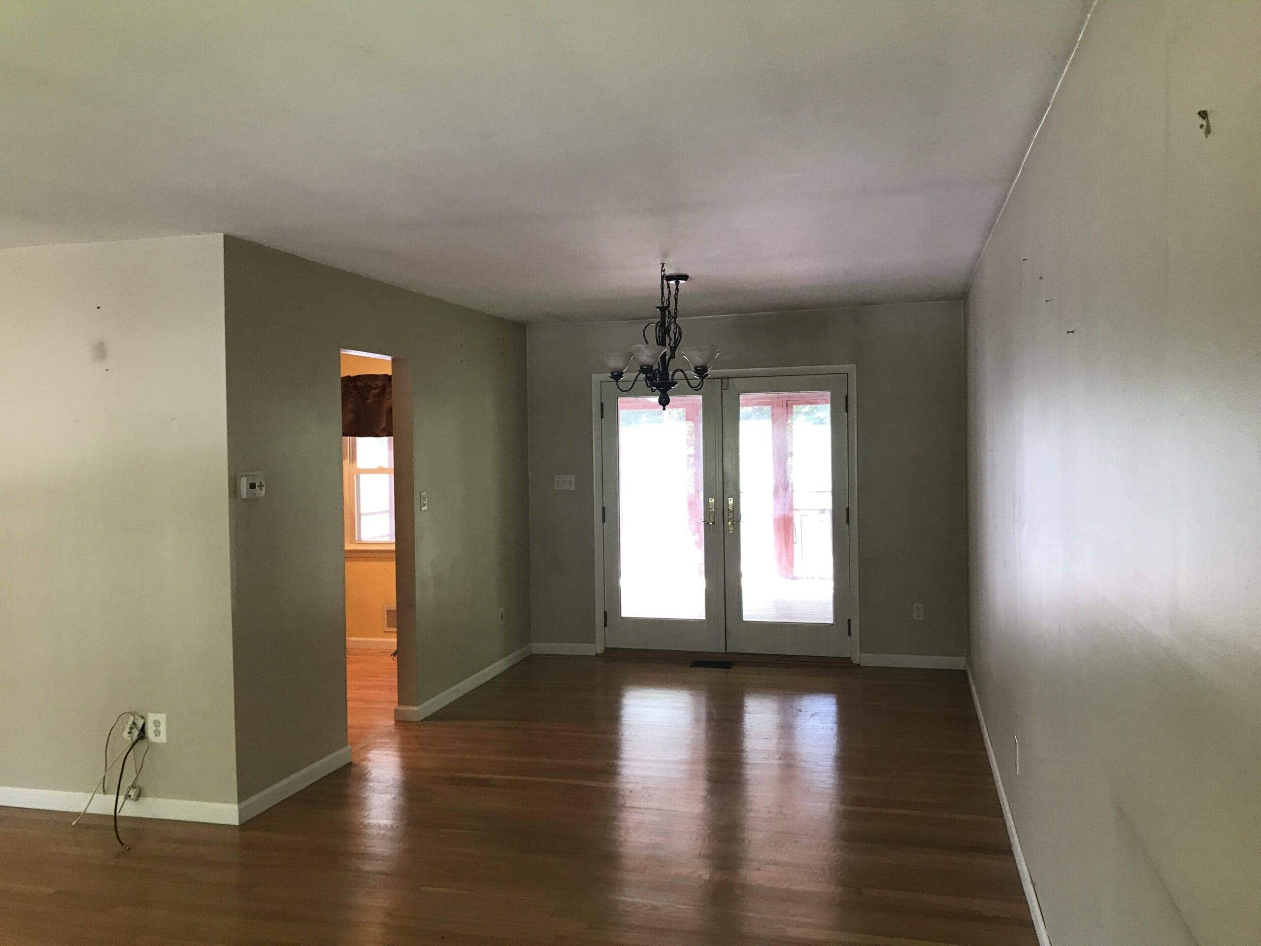
After we knocked down the wall to kitchen (view from dining room into kitchen):
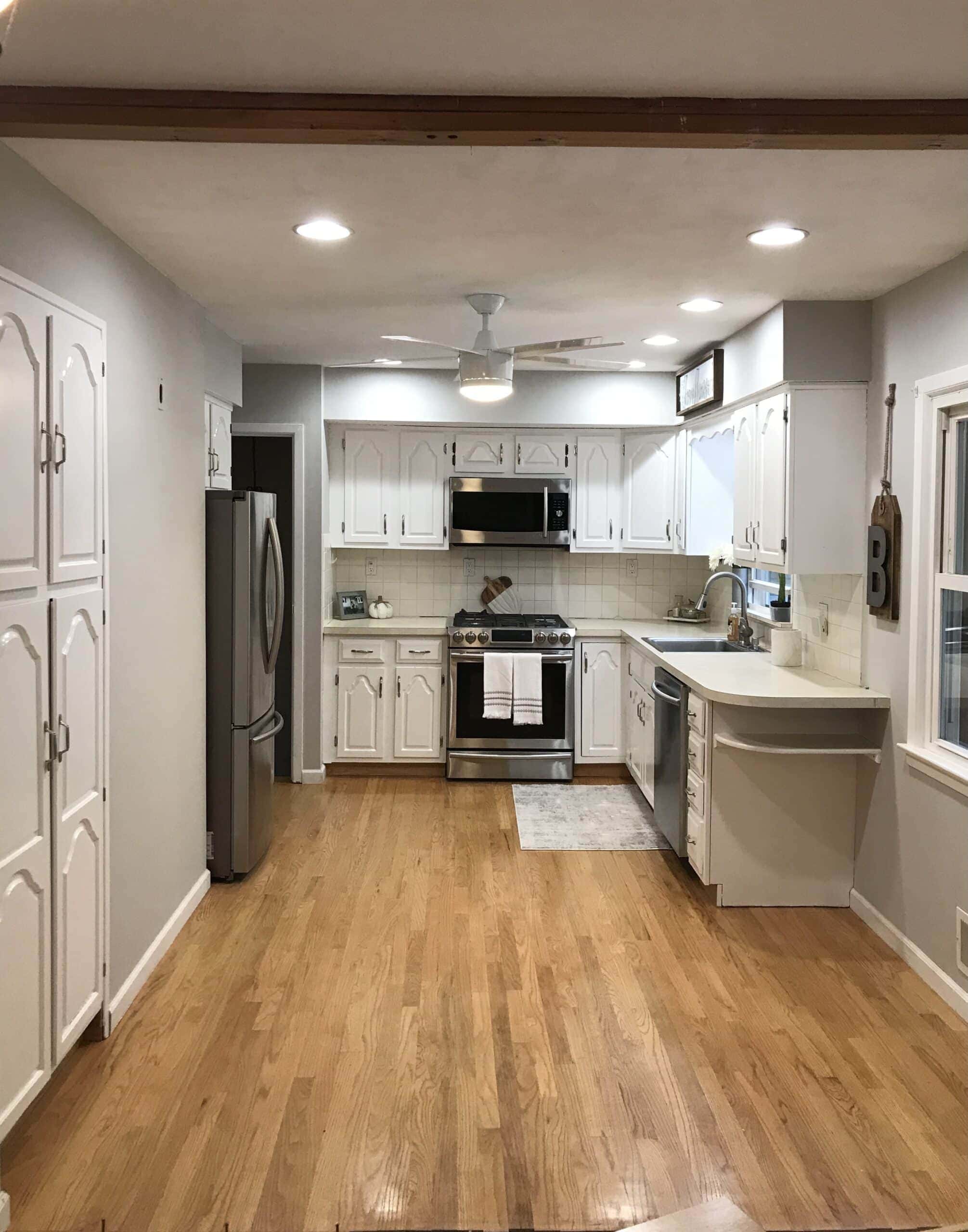
(that’s absolutely a FARMHOUSE sign over the sink, don’t @ me before reading this post)
The ugly area between the kitchen and dining where the wall once was:
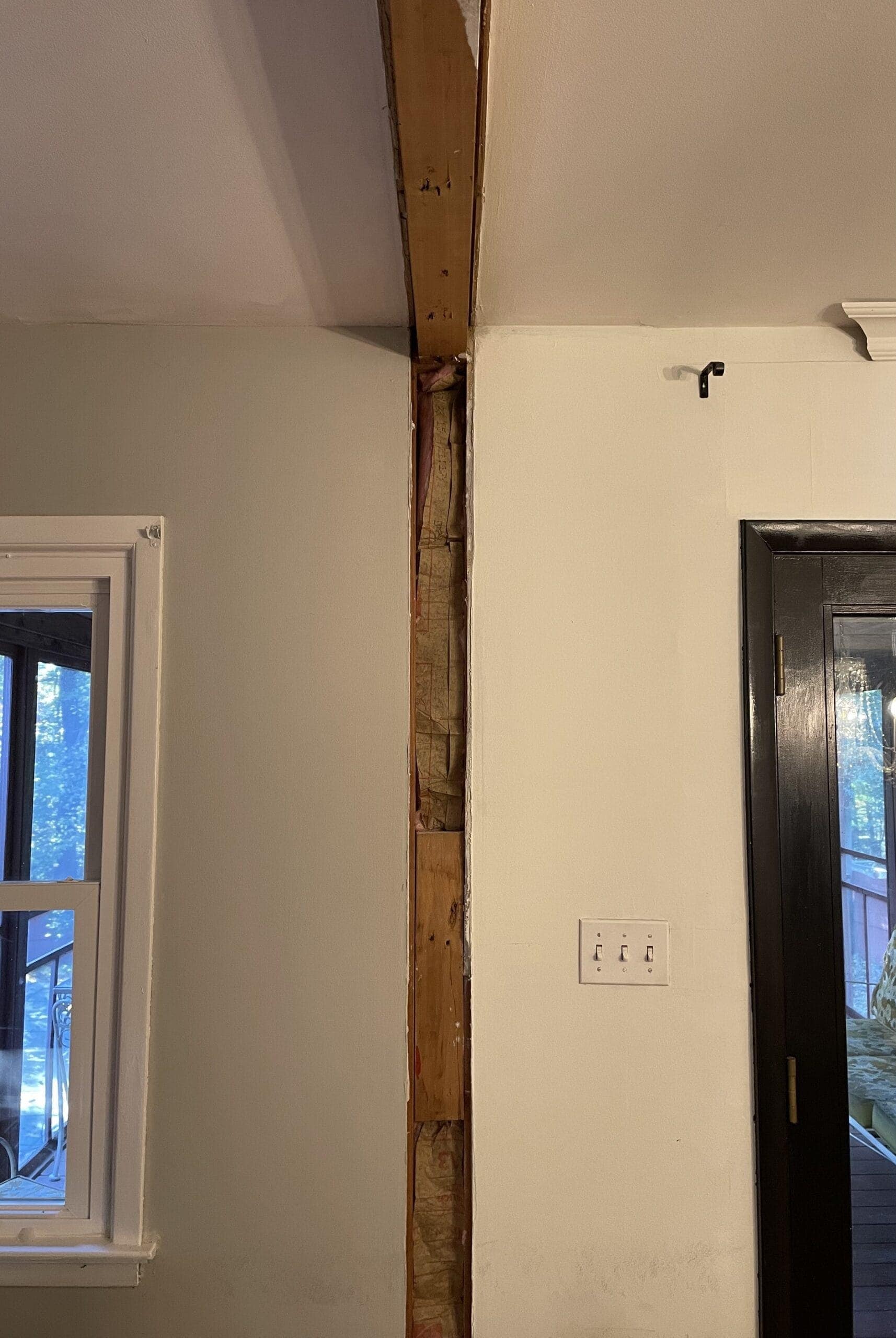
View from the kitchen (the day I primed the cased opening):
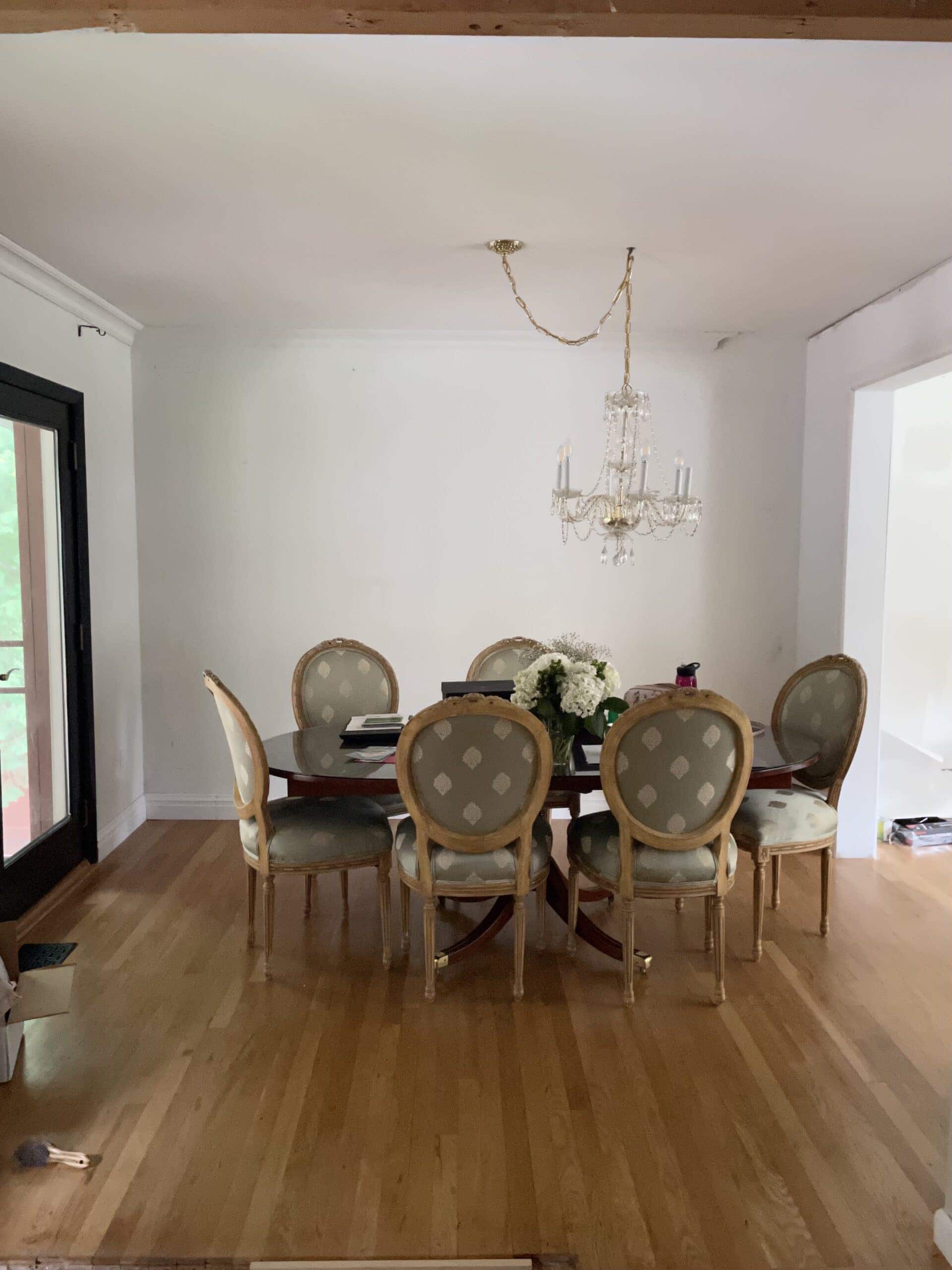
View from the dining room french doors to the living room:
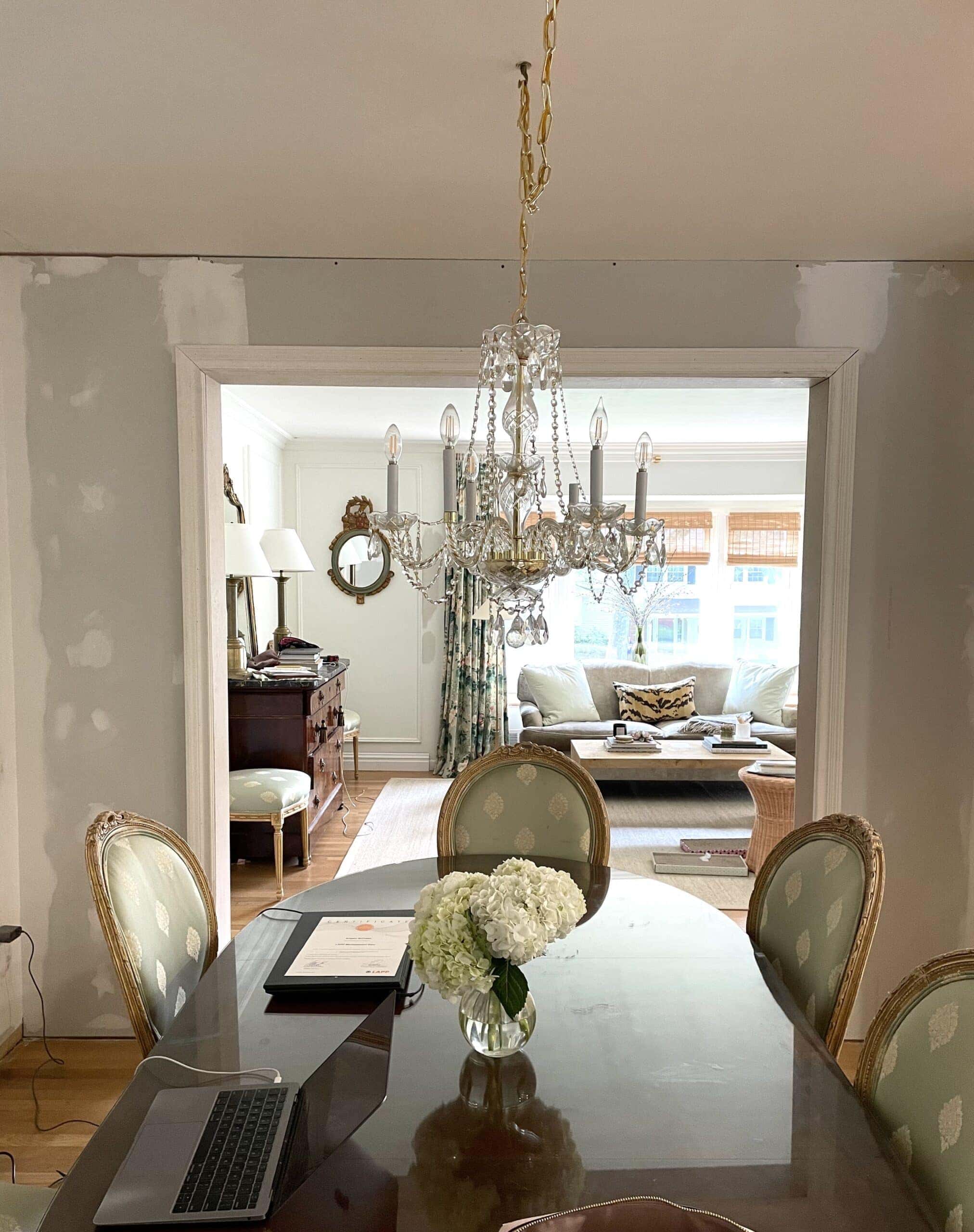
Since we built the cased opening to separate the living and dining room earlier this year, I’m able to treat these rooms as completely separate spaces, which is something I did not previously have the luxury of doing.
The total size of the dining room is about 10′ long x 9′ wide. It’s definitely a smaller and more intimate space, but I’m working with it.
There’s actually not that much manual labor to be done in our dining room besides finishing crown/baseboard, framing panels, closing off the gap in the wall between kitchen and dining, painting, and sourcing secondhand items (lugging shit in/out of your car and up/down the stairs is absolutely manual labor).
I “presented” the living room and entry concept last year in a slide format (made in Canva) and it was a hit, and I thought I’d do the same for our dining room. So without further ado, let’s dive in.
Some points I want to mention about the design:
Full transparency, I’m trying to decide between The Mural Source panels and Gracie panels. Gracie is classic, hand-painted chinoiserie whereas Mural Source is printed. The cost difference is pretty big, and Gracie would be ideal, but I have a few samples from The Mural Source and I have to say, I’m really impressed with the quality/detail.
Pictured below is the color palette for Gracie Skylark, Gracie Hampton Garden and a sample of Mural Source Maysong Spring:
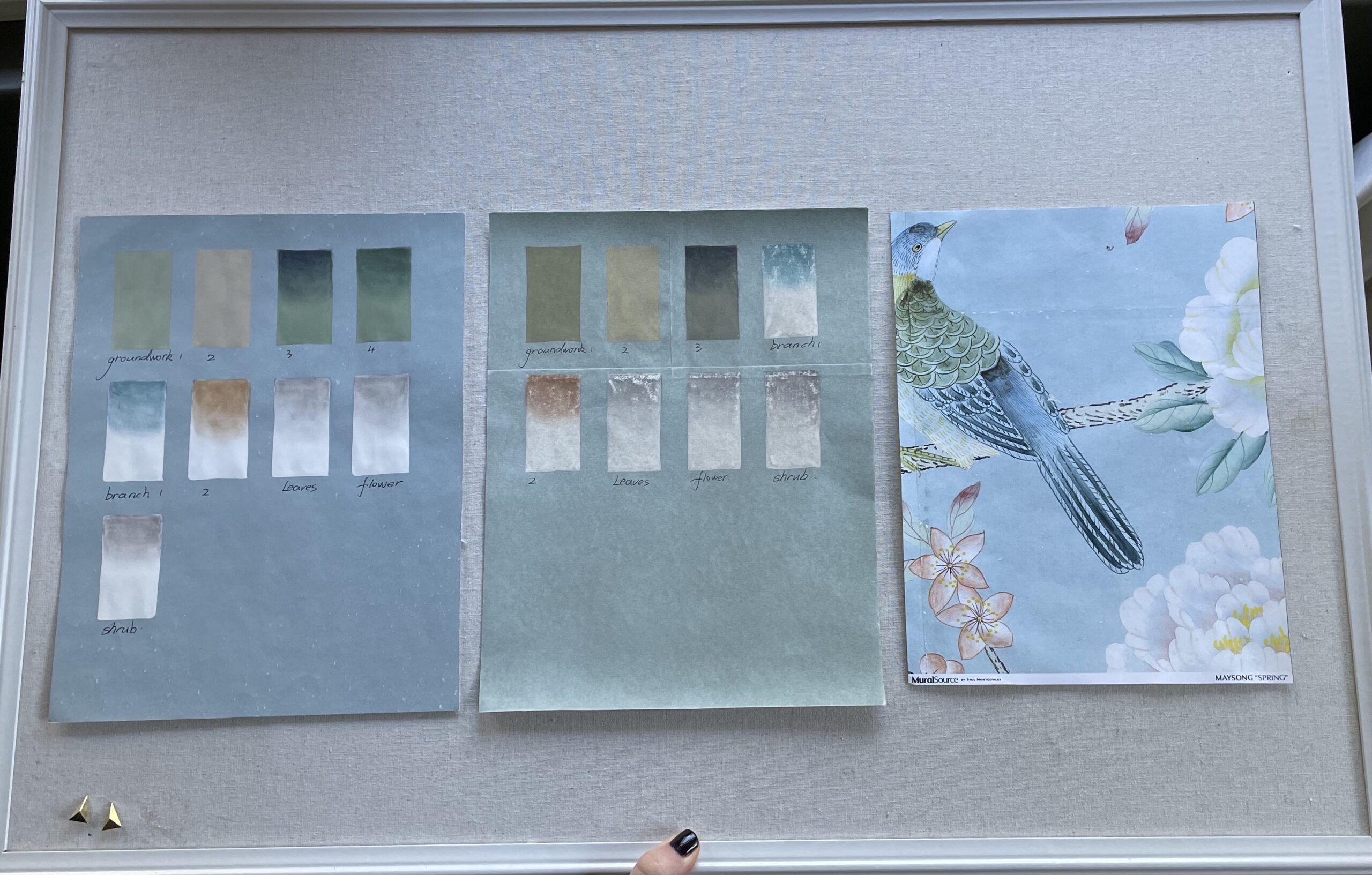
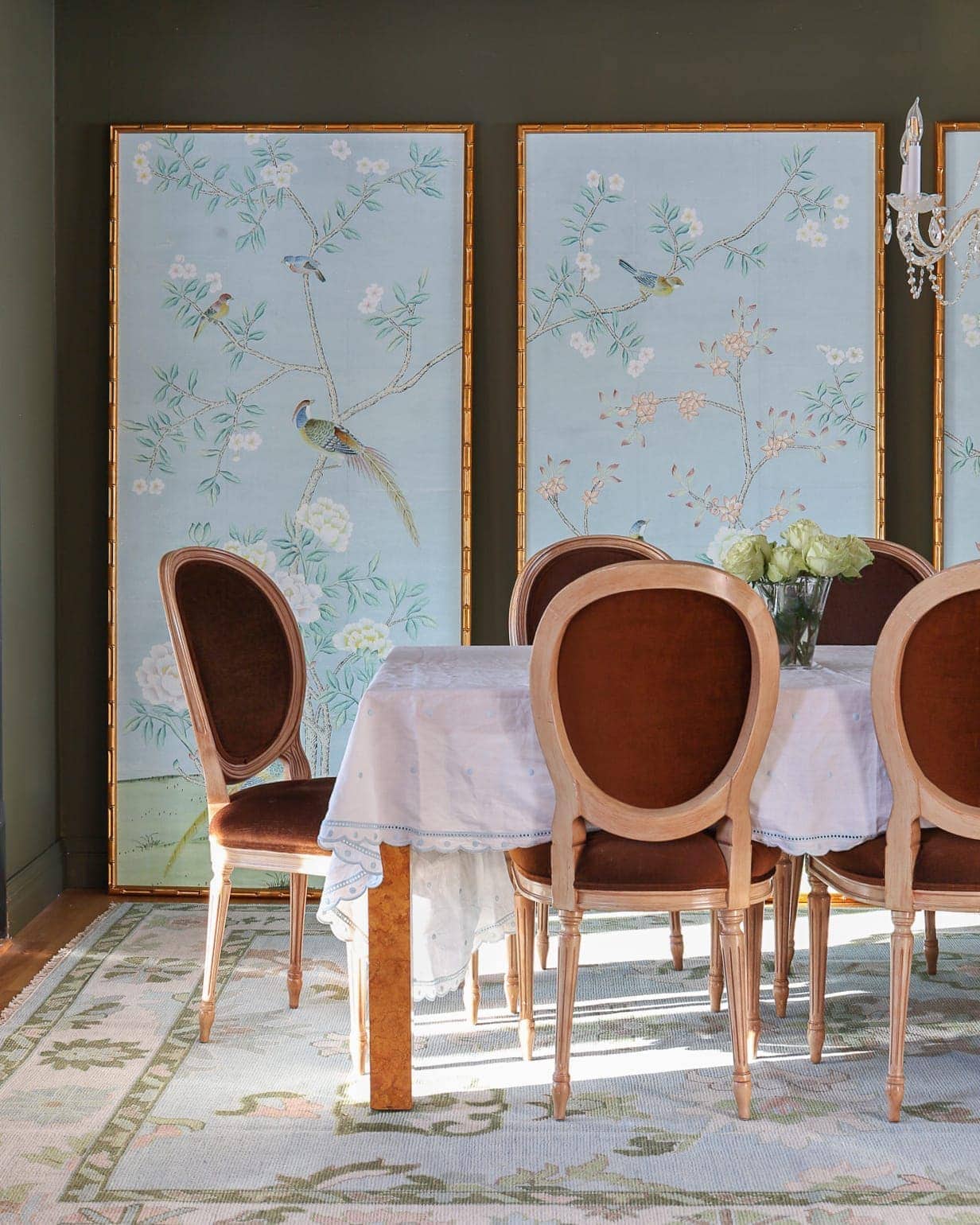
No matter what, I’m going to choose a light blue chinoiserie mural. I think that the way I can make these work and for the dining room to not look too feminine is with some rougher elements and dare I say “ugly” colors. I.e. chartreuse, celery, brown.
My sweet grandma (nonna) bought me the chandelier as a housewarming gift, so that’s definitely staying. I may get shades for it. But I’d like to balance out the classic chandelier with modern lamps.
I’m also undecided on whether I want the walls to be the same color as the chinoiserie panels, or if I want to use an “ugly” contrast color (like a muddy light olive) to make the panels pop and again, tone down the feminity of the design.
Last, I have some rationale/thoughts on why I’m doing framed panels vs. full wallpaper:
- This (hopefully) isn’t our forever home, so I’m trying to limit the number of rooms we wallpaper. It’ll just be a headache to remove if/when it comes time to sell
- I have no idea when we’re renovating our kitchen, which flows into the dining room. We may make some decisions for the kitchen that impact the dining room wall so I feel like not wallpapering the dining room will give us creative freedom in the kitchen
- I feel that 3 panels framed on the long wall in our dining room will still make a big impact. It’s the longest wall in the dining room. Every other wall is broken up by an opening or door. And the dining room wall is one of the first you see when you walk through our front door
- I can take framed panels with me to our next home, or if I ever don’t have a place for them, I can always sell them
- Framed panels are cheaper (for me) than wallpapering the whole room
I guess that’s it for now! I’m going to be making some decisions over the next few weeks and as usual, plan to share the process via my IG stories.
Have a good rest of your weekend!
xo
Alisa
Alisa! WOW! This is going to be amazing. I really think the Mural Source is going to be great, it looks lovely. Also I appreciate your thought process. I think some “ugly” elements will be the perfect way to tone down the feminity. brava
thanks Sharron!!
Love those panels from Mural Sources. Gracie is so pretty but at such a high cost. Personally, I love some “design elements with character (aka ugly)” that ground a space. Can’t wait to see you execute this!
thank you Kimi! 🙂
Can’t wait to follow along!
thank you so much, Adrienne!
It’s going to be stunning! My preference is option #2. I think panels is the way to go. Gracie wallpaper is expensive and as you said this is not your forever house. I know with the new wall you feel like it is completely separate room but you can still see from one to the other. Knowing this would you not keep the same color way as the living room?
Thanks Joanna! Good question. Yes, I could keep the color scheme the same as the living room, or I could do something completely different to keep things…interesting 😉 I guess I went the second route! Some of my favorite homes have openings from one room to the next, but each room looks completely different if that makes sense
From your concept room it looks like you are carrying on with the dark green but then deviating. I think whatever you do will be fabulous. I would never pull this look off. It would just come off as Old Lady Stuck in the Past. Lol
BTW I enjoy your Instagram posts. So fun!
Looks like it’s going to be a stunner… can’t wait to see.
thank you, Jamala!
Looks gorgeous! Love Gracie but for sure not the price. Option C for your walls could be to take the mural background color down 3 shades or so in darkness. Or even one of the other colors (dare I say the green ????) just darker. But I love the “ugly” idea too. So fun to follow along!
yes! Love that idea! thank you so so much
I am so glad you are doing panels rather than wall papering the entire wall! I think the panels look more intentional and special. Small walls look great wallpapered, but large expanses of walls, like your dining room, really benefit from being “framed” in panels. Real bonus that they can be removed and reused! 🙂
Your dining room is going to look so lovely!
yes! totally agree, Deborah! Thanks so much for the kind words 🙂
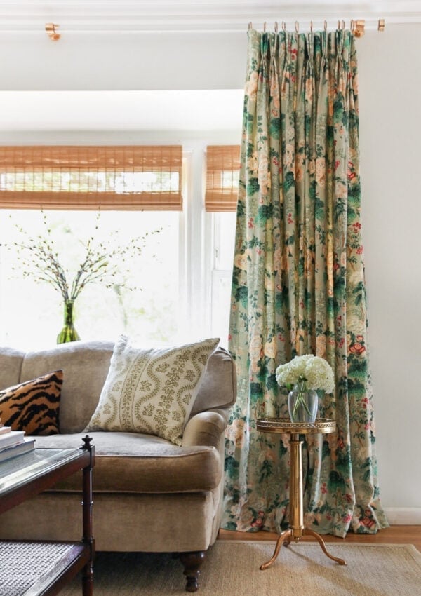
Excited to see this come together! You are going to outdo yourself, once again. Those lamps & curtains are just THE perfect unexpected modern touch! You do traditional/grandmillennial unlike any other. Thank you for being a source of inspiration.
Also, I wanted to share this w you & let you know that the timing of your post couldn’t have been more perfect.
So, I do interior design & remodeling here in Texas & still have a few projects lingering from that awful winter storm back in Feb, if you recall. This particular client lives in a super charming historical home right off Main St in Grapevine TX, right in between Dallas and Fort Worth. She lost literally EVERYTHING due to massive amounts of water damage from busted pipes which then led to finding asbestos. UGH. Her & her three cats had to immediately evacuate with no belongings, have been staying in extended stay hotel ever since. And it’s looking like she’ll hit the one year mark. Would you believe she is the most laid back, upbeat, positive client I have prob ever had?
We are taking this opportunity to really make this home ‘her’, something she’s always wanted to do but never been able to since taking ownership after a bad divorce many years ago.
Now that all material selections, cabinetry & paint colors have been made, I’m starting on furnishings. My mind keeps going to rugs as the jumping off point. I know what I want, having trouble finding the right colors although I can see it in mind. I’ve been feeling really stumped after not finding what I want color wise as well as vintage.
Alisa, your source for custom rugs COMPLETELY SLIPPED MY MIND! As I was reading your post and read -create custom rug-, I flew up out of my chair! Thank you!! I’m going to look back at your living room post for the specifics. If we can swing, I’d love to have a rug made for her living room. ????
Then, it’s on to antiques!
Also, I want to let you know I’ve referenced several photos of yours when during my presentation w this client (and always crediting you!). Your beautiful home & photos have helped tremendously as far as visualization purposes on this particular project. She couldn’t quite wrap her head around molding and painting all surfaces one color in the primary bedroom, seeing progress pics of yours helped tons.
Anyway, just wanted to say thank you for being a source of inspiration in ways you may not even be aware of sometimes. With this historic home now being down to studs, it’s important to be to bring back the integrity & charm of the home. I feel that you have done that in your home and it’s so nice to see! Molding, trim, chunky base and crown molding just really add such charm & charater that a flat wall cant begin to complete w.
Thanks again for constant inspiration, in both your design sense and your spunky attitude! The world needs more like you!
!). Thank you for being a constant source of inspiration!
beginning w rugs. Your source completely slipped my mind!! The timing of your post could not have been more perfect.
have been.
I’ve been feeling stuck i
Please forgive the overly long comment as well as those typos there at the end…not sure where those came from. ????
wow, Leah. I am so emotional after reading your comment. That is so touching. I am so so sorry to hear your client lost everything in that horrible storm, but it seems like she has a wonderful, caring designer to help build her life back again. I am going to email you something that may be helpful 🙂 but again, thank you so so much for that deeply personal comment and the very kind words. I truly appreciate it!
Using wallpapered panels that can move with you to another house? Genius!
ha! thanks Laura!
AGGGHHHH I already know this is going to be a great room! I would have never thought to use the Kelly Wearstler lamps or pattern with the chinoiserie but it totally works. Cant wait to see you execute, as usual
thank you Jennifer!
Sending lots of love to you while you prepare for this makeover. your rooms never cease to inspire me!!!! that rug is going to be SO wonderful, I can tell by the colors you chose
Hi Alisa,
I know this comment is very late, but maybe you’ll see it. I’m brand new to your blog, and think you are brilliant! I really love how your gorgeous space is coming together.
I have a question about your plans for framed chinoiserie panels. I’ve always wanted to do something like this, but having them framed is incredibly expensive. I assume you make your own frames? If so, can you give any tips on how you do it?
Thanks so much! I look forward to watching your home evolve. And congrats on baby Bovino!
Abbott
Hi Alisa,
I would love to send you a table cloth for your dining room. The designs I have are right up your alley. I’ve DM’d you as well.
Best,
Julie@foxandpark.com