After sharing via IG stories that I found an *almost* perfect green paint color to match the wallpaper for my office but wanted to lighten it a bit, I received some questions about how and why I would lighten (or darken) a paint color, so I figured I’d explain in a blog post.
Unfortunately because of the busy pattern, the paint store couldn’t match an exact paint color with my wallpaper sample, so I was left to figure out an exact paint match on my own.
NBD, I thrive off paint swatching.
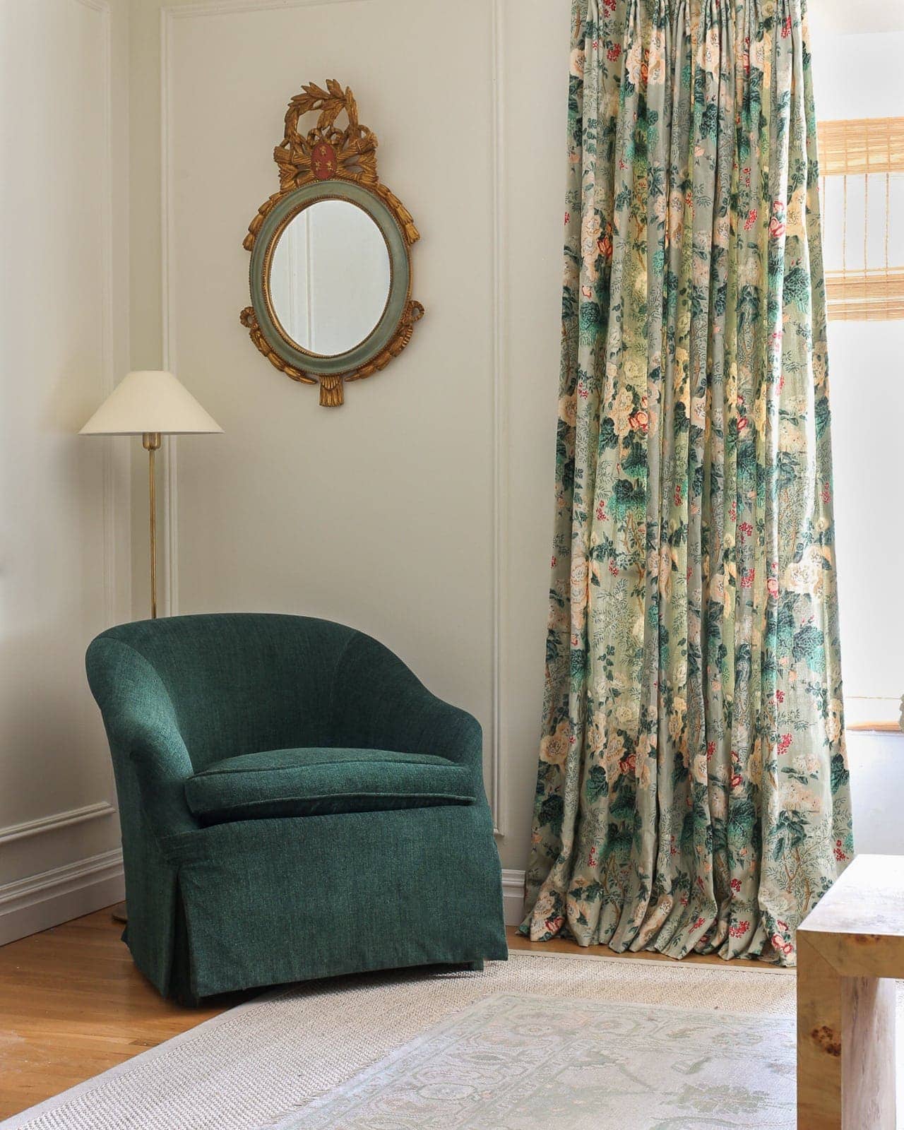
I ended up finding that Farrow and Ball Yeabridge Green was the almost perfect match to the green in Sister Parish Dolly wallpaper, but I wanted it to be the slightesssst bit lighter.
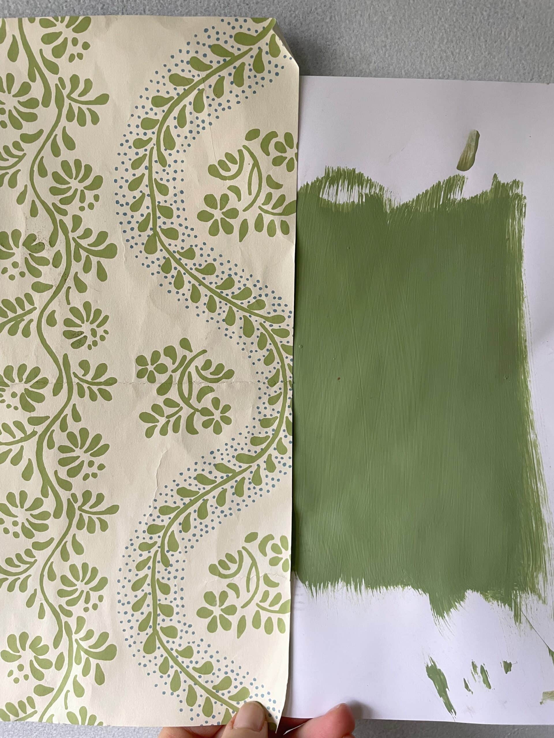
I asked my local Benjamin Moore store if they had Yeabridge Green in their system to color match and they did, so I asked if they could give me a sample but have it lightened by 50%. This was a guess on my part. I assumed 25% lighter would be too subtle of a change, and 75% lighter would be far too light.
I went home to test the sample and 50% lighter was exactly what I wanted, so I went back the next day and got a quart of semi-gloss, just enough to paint the trim and doors.
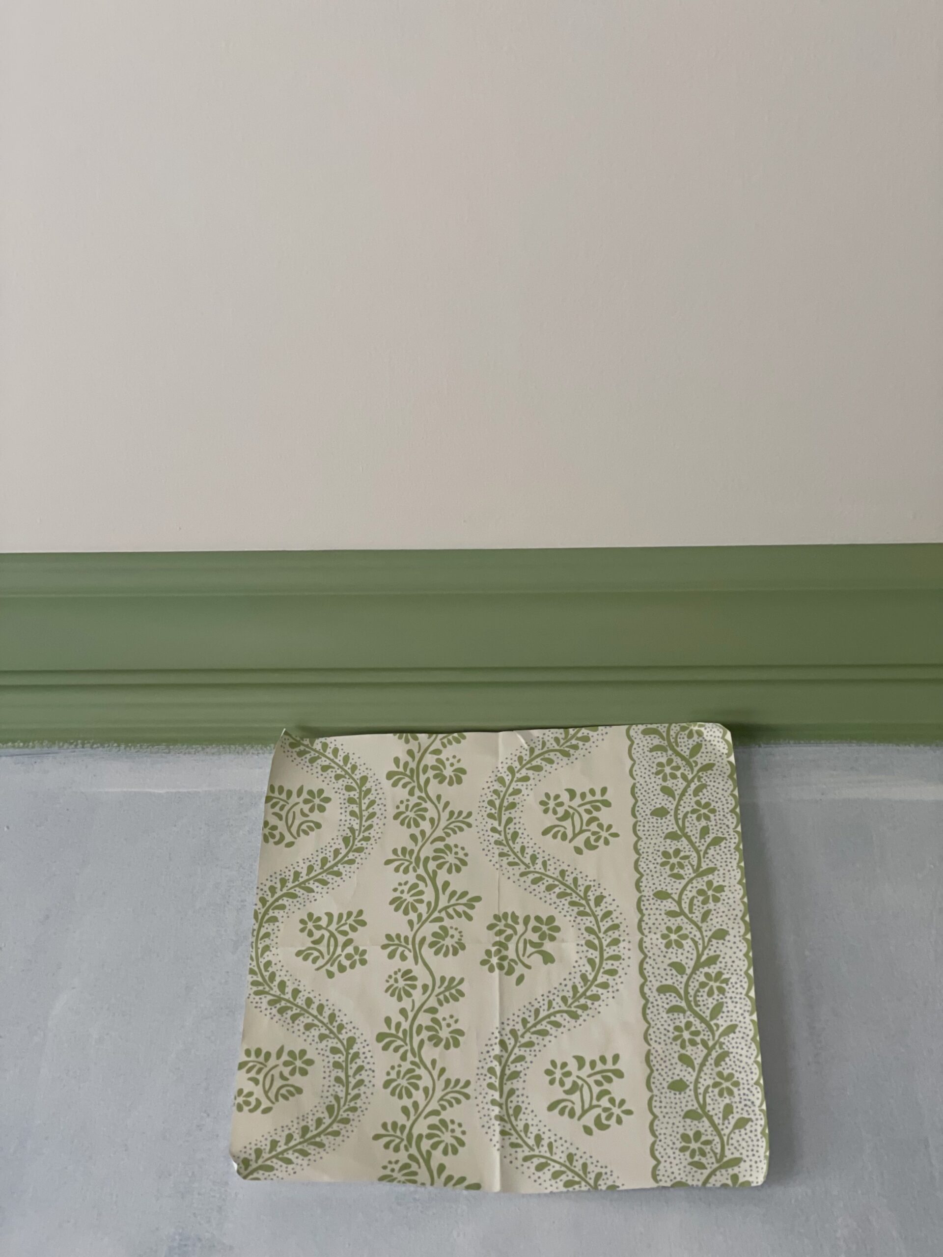
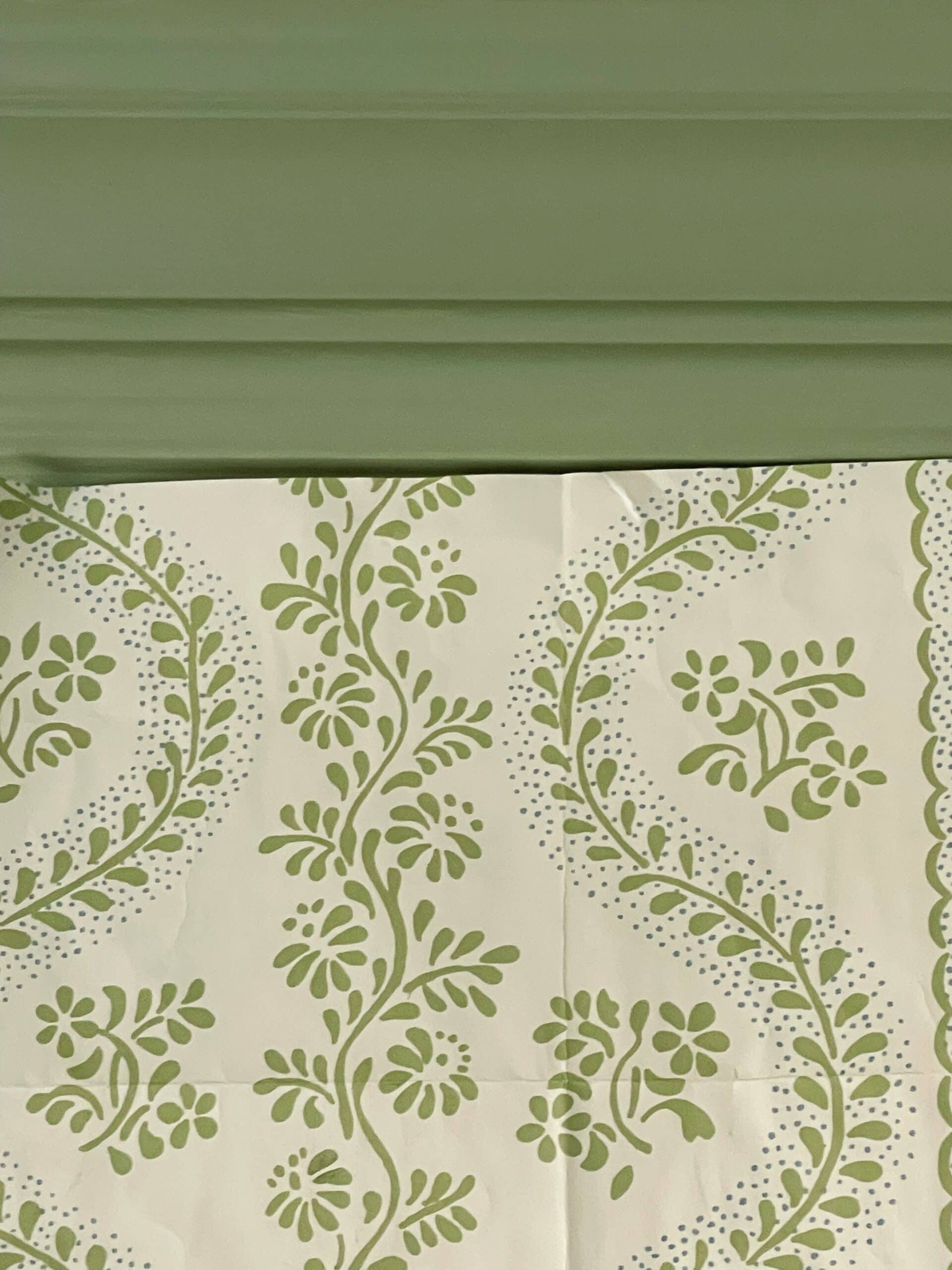
To the naked eye, it’s a perfect match. But if you look closely, you can tell that the trim is slightly lighter than the green floral pattern.
Every paint color has a formula, and you can either lighten (add white) or darken (add black) a formula to your liking. The LRV (light reflective value) of a paint color changes slightly based on how you darken or lighten it, but there’s no way to tell by how much (for reference, black is 0 and bright white is 100).
I’m guessing that since the original LRV of Yeabridge is ~33, lightening by 50% would give it an LRV of ~40.
Note, Farrow and Ball does not lighten or darken paint colors. With colors directly from their store or website, you get what you get. If you happen to find a Farrow and Ball paint color that you want to lighten or darken, then color matching at your local paint store is the way to go (check to make sure they have the color in their system first).
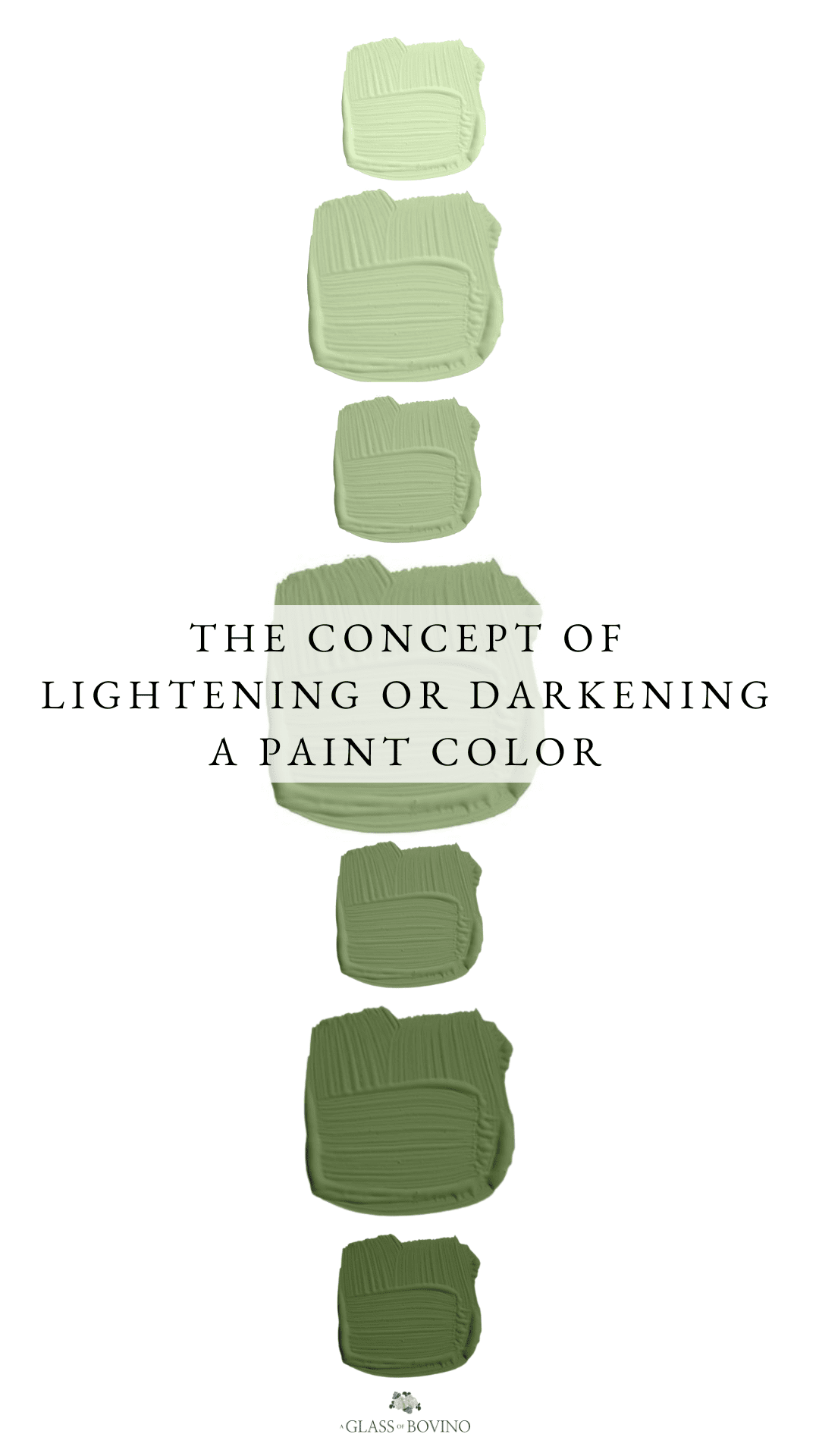
Here’s a simple graphic with Yeabridge Green lightened and darkened by up to 75%
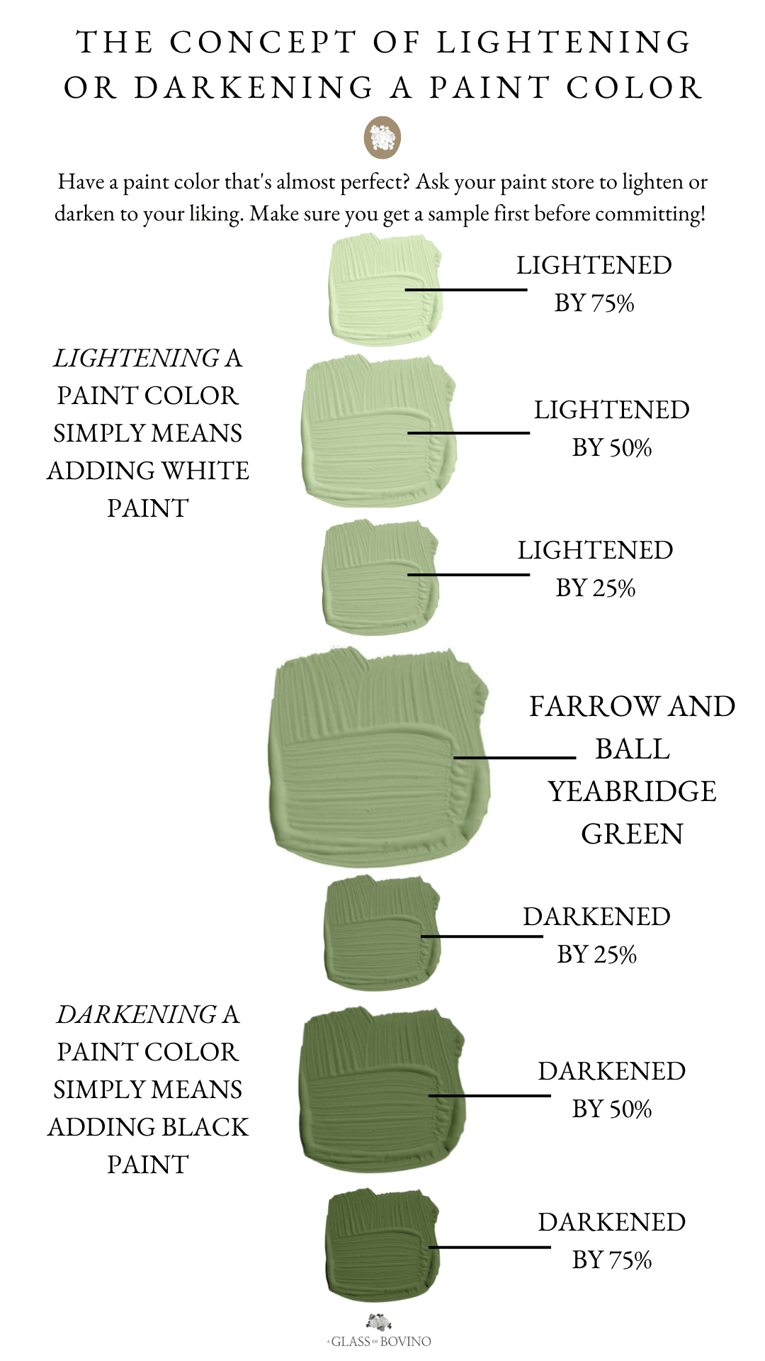
Honestly, if you’re lightening or darkening by 75%, just find a new paint color. Unless you’re going for a tone-on-tone look (for example, the ceiling painted a 75% lighter color than the walls).
I also did this with our living room last year. I fell in love with Benjamin Moore Seashell but felt it was a little too light, so I had it darkened by 50%, but it really didn’t make a huge difference. I think it’s harder to tell when you alter lighter paint colors – sometimes they just look muddier if that makes sense.
Just remember to ALWAYS get a sample of a lightened/darkened color to make sure you like it before committing.
Hope this was helpful!
Great post!
Great post
Hi
This is a great post
Your tips were so instrumental when I was color matching De Nimes for my bedroom. I have shadowy corners, north facing and extreme dark out shades (I work nights). Tried many shades AND finishes before I found the right one for my space. Thank you.
Hey Alisa!! I’m choosing colors right now for our home & would love to know how you made the swatches of green lightened and darkened! That would be so helpful to be able to do. I took a photo of our samples on the wall and went to “markup” in Photos on my iPhone, used the color match dropper, but it only gives me the option to change opacity.
thank you!
Sara