That was a hard title for me to write, mostly because I’m a dark walls kinda gal. I had a spur of the moment urge to paint my office white back in February…and I immediately knew it wasn’t for me. So the next day I ran out to Sherwin Williams, purchased a gallon of Greenblack and killed those white walls.
Within 24 hours, my office went…
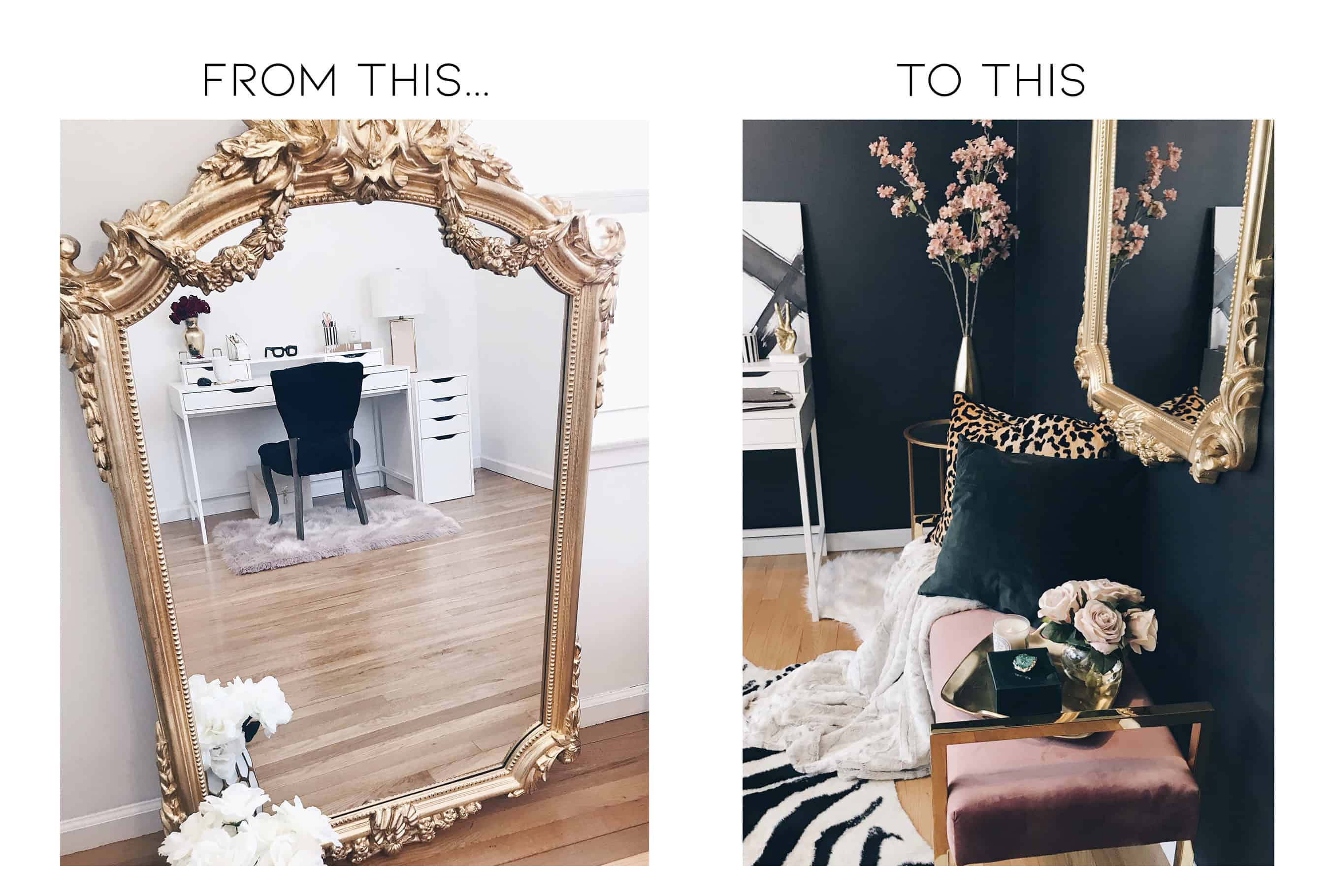
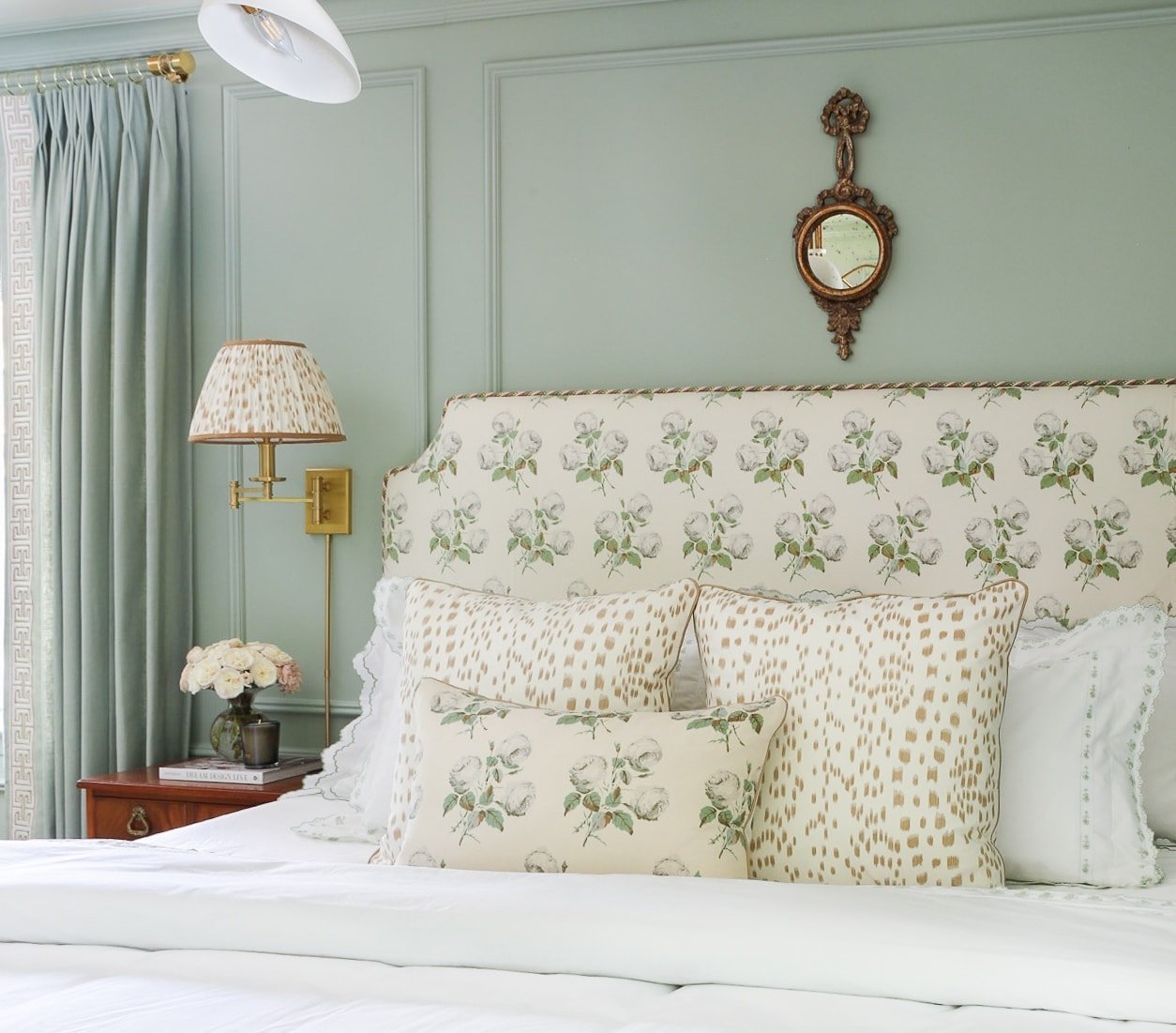
And that ornate gold mirror (a Home Goods find) inspired it all.
Maybe if I gave white a chance for more than 14 minutes, I would have eventually grown to like it. But, I also wouldn’t have ended up with the bomb-ass black walls that currently surround me as I’m writing this.
Chances are, you and I are probably similar in a sense that we can become so inspired by just one image that it’ll compel you to redesign an entire room or home (bless our significant others). That’s not exactly what happened to me, but let me explain.
Lately, I’ve been observing the big shot designers; Studio McGee, Amber Interiors, the list goes on. What I did was try to find similarities or a distinction between their designs and why they’re so good at what they do (besides the fact that they’re well – really good at designing).
Although they each have their own style, I did notice something similar between these bright-space designers – they all use white walls in most of their designs.
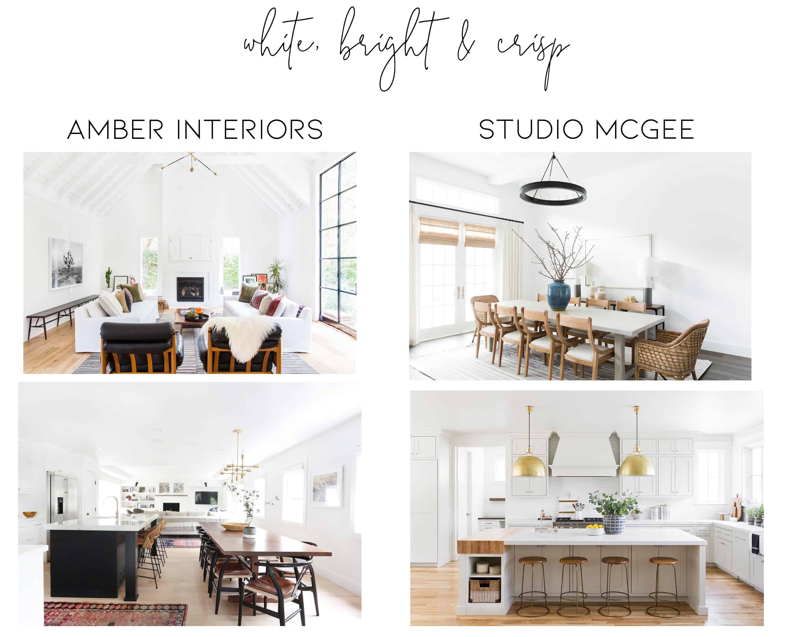
Via Amber Interiors & Studio McGee
Not all – most. And I rarely see them using colors like gray or beige. When they do dabble in a wall color other than white, it’s a color that’s sure to draw attention and leave a lasting impression. But they all have a similar look, which is bright white walls and pops of color throughout.
So naturally, I started thinking. I’m not looking to change the entire design aesthetic in my home, but I’m kinda bored with these gray walls. What if I gave white a chance that lasted longer than 14 minutes? What if I could apply that molding I’ve been dying to install and then paint our walls white?
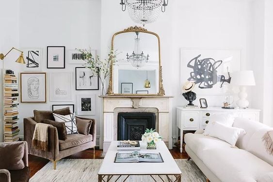
After all, white is the perfect backdrop as it brings out the textures, furnishings, and accessories in a room.
Although I haven’t used many white paints in our home, I have in client’s homes and through research, I’ve compiled 7 fail-proof shades of white paint for you to use in your home.
These are all fail-proof shades of white paint, however, a few quick things before diving in:
+ I included 3 image examples for each paint color to show you that the same shade of white always looks different from one room to the next. Which is why I always recommend to SAMPLE! Yes, these are fail-proof shades, BUT, they may not be the right shade for you.
+ If you’re having a hard time choosing paint colors, buy some poster boards and paint one color sample per board. Hold it up or tape it to the wall and keep an eye on it throughout different times during the day to see how it changes with the light. Take pictures of that poster board. Become one with the poster board. You’ll notice that each color looks different throughout different times of the day and in different lighting, which is fine, because you’ll then know which colors you do/don’t love.
Without further ado…
1. Benjamin Moore Chantilly Lace
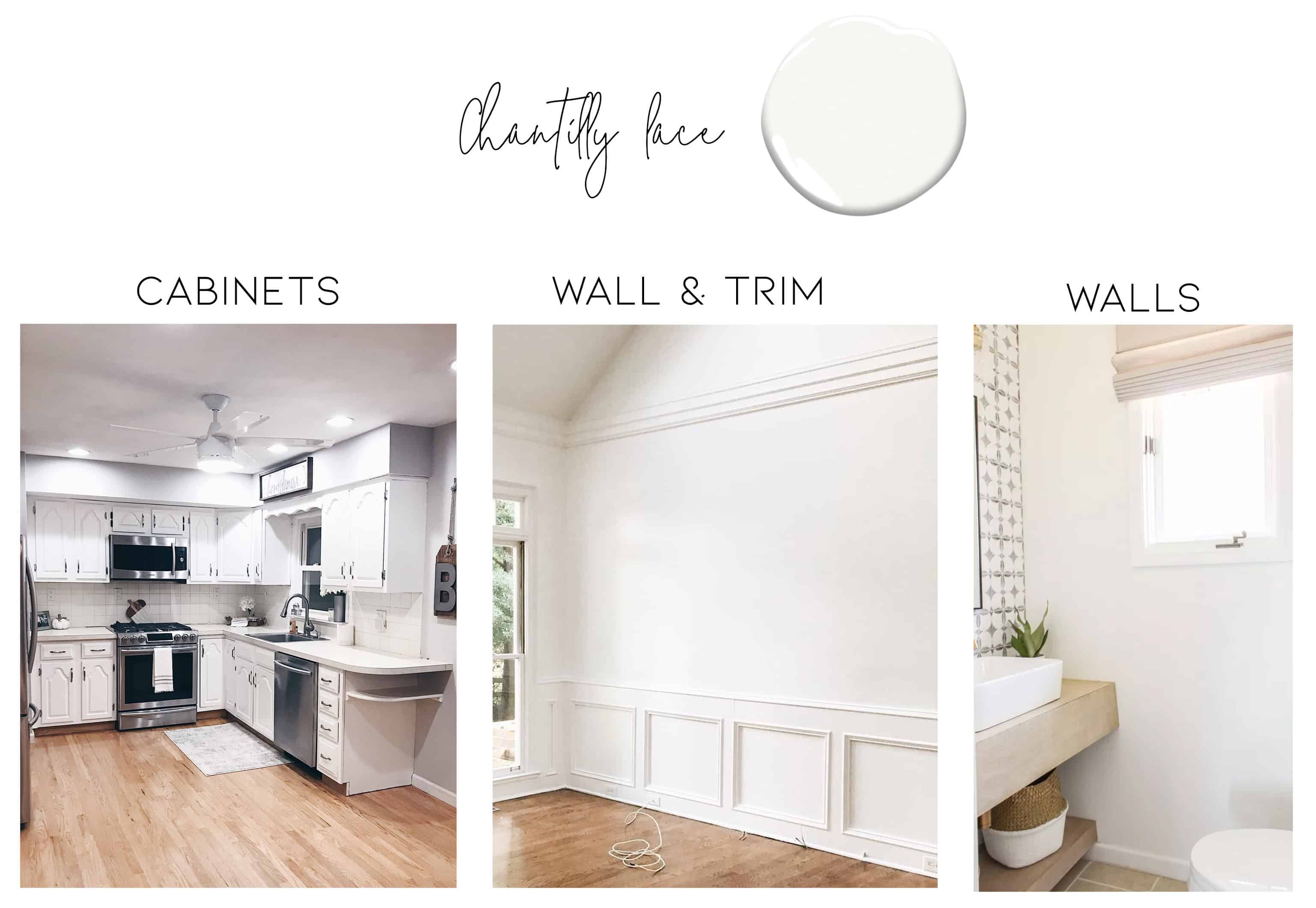
Chantilly Lace is a crisp, bright white and the beauty of this color is that it can bring in both warm and cool tones. This is the white we used for our cabinets and the color that was on my office walls for less than 24 hours. This is by far, my favorite white, simply because it’s the truest white I’ve found.
2. Benjamin Moore Decorator’s White
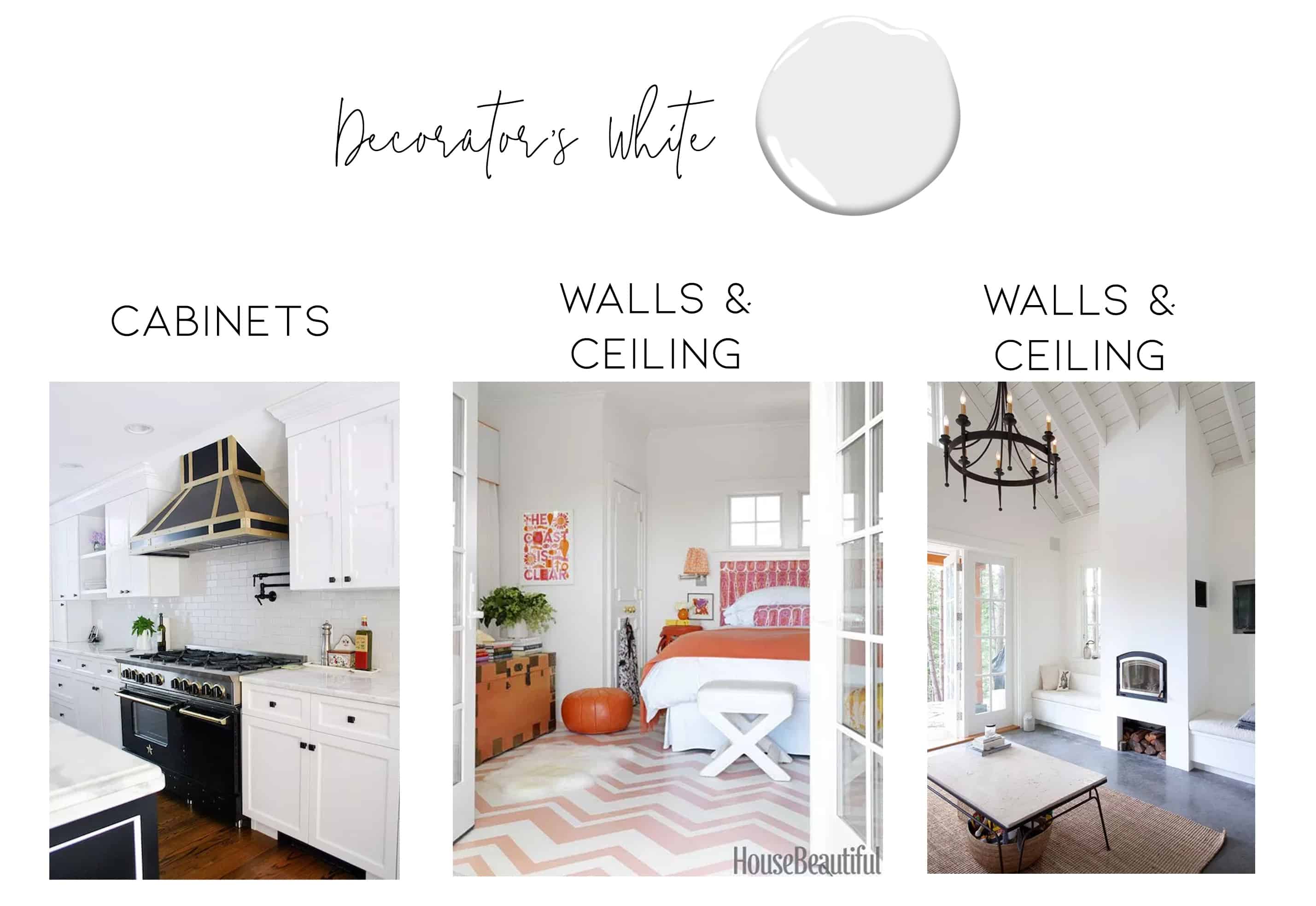
Personally considering this one for our bathroom.
“YOU CAN’T GO WRONG WITH BENJAMIN MOORE’S ‘DECORATOR’S WHITE’ (CC-20). IT’S WHAT I USE IN MY OWN HOME AND FOR CLIENTS’ WALLS WHEN THEY TELL ME THEY CAN’T DECIDE ON A WHITE AND I WANT TO PLAY IT SAFE. THERE MIGHT BE FANCIER WHITES, BRIGHTER WHITES, DARKER WHITES, GRAYER WHITES, AD INFINITUM, BUT THIS ONE ALWAYS DELIVERS IN A FRIENDLY, CONSISTENT WAY.” —SUSANNA SALK
3. Benjamin Moore White Dove
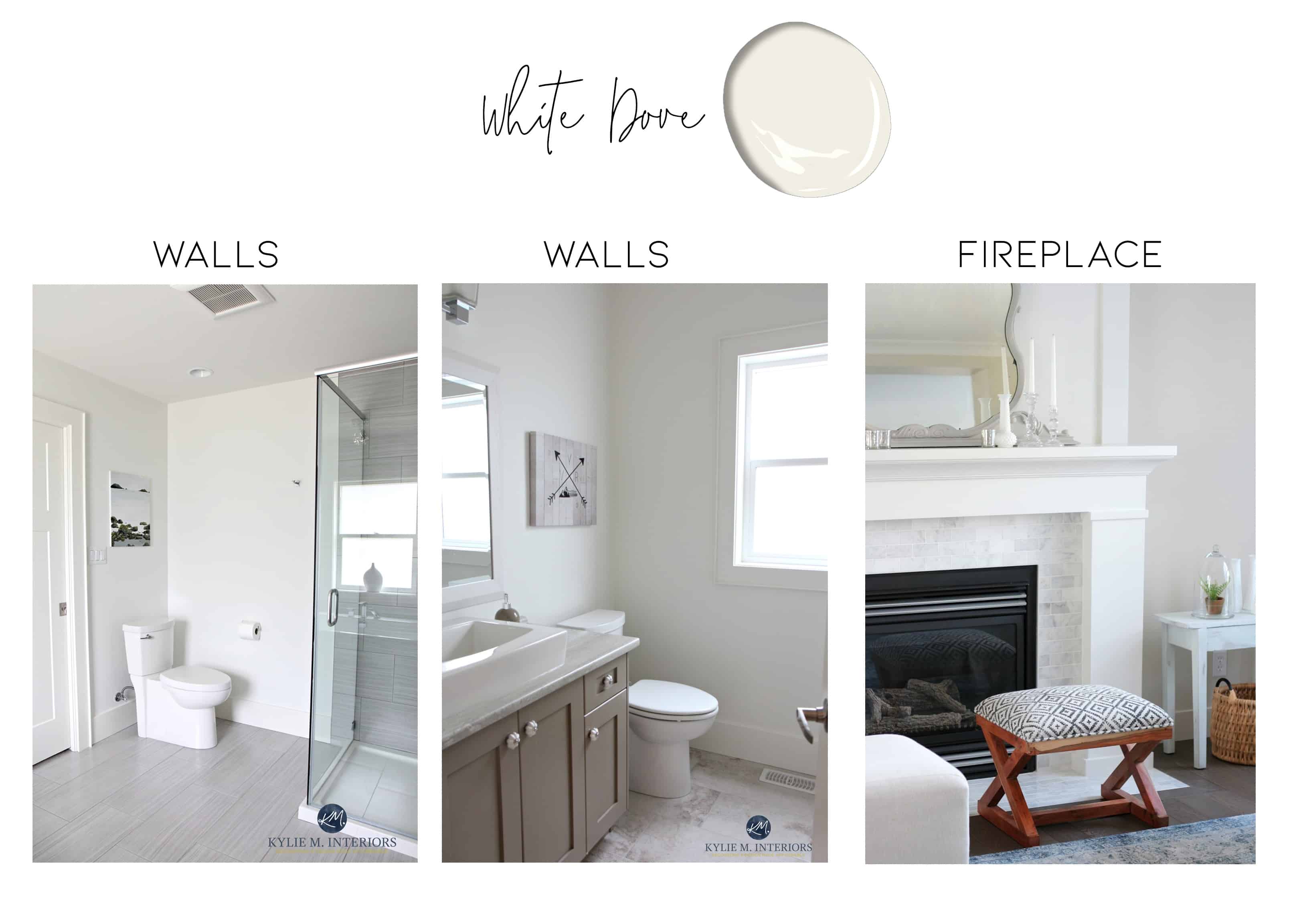
This is definitely a creamy, pale-ish, off-white. I’d say it’s almost a light light greige and it’s a bit warmer than other white paints. This color paired with a bright white for trim will create a stunning combination.
4. Sherwin Williams Pure White
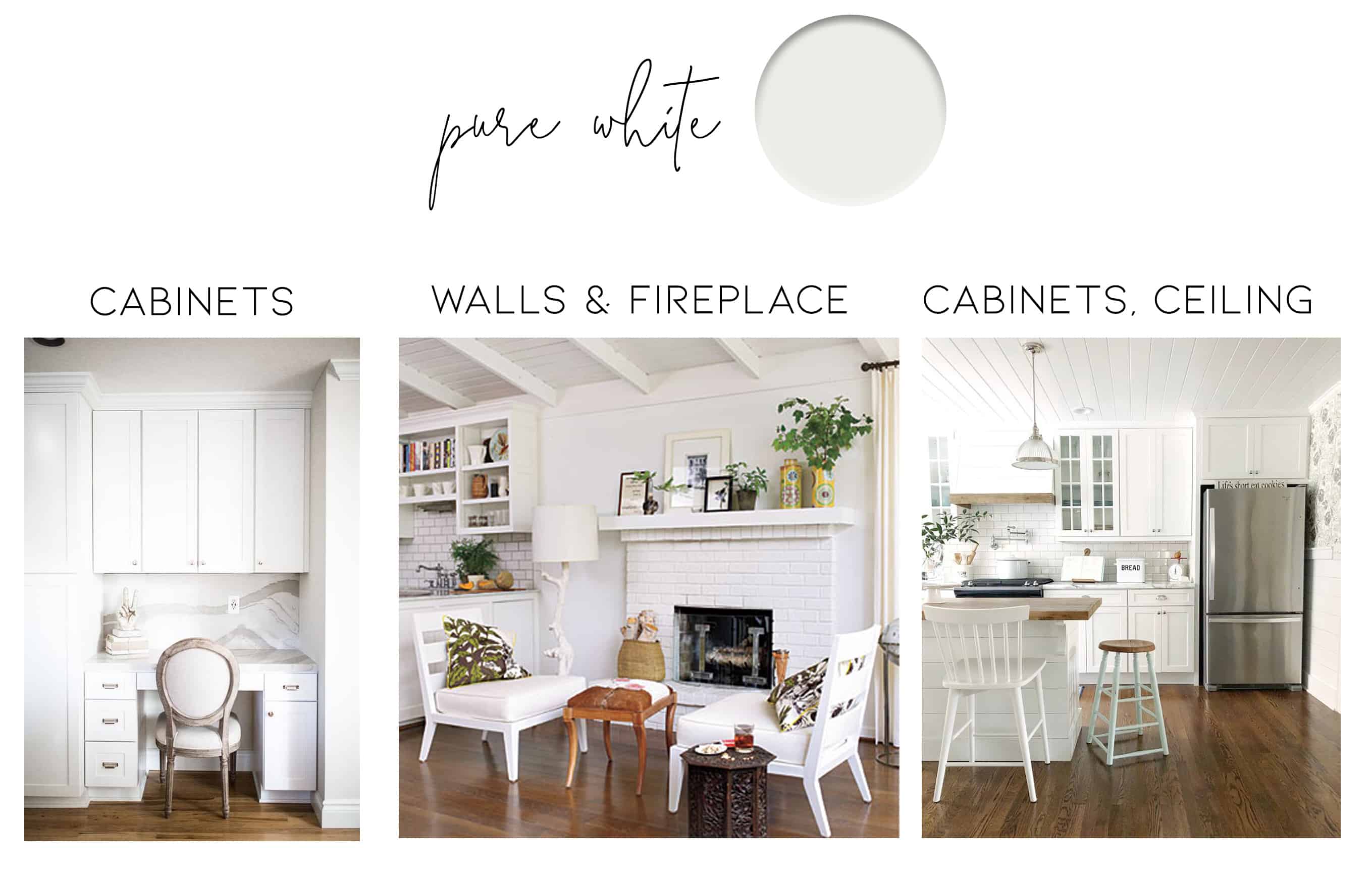
Pure white is named properly – it’s a pure, crisp white (with a teeeensy bit of warmth to it). I would compare this to BM’s Chantilly Lace.
5. Sherwin Williams Extra White
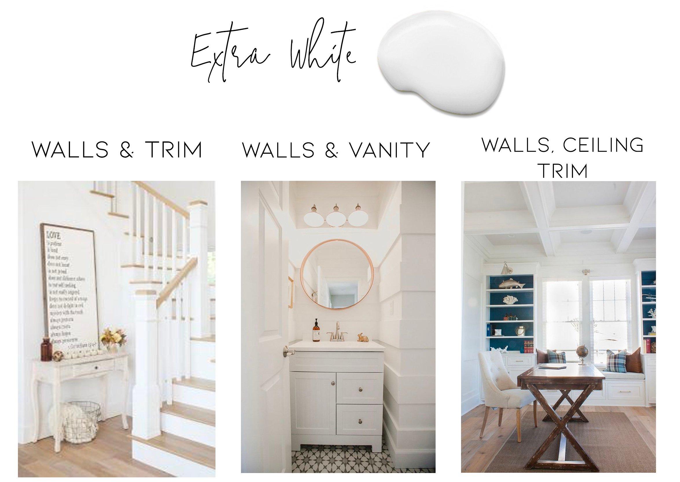
If you’re looking for a white with a tad bit of cool undertones, this is the perfect white for you.
6. Sherwin Williams Alabaster
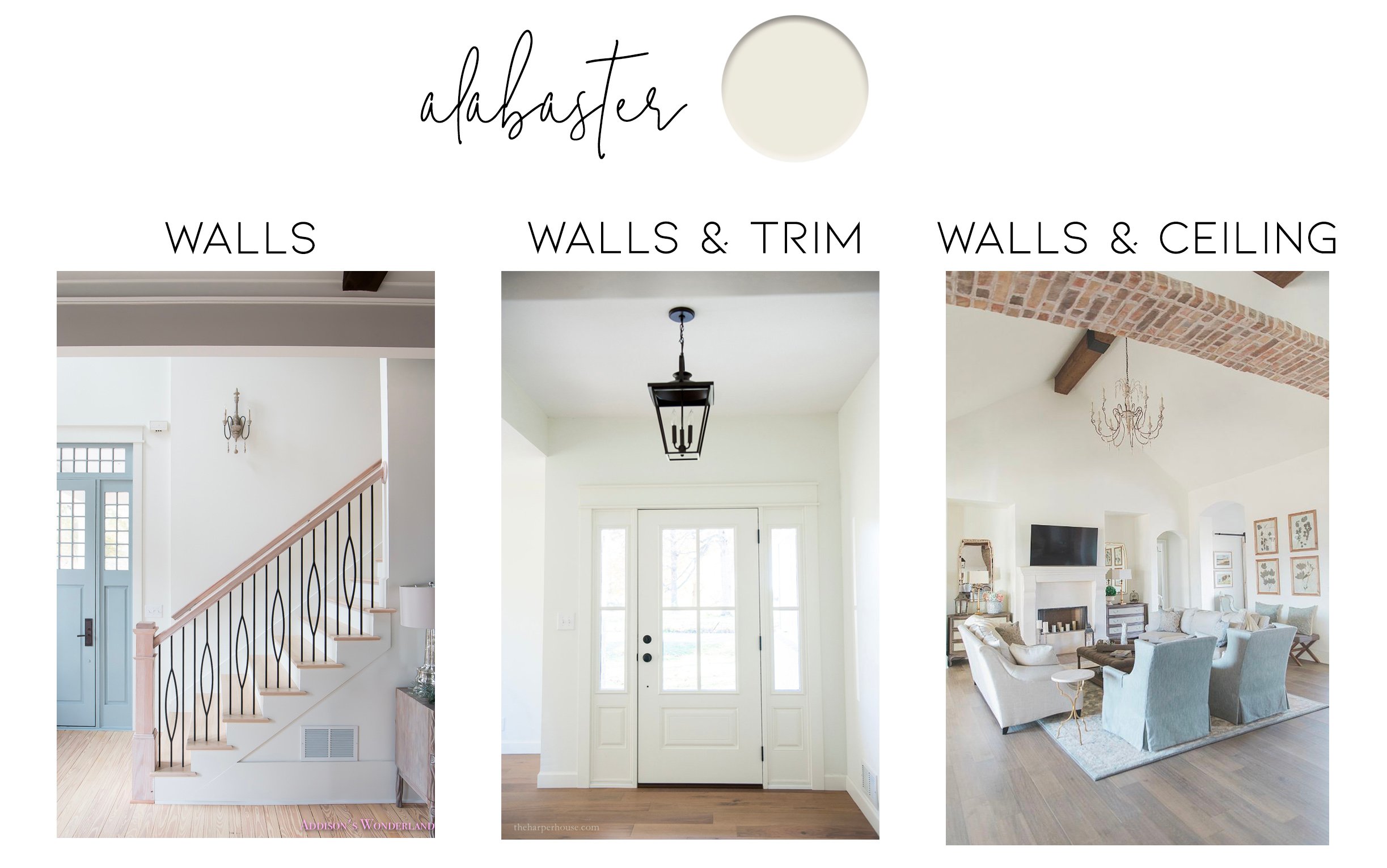
Sherwin William’s 2016 Color of The Year: Alabaster. It’s a pure white that isn’t too stark or blinding. It’s definitely on the creamier side and in between an off-white and bright white.
7. Farrow and Ball Wimborne White
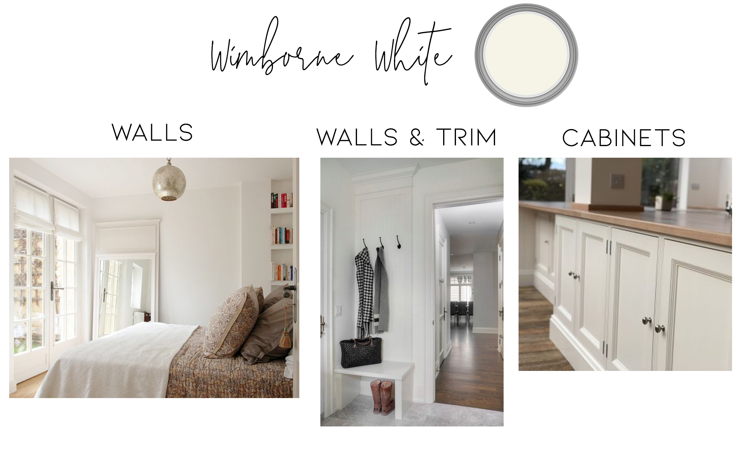
I learned something interesting recently – Farrow and Ball’s paints are roughly 30% more pigmented than other brands. Wimborne white is one of their most popular shades, which is an off-white with a touch of warmth.
*remix*
If you’re having a hard time choosing the perfect paint color, subscribe below to gain access to my Guide to Choosing the Perfect Paint Color!
See you Thursday for this week’s One Room Challenge bathroom reno update!
xo
Alisa


Some times its a pain in the ass to read what website owners wrote but this site is real user friendly ! .
Working Auto Liker, Photo Auto Liker, autoliker, Autoliker, ZFN Liker, Autolike International, Auto Liker, Increase Likes, Autolike, auto liker, autolike, auto like, Autoliker, Status Liker, Auto Like, Status Auto Liker, Photo Liker
Hi there, just wondering if I should paint my cottage Chantilly lace, I would prefer it to be a warm white! Open concept with cherry wood cupboards? If so what colour for the trim & doors?
[url=https://cymbalta24.com/]cymbalta 10mg[/url]
Good afternoon!
We’re downsizing after 40 years in this house.
I’ve chosen SW Alabaster paint for the interior walls.
I was thinking of using SW Extra White for the trim.
Obviously I cannot put samples up on the walls at the new place until we close on the house.
My question is do you think there will be enough contrast between the SW Alabaster paint and the SW Extra White trim to be noticeable?
Thanks
I am putting in Moonshine Cabinets and was thinking of doing all my walls in White Dove but would like the trim to be a bright white. What is your opinion on these colors as I want to keep it bright and clean looking. I so appreciate your opinion.
Thank You, Patti
ทําไม เล่นสล็อต ไม่เคยได้เลย เว็บตรง PG มีทางออกดีๆ มาเเนะนำ รู้หรือไม่ว่าเว็บเดิมพันสล็อต มีผลกับการสร้างรายได้ 100% ถ้าเริ่มต้นจากการเลือกเล่นสล็อตกับเว็บตรงปลอดภัย มั่นใจได้เลยว่ายังไงก็มีกำไร เเละนอกจากนี้ยังมีปัจจัยอื่น ที่สามารถทำให้ชนะได้อีกมากมาย ทั้ง เทคนิค การ เล่นสล็อต ให้ได้ โบนัส pantip สูตรเล่นสล็อตพีจี รวมถึงโปรโมชั่นต่างๆ ซึ่งเว็บที่ดีจะมีบริการทุกอย่างที่กล่าวมาครบถ้วน
เล่นเกมทดลอง 99club ก่อนที่คุณจะเล่นด้วยเงินจริง ลองเล่นเกมทดลองเพื่อรู้จักกับเกมและทดสอบกลยุทธ์โดยไม่ต้องเสี่ยงเงิน
การใช้เทคโนโลยีเพื่อสนับสนุนการเรียนรู้แบบอัจฉริยะ lavagame ช่วยในการใช้เทคโนโลยีเพื่อสนับสนุนการเรียนรู้แบบอัจฉริยะ ที่สามารถเพิ่มการคิดวิเคราะห์และการอัพสกิลในการเรียนรู้